Bonus: DVLA Data Dashboard in Power BI
This project follows on from my one on analysing DVLA data. If you haven’t already read it, you may want to do so - you can find it here: https://www.jamesgibbins.com/analysing-dvla-data/
Intro
Time for something different - a dashboard! Sure, Python is great for transforming and analysing data, but it’s not the most end-user-friendly†. This is why business intelligence (BI) / data visualisation tools exist, the most popular of which is Microsoft’s Power BI.
I found out after creating the dashboard that I can’t host it online unless I pay Microsoft a chunk of change. Instead, I’ll give you some screenshots, the Power Query code, and provide some hints and tips for creating a dashboard. This won’t be a full guide on how to use Power BI, as that’s best done through a video (as it’s a click click GUI) - there are plenty available on YouTube and elsewhere.
The file itself is in my GitHub repo: https://github.com/jamesdeluk/data-science/tree/main/Projects/dvla-vehicle-statistics
† Actually, you can make a dashboard using Dash (part of Plotly) with Python… Maybe a future project!
The data
The two CSV files (AM and NZ) are imported as separate Queries, identical transformation steps are applied to each, then they’re Merged into a single Query.
One thing to be aware of - Power Query is far slower than pandas in Python. For example, the longest step in pandas took about 15 seconds; in PQ, the final loading of the data took over 10 minutes, and some of the individual steps also took several minutes!
I mostly used the GUI to build the transformation steps. After transforming the first Query, I copied the code, available from the Advanced Editor, across to the second Query. This ensures identical steps are taken for each, and works as the files have identical formats and structure.
To create the visuals I wanted, I needed the data in two forms - pivoted, and unpivoted (equivalent to melted in pandas). To create the pivoted data, I duplicated the pivoted Queries, then modified the steps/code. The final results is six Queries - three for pivoted and three for unpivoted, each consisting of two linked to the CSV files, and the merged combination of the two.
The steps
The transformation steps are:
Sourcetells Power Query where to find the data (this line is created automatically when importing the data).- Separate the first row of the CSV (which contains the headers) from the data.
- Set all the numerical columns to be integers (whole numbers).
- Replace errors caused by trying to convert
[x]or[z](see the other post) to integers to 0s. - Unpivot the data, to combine the individual year columns.
- Make the new
Yearcolumn also an integer. - Remove
MISSINGs.
For the unpivoted Queries:
- Make a new column combining the
ModelandLicenseStatus, needed for one of the plots.
For the pivoted Queries:
- Pivot the data, to split
LicenseStatusintoLicensedandSORN. - Make a new columns with the LS ratio by dividing
LicensedbySORN.
The code
For the unpivoted Queries:
let
    Source = Csv.Document(File.Contents("C:\[]\df_VEH0124_AM.csv"),[Delimiter=",", Columns=17, Encoding=1252, QuoteStyle=QuoteStyle.None]),
    #"Promoted Headers" = Table.PromoteHeaders(Source, [PromoteAllScalars=true]),
    #"Changed Type" = Table.TransformColumnTypes(#"Promoted Headers",{{"YearFirstUsed", Int64.Type}, {"YearManufacture", Int64.Type}, {"2023", Int64.Type}, {"2022", Int64.Type}, {"2021", Int64.Type}, {"2020", Int64.Type}, {"2019", Int64.Type}, {"2018", Int64.Type}, {"2017", Int64.Type}, {"2016", Int64.Type}, {"2015", Int64.Type}, {"2014", Int64.Type}}),
    #"Replaced Errors" = Table.ReplaceErrorValues(#"Changed Type", {{"YearFirstUsed", 0}, {"YearManufacture", 0}, {"2023", 0}, {"2022", 0}, {"2021", 0}, {"2020", 0}, {"2019", 0}, {"2018", 0}, {"2017", 0}, {"2016", 0}, {"2015", 0}, {"2014", 0}}),
    #"Unpivoted Columns" = Table.UnpivotOtherColumns(#"Replaced Errors", {"BodyType", "Make", "GenModel", "Model", "YearFirstUsed", "YearManufacture", "LicenceStatus"}, "Year", "Value"),
    #"Changed Type1" = Table.TransformColumnTypes(#"Unpivoted Columns",{{"Year", Int64.Type}}),
    #"Filtered Rows" = Table.SelectRows(#"Changed Type1", each ([Model] <> "MISSING")),
    #"Added Custom" = Table.AddColumn(#"Filtered Rows", "Model_LicenceStatus", each [Model] & " - " & [LicenceStatus])
in
    #"Added Custom"
For the pivoted Queries:
let
    Source = Csv.Document(File.Contents("C:\Users\jgibb\Google Drive\My Drive\Data Science\Projects\dvla-vehicle-statistics\df_VEH0124_AM.csv"),[Delimiter=",", Columns=17, Encoding=1252, QuoteStyle=QuoteStyle.None]),
    #"Promoted Headers" = Table.PromoteHeaders(Source, [PromoteAllScalars=true]),
    #"Changed Type" = Table.TransformColumnTypes(#"Promoted Headers",{{"YearFirstUsed", Int64.Type}, {"YearManufacture", Int64.Type}, {"2023", Int64.Type}, {"2022", Int64.Type}, {"2021", Int64.Type}, {"2020", Int64.Type}, {"2019", Int64.Type}, {"2018", Int64.Type}, {"2017", Int64.Type}, {"2016", Int64.Type}, {"2015", Int64.Type}, {"2014", Int64.Type}}),
    #"Replaced Errors" = Table.ReplaceErrorValues(#"Changed Type", {{"YearFirstUsed", 0}, {"YearManufacture", 0}, {"2023", 0}, {"2022", 0}, {"2021", 0}, {"2020", 0}, {"2019", 0}, {"2018", 0}, {"2017", 0}, {"2016", 0}, {"2015", 0}, {"2014", 0}}),
    #"Unpivoted Columns" = Table.UnpivotOtherColumns(#"Replaced Errors", {"BodyType", "Make", "GenModel", "Model", "YearFirstUsed", "YearManufacture", "LicenceStatus"}, "Year", "Value"),
    #"Changed Type1" = Table.TransformColumnTypes(#"Unpivoted Columns",{{"Year", Int64.Type}}),
    #"Filtered Rows" = Table.SelectRows(#"Changed Type1", each ([Model] <> "MISSING")),
    #"Pivoted Column" = Table.Pivot(#"Filtered Rows", List.Distinct(#"Changed Type1"[LicenceStatus]), "LicenceStatus", "Value", List.Sum),
    #"Inserted Division" = Table.AddColumn(#"Pivoted Column", "LS_Ratio", each [Licensed] / [SORN], type number)
in
    #"Inserted Division"
The dashboard
I created three pages.
Page 1: The whole market
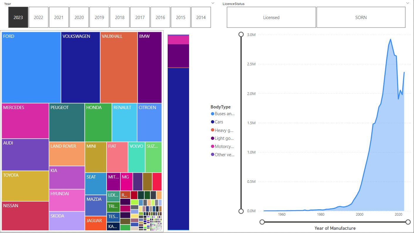
The top are filters. The left-most graphics shows you the relative size of each Make. The middle stacked bar gives the breakdown by vehicle type (annoyingly there’s no way I found to manually move the legend so it’s more visible). The right-most graphic is the count by year of manufacture, with zoom sliders.
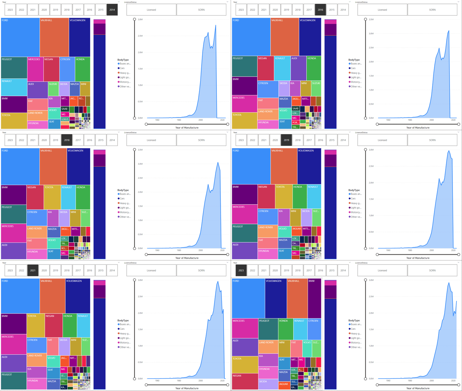
Here’s a GIF showing how the charts change with different years selected. Some observations:
- Ford loses market share
- VW overtakes Vauxhall as #2
- The percentage of motorcycles and light goods vehicles increases
- The year of manufacture expands right as new years start existing (obviously, but fun to see!)
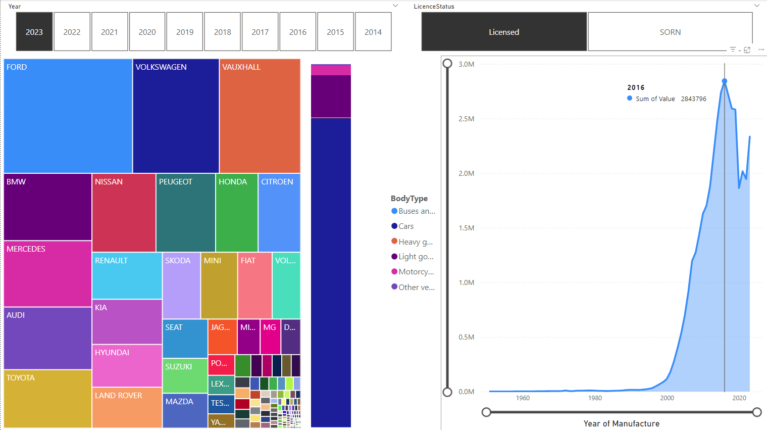
Comparing Licensed:
to SORN:
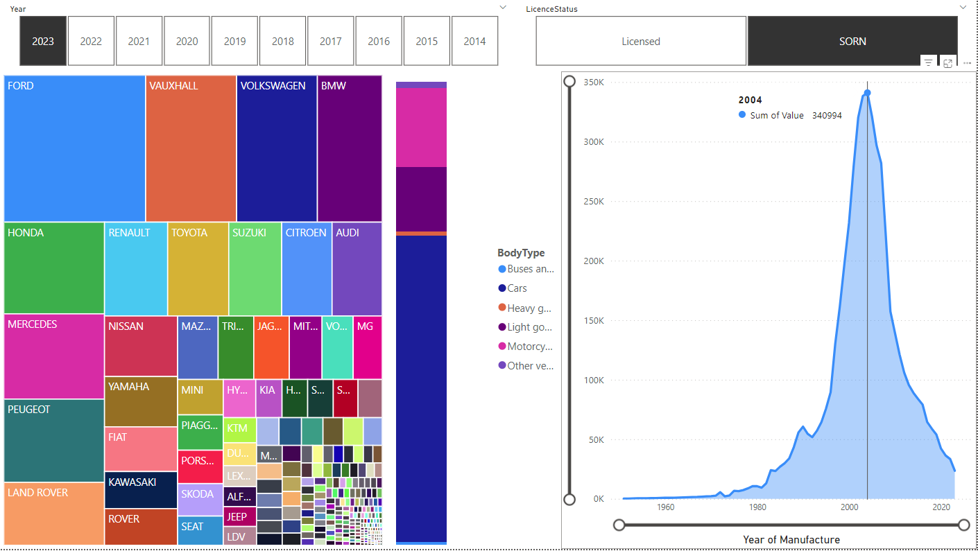
Unsurprisingly, SORN vehicles were typically manufactured before Licensed ones, with the peak at 2004 vs 2016. Far more motorcycles are SORN, too.
You can pick one model and the other charts update too:
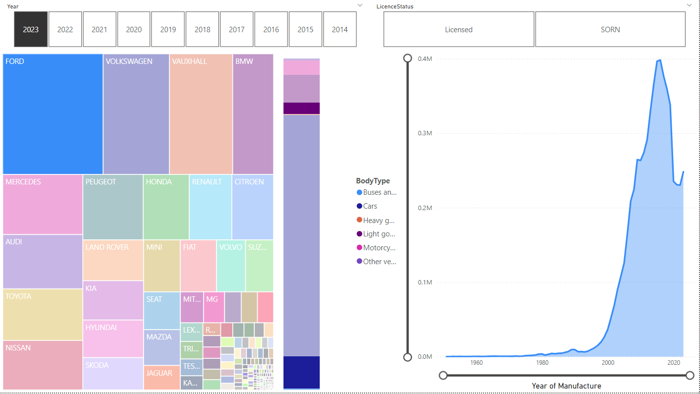
Ford looks to be about 3/4 cars and 1/4 lights goods vehicles. The shape of the right graph is similar to all vehicles, although of course the peak is lower.
Page 2: Make/Model trends
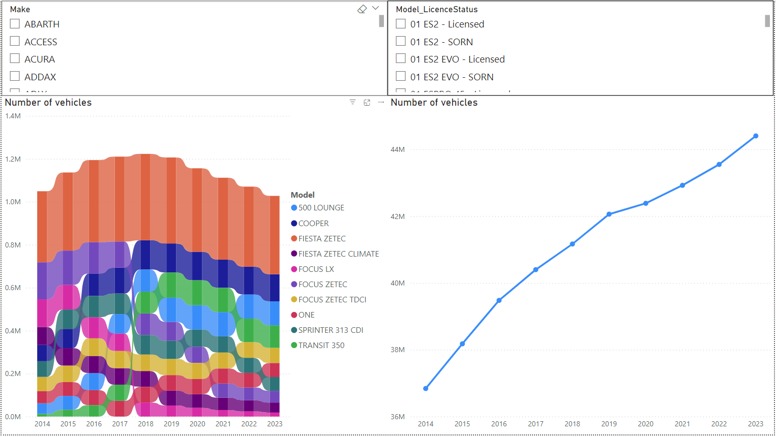
The filters at the top are make and model. The left graphic shows how the top 10 models have changed over time (the Mini Cooper has become a lot more popular, and the Focuses have dropped significantly); the right graphic shows the total number (fairly stead increase, with a slowdown during COVID).
This changes with the filters, e.g. Triumph:
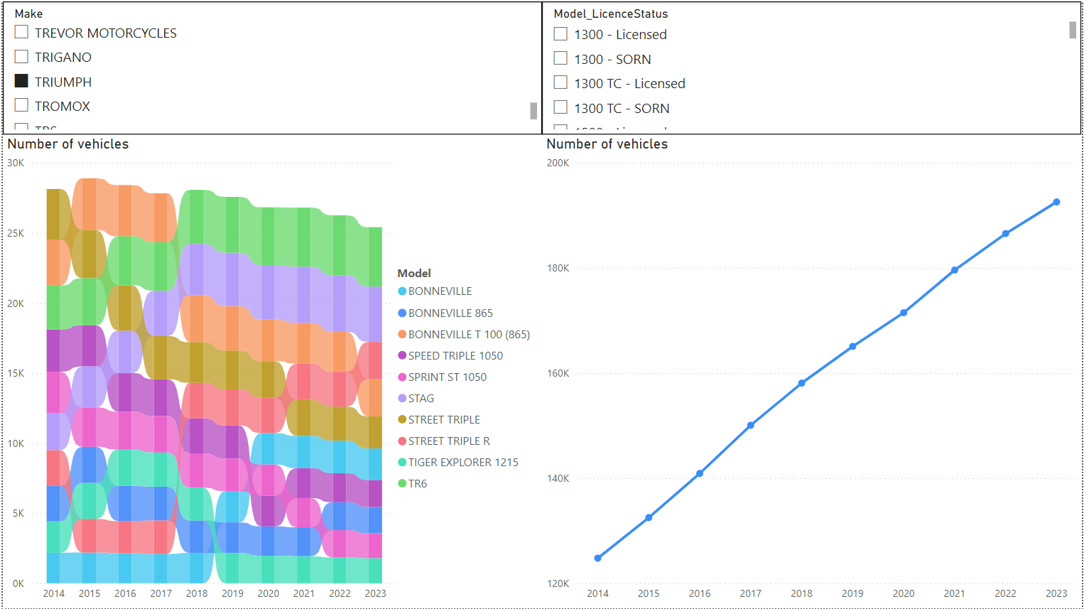
Note the three most-Licensed Triumph are the TR6 (classic car), the Stag (classic car), and then the Street Triple R (modern motorbike).
I also made a variation, where the right graph is split by model. This is where the Model_LicenseStatus column comes in (it’s the “Legend” for the chart). For example, looking at Aston Martins, and some select DB models:
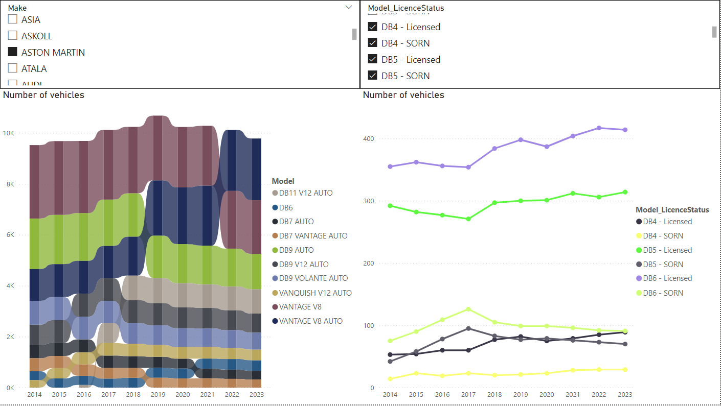
Now we can compare different models and their number of Licensed and SORN over time. Looking at these trends, soon there may be more Licensed DB4s than SORN DB5s.
Page 3: Licensed-to-SORN ratio
The main purpose of this page is to show the Licensed to SORN ratio. This used the pivoted Query:
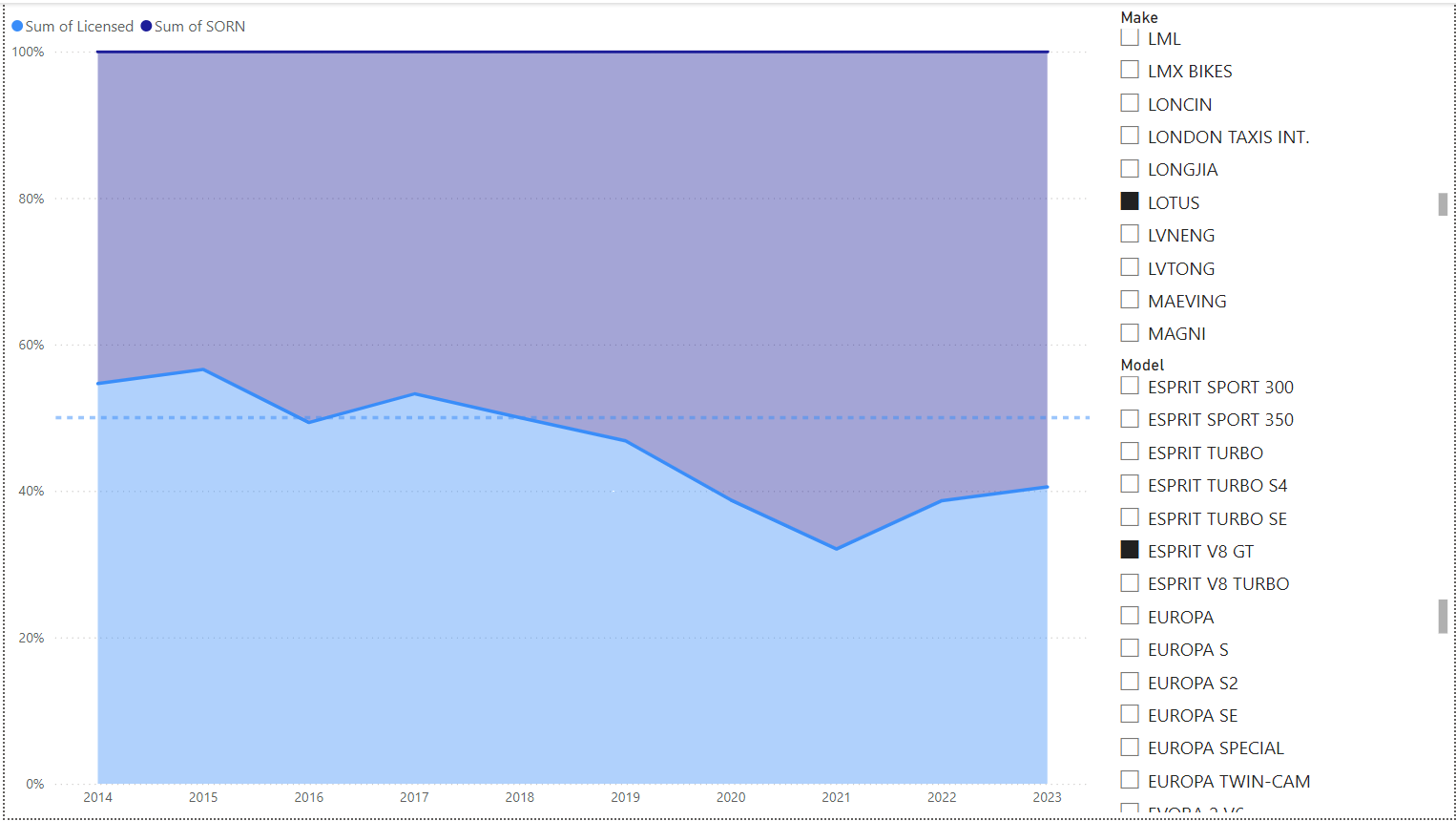
Again, filters, this time on the right. Example shown is the Lotus Esprit V8 GT. A 100% stacked area graph shows the split between Licensed and SORN over time, with a dotted 50% line. You can see it was above this line in 2015, dropped below in 2016, above again in 2017, but has been below since.
Hints and tips
- The year on the x-axis had a tendency to go from high to low (i.e. 2023 to 2014). To fix this, press the three dots in the top-right of a plot, the Sort Axis, Year, Sort ascending.
- Make sure the Edit interactions are correctly configured from the Format menu for all items (especially Slicers) to ensure they work properly.
- When importing data, it always wants to guess the data types. This is often wrong, so I typically delete this step.
- Give yourself time. Loading and transforming the data in Power BI is slow.
Conclusion
This was a quick dashboard I threw together in a couple of hours to more easily visualise the data. If I was in the used car market, for example, I could painlessly see vehicle trends over time, such as make popularity, compare models within a make, monitor Licensed vs SORN patterns, etc. When a new dataset is released, all I’d have to do is replace the CSV, and the dashboard would automatically update. If this was being productionised I’d make several improvements, such as adding some more useful plots, building a new Query where the data is grouped by GenModel, and ironing out the few kinks that appear when using the dashboard live (luckily for you you can’t see them in static images!)
