Customer Analysis Part IV: Brand Analytics and Elasticity
This is part four of a multi-part series. Part one, segmentation and clustering, can be found here. Part two, classification, is here. Part 3, purchase analytics, here.
As before, the code below is simply snippets. The full code for this section can be found in the repo: https://github.com/jamesdeluk/data-science/blob/main/Projects/customer-analysis/ca4-brands.ipynb
Intro
At last we reach out final part in this series. Here we’re looking at brands, quantities, and elasticities.
Data
The first thing is to reimport the data, the same as part three. I also created NumPy array of prices I’ll use later for testing and simulation. We know the prices in our dataset range from 1.10 to 2.80; for nice numbers, I picked 1.00 to 3.00, in 0.01 intervals:
price_range = np.arange(1.00, 3.01, 0.01)
Plots
As usual, I started with some charts. For quantity sold per brand, I made a DataFrame for each brand, filtering by the brand, then summing the quantity. I then combined the DataFrames, and plotted:
df_brand1_quantity = pd.DataFrame(df[df['Brand_1']==1][['Quantity']].sum()).rename(columns={0:'Brand 1'})
df_brands_quantity = pd.concat([df_brand1_quantity, df_brand2_quantity, df_brand3_quantity, df_brand4_quantity, df_brand5_quantity], axis=1)
sns.barplot(df_brands_quantity, palette="Set1")
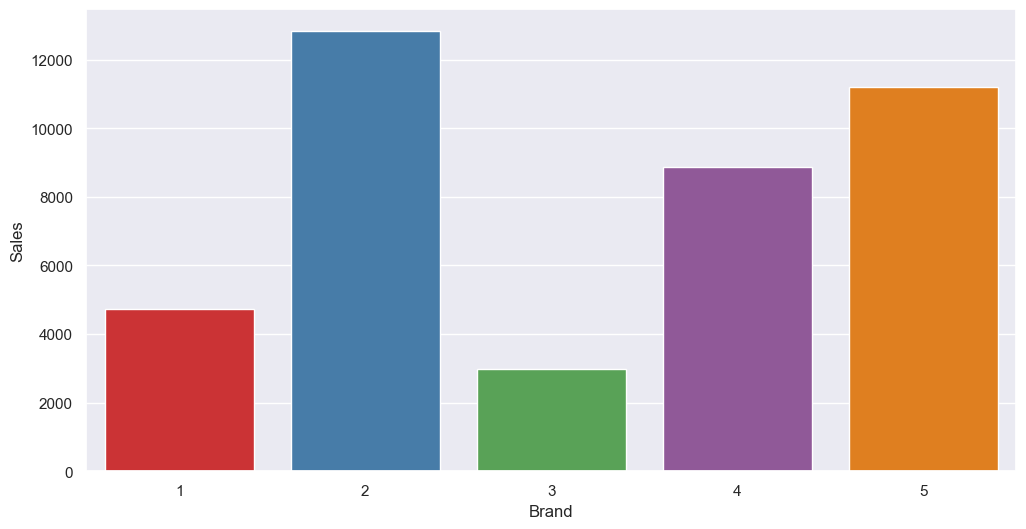
Brand 2 is our top seller, with brand 5 about 20% behind, and brand 4 about 20% down on that. Brands 1 and 3 are way behind. This matches what we saw earlier based on customers and clusters.
What about revenue?
df_revenue_by_brand = df_brands[['Revenue_Brand_1','Revenue_Brand_2','Revenue_Brand_3','Revenue_Brand_4','Revenue_Brand_5']].sum()
sns.barplot(df_revenue_by_brand)
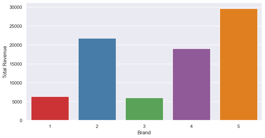
A slight change now; as brand 5 is much more expensive than brand 2, it brings in more revenue, and now takes the top spot. Brand 4 is still in third, with 1 and 2 lagging behind.
I was also curious about sales at each price point. Similar to above, for each brand, I filtered by the brand, this time grouped by the selling price, then took the sum of the quantity sold:
df_brand1_quantity_by_price = pd.DataFrame(df_brands[df_brands['Brand_1']==1].groupby('Price_1')['Quantity'].sum()).rename(columns={'Quantity':'Brand 1'})
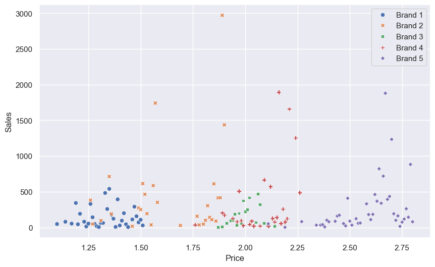
All plotted on a single graph:
And one brand per graph, to see the individual distributions a bit more clearly (note each plot has different scales):
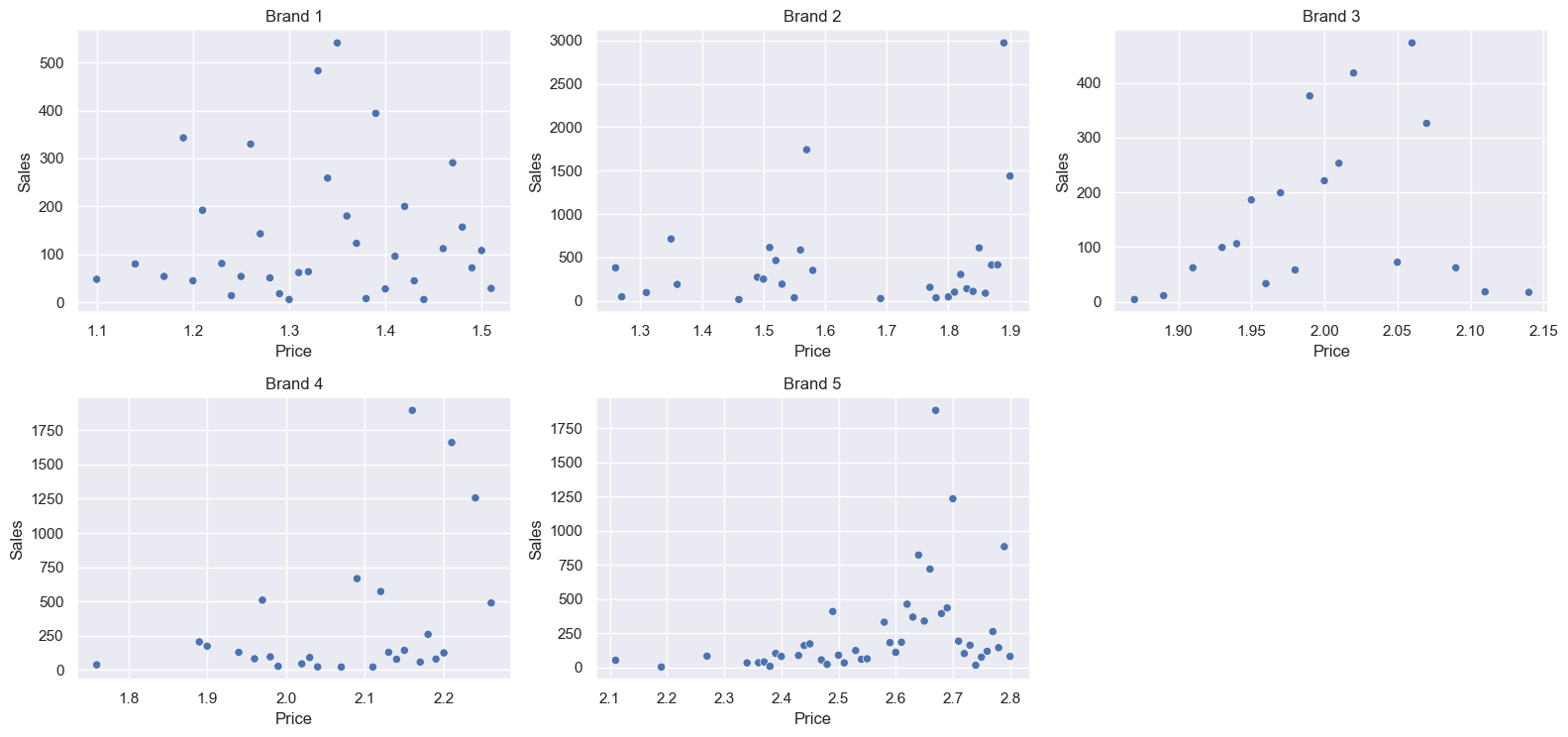
All brands have a wide range of selling prices. We’d think a higher price would result in lower sales, but that doesn’t look to be the case. Brand 3 in particular looks to have a slight positive correlation between price and quantity, although drops off again at high prices. Brand 1 appears to have no real correlation. Brands 2 has a standout high sales period, at almost its maximum price - perhaps there was a supply shortage, or an excellent marketing campaign. Brands 4 and 5 also experience their strongest sales at almost their highest price, again suggesting external factors, such as promotions.
I was also curious to do a cumulative sales line graph, this time using .cumsum():
df_brand1_quantity_by_price_cum = pd.DataFrame(df[df['Brand_1']==1].groupby('Price_1')['Quantity'].sum().cumsum()).rename(columns={'Quantity':'Brand_1_Quantity'})
df_brands_quantity_by_price_cum = pd.DataFrame(np.arange(1.1, 2.81, 0.01)).rename(columns={0:'Price'}).set_index('Price')
df_brands_quantity_by_price_cum = pd.concat([df_brands_quantity_by_price_cum, df_brand1_quantity_by_price_cum, df_brand2_quantity_by_price_cum, df_brand3_quantity_by_price_cum, df_brand4_quantity_by_price_cum, df_brand5_quantity_by_price_cum], axis=1)
sns.lineplot(df_brands_quantity_by_price_cum)
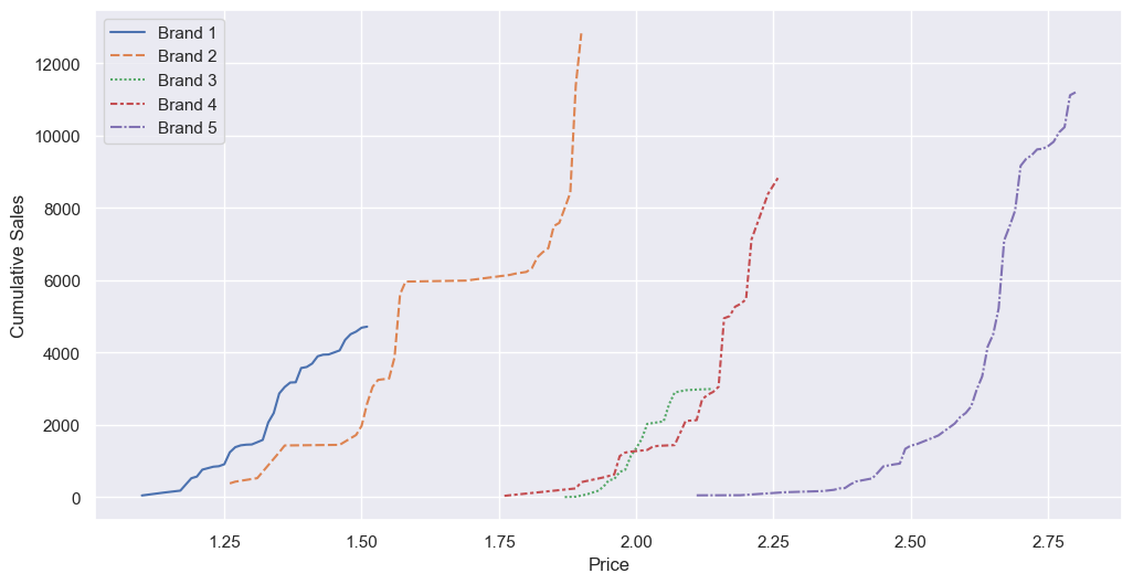
Brands 2, 3, and 5 have more exponential graphs, whereas brands 1 and 4 are more linear. Again, this is weird - if more sold at lower prices, as is typical for most products, we’d expect a logarithmic curve. Brand 2 also has a dead zone between approximately 1.60 and 1.80, although that’s because the brand was never sold at that price.
Correlations
Let’s see if correlation heatmaps give us anything. First, sales vs price:
sales_cols = [f'Brand_{i}' for i in range(1, 6)]
price_cols = [f'Price_{i}' for i in range(1, 6)]

correlation_matrix_sales_price = df[sales_cols + price_cols].corr()
sns.heatmap(correlation_matrix_sales_price.loc[sales_cols, price_cols], annot=True, cmap='coolwarm', cbar=None)
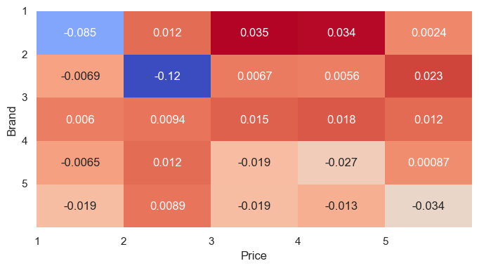
This corroborates the scatter plots. All the values are very small, suggesting a low correlation, and hence factors besides price drive the sales. A negative correlation means that sales decrease as price increases (and vice versa). Brands 1 and 2 are most sensitive to their own prices, so lower prices result in more sales, followed by brands 5 then 4. If this is good for the store depends on the profit margins. Interestingly, as brand 3’s price increases, the number of sales also increases - so I’d suggest the client increase the price and monitor the sales. Brand 1 has a positive correlation with the prices for brands 3 and 4, meaning that more of brand 1 sells as brands 3 and 4 increase their prices - suggesting it might act as a substitute purchase.
And what about sales vs promotion?
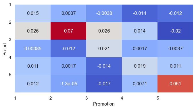
Again, all values are very small. There are a couple of standouts - both brands 2 and 5 experience more sales when on promotion compared to the others. Brand 2 experiences the largest decrease in sales when brand 5 is on promotion, suggesting they’re mildly substitute goods (although this could simply be because they’re both the top-selling brands). Halo effects are noteworthy - when brand 1 is on promotion, all brands experience increased sales. This happens for several of the promotions - I suppose it’s difficult to promote a specific brand of a product without increasing demand for the entire market. For a seller of all brands, this is good; for an individual brand, this may not be so good, as it helps competitors.
Elasticity of price
Now for some economics. Elasticity is the relationship between price and quantity sold. A value under 1 is inelastic, a value more than 1 is elastic. For example, if you decrease price by 5%, and sales increase by 10%, then it is elastic (10/5=2) - and the company makes more revenue, and hopefully, more profit! Alternatively, increasing the price by 5% would lead to a drop in sales of 10%… Which is probably less good.
First I calculated the overall elasticity, regardless of brand or cluster. The code:
y = df['Incidence']
X_mean = pd.DataFrame((df['Price_1']+df['Price_2']+df['Price_3']+df['Price_4']+df['Price_5'])/5).rename(columns={0:'Mean_Price'})
lr = LogisticRegression(solver='sag')
lr.fit(X_mean,y)

P = lr.predict_proba(pd.DataFrame(price_range).rename(columns={0:'Mean_Price'}))
pe = lr.coef_[0,0] * price_range * (1-P[:,1])
I’m using a logistic regression. Technically, a logistic regressor models the log-odds of choosing a target as a linear combination of the inputs. Put more simply, it calculates the probability of a certain combination of inputs resulting in a particular output. For training, the output/target, y, is whether there was a purchase, and for the inputs I’ve used the mean price of the different brands. I used the price_range created earlier and predicted the probability, based on the model, for each of the price points. pe is a NumPy ndarray, giving the price elasticities at each price point, using an elasticty formula. lr.coef_[0,0] is the coefficient of the linear regression model, which represents the slope of the relationship between price and the log odds of purchase - in this case, it’s just a single value in a 1x1 ndarray. P is also an ndarray, with two values for each price point: the probability of the negative (no sale), and of the positive (a sale), respectively. I could use P[no sale] directly, but based on the elasticity formula, and to keep the focus on what we care about - that is, a sale - the norm is to use 1-P[sale].
Plotting the probability of a sale (P[:,1]):
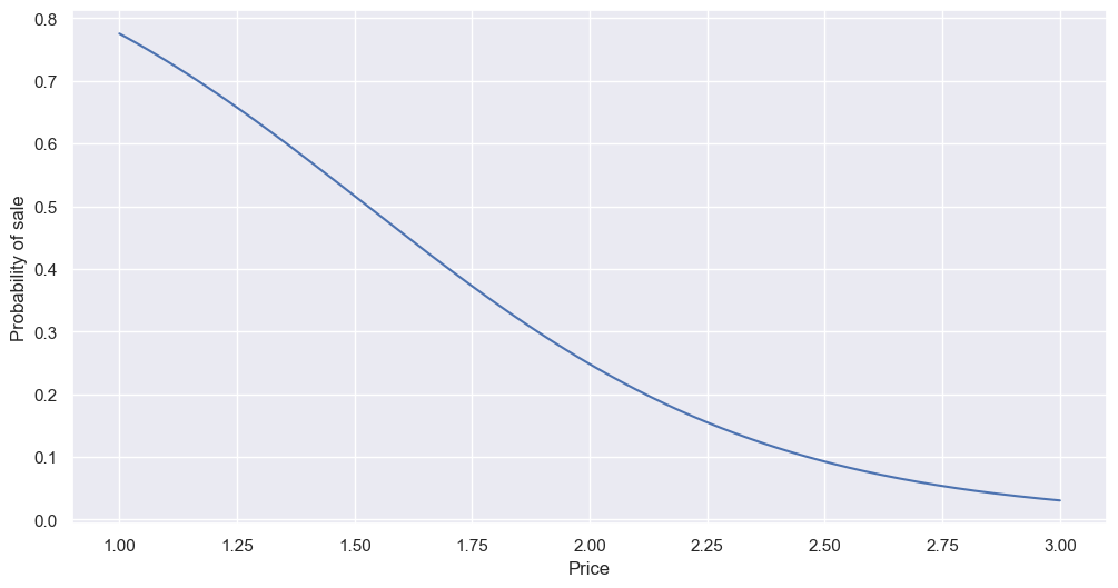
As expected, the higher the price, the lower the probability of a sale - although even at the cheapest price, a sale is not guarantee.
And the price elasticity (pe):
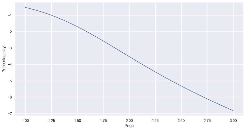
The relationship is fairly linear. We can read the values off the chart, or, if we want more precise values, we can check the table. For example, if we increased the price from 2.00 to 2.10:
df_pe_results[df_pe_results['Price']==2.00]
We get -3.53. So, if we change the price by +5% (2.00*1.05=2.10), then the demand (i.e. sales quantity) will change by (-3.53*5=) -17.65 - that is, a drop of almost 18%. So perhaps let’s not increase the price. However, going from 1.00 to 1.05 (-0.53*5) results in only a 2.65% drop in sales, which might make the price increase worthwhile - remember, an elasticity of under ±1 is elastic, and typically it’s good practise to increase price until the elasticity hits ±1.
By cluster, by brand
That’s taking the mean - I can do better! For example, we have four customer clusters, and five brands. I repeated the above basic code, but looped through, each time filtering. First, the clusters:
for cluster in [1,2,3,4]:
    df_c = df[df['Cluster'] == cluster]
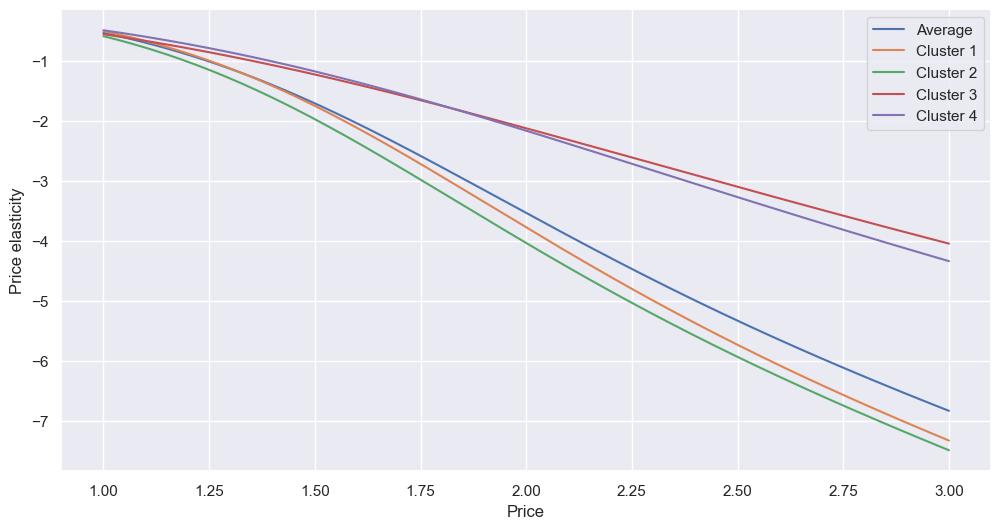
All follow the same basic trend, although clusters 3 and 4 - those are, if you remember, the groups with more successful careers and higher incomes - are far less price-sensitive. In this case, a price increase of 2.00 to 2.10 would result in the average cluster 3 customer’s only buying (-2.11*5=) -10.55% less. Or, flip it on its head - if we give cluster 1 or 2 a discount, the increase in sales will be far greater than the same discount offered to clusters 3 and 4.
Next, brands:
for brand in [1,2,3,4,5]:
    y_b = df[f'Brand_{brand}']
    X_b = pd.DataFrame(df[f'Price_{brand}'])
This gives:
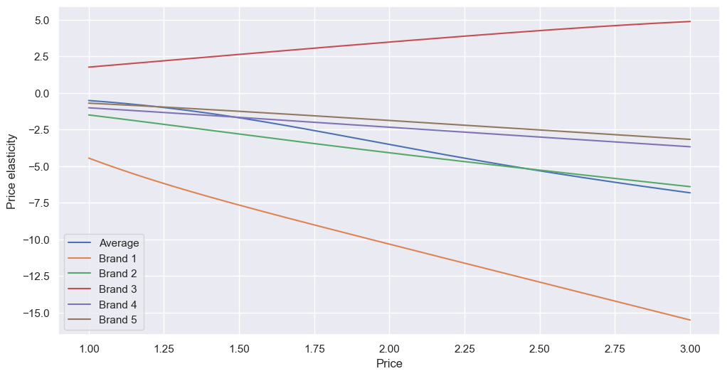
Most have negative elasticity, as expected. Brand 1 has the steepest line, with the lowest intercept, meaning it is the most elastic. If the client were to offer a discount, the greatest boost in sales would be if it was for brand 1. All others have shallower gradients than the mean, meaning they’re less elastic than our example above. As we saw earlier, brand 3 is abnormal, with positive elasticity. In theory, increasing the price from 2.00 to 2.10 would increase demand by (3.47*5=) 17.35% - I’d suggest the client experiment with this.
This brings us to an important consideration about the validity of these predictions. I’ve modelled for a large price range - 1.00 to 3.00 - whereas the data we have for each brand exists in more condensed price ranges. Predictions outside of these ranges may not be reliable, and should be treated with caution. To visualise these ranges, I created horizontal boxplots, with the x-axis the testing price range:
sns.boxplot(data=df[['Price_5','Price_4','Price_3','Price_2','Price_1']], whis=[0,100], width=0.5, orient='h', palette='Set1')
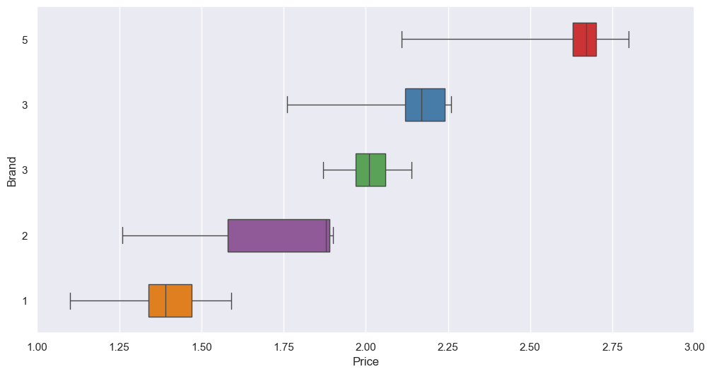
Brand 3, for example, has real data for prices between 1.87 and 2.14. Increasing the price from 2.00 to 2.10 is within this range, so the elasticity may be trustworthy; however, if we keep increasing it to 2.20, outside of the range of known data and into extrapolation territory, the impact on demand may not be as we predict. For example, I very much doubt we can increase the price to 3.00 and keep seeing rising sales. It is, however, something to experiment with.
Moving on. I did go a step further and calculate the price elasticity of each brand for each cluster, but the graph got a bit messy:
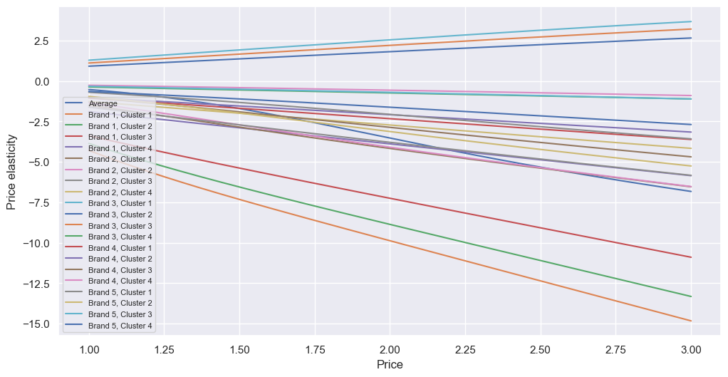
It’s mostly a combination of the two above, with brand 3 being at the top (positive elasticity) and brand 1 at the bottom (most negative elasticity), and, within each brand, cluster 1 being more elastic, and cluster 4 being least elastic. However, the data table behind this plot could be useful, as we can determine how we expect a price change for a specific brand to influence the sales for a specific cluster. In fact, I made a little piece of code to see how often the price is inelastic (<±1, best done by taking the absolute value):
inelastics = pd.DataFrame(index=price_range)
for column in df_pe_results.columns[1:]:
    temp_df = df_pe_results[['Price',column]].set_index('Price')
    results = temp_df[abs(temp_df[column] <= 1)]
    inelastics = inelastics.join(results)
Of the various variations, 64 of the 69 have inelastic results:
inelastics.count()[inelastics.count()>0].count()
However, looking at the graph above, these are all at low prices, possibly outside of the actual ranges. For the actual values:
inelastics_filtered = inelastics[~inelastics.isnull().all(axis=1)]
None of them are elastic at prices above 1.12, which, from the boxplots above, we know can only apply for brand 1. Filtering:
inelastics_filtered.loc[:,inelastics_filtered.columns.str.contains('Brand_1')]
We can see that, under any promotion state or cluster, brand 1 is elastic under a price of 1.12, with it being more elastic with cluster 1, and the highest elasticity when on promotion. However, given brand 1 can sell for as much as 1.60, reducing it this far to benefit from elasticity may be unwise.
Promotions
What are the effects of promotions on elasticity? Similar as before, I used a logistic regression, but this time with two features for X - the mean price, as before, but also the “mean” promotion (remember, promotion is a binary, 1 for with promotion, 0 for no promotion):
X_promo_mean = X_mean.copy()
X_promo_mean['Mean_Promotion'] = (df['Promotion_1']+df['Promotion_2']+df['Promotion_3']+df['Promotion_4']+df['Promotion_5'])/5
lr_promo = LogisticRegression(solver='sag')
lr_promo.fit(X_promo_mean,y)
Now there are two coefficients, one for price (similar to the one before, but slightly different), and one for promotion. There are two values for promotion, 1 and 0, so I looped through both when doing the rest of the modelling:
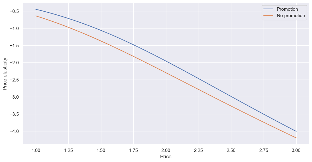
It seems having a promotion makes sales less elastic overall; in other words, it makes price less sensitive. If a promotion is active, demand is less like to drop with a price change than without one. Especially at high price points, if the client wants to increase prices, it’s worth having a promotion to at least partially counteract the loss in demand. Back to our 2.00 to 2.10 example (5% increase in price), the impact of promotion vs no promotion is a drop in sales of (-1.96*5=) 9.8% instead of (-2.30*5=) 11.5%, a difference of 1.7%.
I did a breakdown by brand, by combining some of the above code loops:
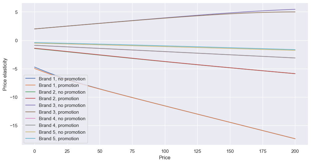
When looking at individual brands instead of the mean, the overall effect of the promotion looks to reduce, so perhaps promotions are not as worthwhile as we’d thought.
Cross-brand elasticity
Disclaimer: The basic economic principle is of cross elasticity is simple - the percentage change in demand for product A divided by the percentage change in price for product B - but modelling it is more complicated. I found multiple methods for calculating cross elasticity of demand, but none clearly explained the workings behind the method, and they all gave different results, some dramatically so. I am still working to validate which method is best. If you have an insight, please do let me know - my contact details are in the footer.
Anyway, similar to above, I used logistic regression to do this, but with Brand now as the target. The coefficients give insight into how the change in the price of one brand will affect the price of others. The code:
df_brand = df[df['Incidence'] == 1].copy()
X_brand = df_brand[['Price_1', 'Price_2', 'Price_3', 'Price_4', 'Price_5']]
y_brand = df_brand['Brand']
lr_brand = LogisticRegression(solver='sag')
lr_brand.fit(X_brand,y_brand)
lr_brand.coef_
And a heatmap of the resulting coefficients:
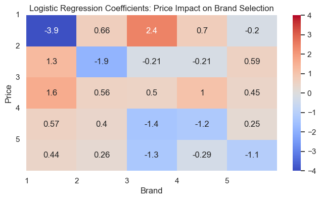
The first thing to look at is the diagonals, how the price of the brand affects the probability of choosing it. Apart from our abnormal brand 3, the rest are as expected - as the price increases, the probability of a sale for that brand decreases. This is most notable for brand 1, where an increase in price of 1 results in a 3.9 reduction in the log-odds of choosing that brand. Brand 5 is the least price sensitive, which we also found from the elasticity graphs above, as shown by it being the most shallow.
On the whole, the values on the diagonal are greater than those not on it, suggesting the price of the brand itself has the highest influence on the chance a customer will select that brand, However, there are also some notable cross-brand effects. For example, the price of brand 3 has a marked impact on the sales of brand 1, suggesting they’re strong substitutes; if brand 3 were to increase in price, the sales of brand 1 may increase substantially. Going back to our previous example, if we were to increase the price of brand 3 from 2.00 to 2.10, that would result in a (2.4/(1/0.1)=) 0.24 decrease in the log-odds. This gives us an odds ratio of (e^0.24=) ~1.27. We know from the original data that brand 1 was chosen 1350 times out of a total of 14638 sales (ignoring quantity), which gives us an original probability of ~9%. This makes the odds of choosing brand 1 (0.09/(1-0.09)=) ~0.1. This we multiple by the odds ratio above, giving the new odds of ~0.127. Converting this back to probability (0.127/(1+0.127)) gives us ~0.11. Originally we had ~0.9, so increasing the price of brand 3 by 5% from 2.00 to 2.10 results in an increase in demand for brand 1 of (0.11-0.09) ~2%, which is a ~25% relative increase. I made a calculator for this:
brand_changed = 3
brand_impacted = 1
price_old = 2.00
price_increase_percent = 5

price_new = price_old * ((100 + price_increase_percent) / 100)
price_diff = price_new - price_old
price_diff_units = 1 / price_diff
coef = bc_coef.iloc[brand_changed-1 , brand_impacted-1]
log_odds_diff = coef / price_diff_units
odds_ratio = np.exp(log_odds_diff)
original_quantity = df[f'Brand_{brand_impacted}'].sum()
total_quantity = df[df['Incidence']==1]['Brand'].count()
original_probability = original_quantity / total_quantity
original_odds = original_probability / (1 - original_probability)
new_odds_ratio = odds_ratio * original_odds
new_probability = new_odds_ratio / (1 + new_odds_ratio)
probability_delta = (new_probability - original_probability) * 100
relative_delta = probability_delta / original_probability

print(f'{round(probability_delta,2)}% ({round(relative_delta,2)}% relative) increased likelihood of buying brand {brand_impacted} if brand {brand_changed} increases price by {price_increase_percent}% from {price_old} to {price_new}')
Another curious observation from the heatmap is how decreasing the price of brand 4 may also decrease the demand for brand 5. Perhaps, given brand 4 appears to be the market leader (based on our data), a drop in brand 4 may signal a lack of trust in premium brands of that product type, hence leading to an equal magnitude increase in brand 3. However, decreasing the price of brand 5 looks to increase the demand for brand 4, and vice versa. We’ve previously found that cluster 4, those with the highest incomes, favour the cheaper brand 4 over the more expensive brand 5. Is there anything we can do to shift this, such as through changing the price of brand 4? The heatmap above suggests an overall negative link, but this might be different for cluster 4.
First I extracted the cluster 4 data and the relevant columns:
X_c4 = df_brand[df_brand['Cluster']==4][['Price_1','Price_2','Price_3','Price_4','Price_5']].copy()
As mentioned in the disclaimer at the top of this section, I tested multiple ways of doing this. Fundamentally, the price of brand 4 is replaced with one of those in the price range, and then the logistic regression model would predict the probability of selecting brand 5. One method involved using the mean of all the other brands:
X_b4xb5_1 = pd.DataFrame(index=np.arange(price_range.size))
X_b4xb5_1['Price_1'] = X_c4['Price_1'].mean()
X_b4xb5_1['Price_2'] = X_c4['Price_2'].mean()
X_b4xb5_1['Price_3'] = X_c4['Price_3'].mean()
X_b4xb5_1['Price_4'] = price_range
X_b4xb5_1['Price_5'] = X_c4['Price_5'].mean()
P_b4xb5_1 = lr_brand.predict_proba(X_b4xb5_1)[:][:,3]
pe_b4xb5_1 = -lr_brand.coef_[4,4] * price_range * P_b4xb5_1
This method counterintuitively selects the probability of brand 4 ([:,3]) and uses the negative of the coefficient for brand 5 price 5 ([4,4]). Yet this method was from a (theoretically) more reliable source.
Another method was similar, but instead took the probability of brand 5 ([[:,4]), uses the coefficient for price 4 and brand 5, and scales by the inverse probability:
P_b4xb5_2 = lr_brand.predict_proba(X_b4xb5_1)[:][:,4]
pe_b4xb5_2 = lr_brand.coef_[4,3] * price_range * P_b4xb5_2 * (1-P_b4xb5_2)
The third method also used averages, but looped through the price range to do a prediction for each value. The same price elasticity formula as method two, but without the scaling:
X_b4xb5_3 = pd.DataFrame(index=np.arange(price_range.size))
X_b4xb5_3['Price_1'] = X_c4['Price_1'].mean()
X_b4xb5_3['Price_2'] = X_c4['Price_2'].mean()
X_b4xb5_3['Price_3'] = X_c4['Price_3'].mean()
X_b4xb5_3['Price_4'] = X_c4['Price_4'].mean()
X_b4xb5_3['Price_5'] = X_c4['Price_5'].mean()
for price in price_range:
    X_b4xb5_3['Price_4'] = price
    P_b4xb5_3 = lr_brand.predict_proba(X_b4xb5_3)[:,4]
    xed_3 = lr_brand.coef_[4,3] * price * P_b4xb5_3
A final method used the actual rows of data instead of the means; otherwise it was the same:
X_b4xb5_4 = X_c4.copy()
for price in price_range:
    X_b4xb5_4['Price_4'] = price
    P_b4xb5_4 = lr_brand.predict_proba(X_b4xb5_4)[:,4]
    xed_4 = lr_brand.coef_[4,3] * price * P_b4xb5_4
Plotted, this gives:
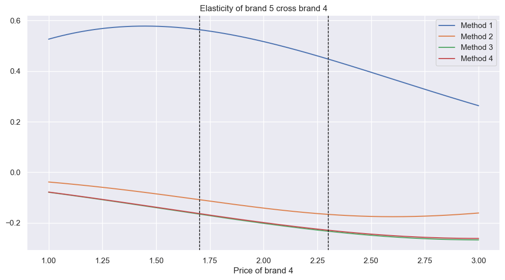
The vertical black dotted lines represent the limits of the real price range for brand 4. How to interpret this plot? Method 1 is clearly the outlier; it’s the only one suggesting positive elasticity, likely as it uses the price-5-brand-5 coefficient. It’s also the most elastic. The others are relatively close, with methods 3 and 4 almost identical, and showing minimal elasticity.
What to do about this? Well, as I said, I will continue to investigate to determine the best method. If this were my store, I would test this in reality by adjusting the price of brand 4 and seeing how the demand for brand 5 changes, which would give real insight into which line is most accurate.
Elasticity of quantity
So far we’ve only considered the price and the brand for elasticity. However, what if we want to know how many of a type of item they’ll buy?
For each sale, I needed the total price paid. Given the Brand_ columns are binary, and only one will be a 1 at any one time, we can get the price through multiplication. I’ll also look at promotions later, so I got that too:
df_quantity = df[df['Incidence'] == 1].copy()
df_quantity['Price_Incidence'] = (df_quantity['Brand_1']*df_quantity['Price_1']+df_quantity['Brand_2']*df_quantity['Price_2']+df_quantity['Brand_3']*df_quantity['Price_3']+df_quantity['Brand_4']*df_quantity['Price_4']+df_quantity['Brand_5']*df_quantity['Price_5'])
df_quantity['Promotion_Incidence'] = (df_quantity['Brand_1']*df_quantity['Promotion_1']+df_quantity['Brand_2']*df_quantity['Promotion_2']+df_quantity['Brand_3']*df_quantity['Promotion_3']+df_quantity['Brand_4']*df_quantity['Promotion_4']+df_quantity['Brand_5']*df_quantity['Promotion_5'])
X is these features, whereas y is the quantity purchased. This time I needed to use a linear regression, as the result with be a continuous variable, not categorical/a probability:
X_quantity = df_quantity[['Price_Incidence', 'Promotion_Incidence']]
y_quantity = df_quantity['Quantity']
lr_quantity = LinearRegression()
lr_quantity.fit(X_quantity, y_quantity)
Now to create the DataFrame for the data to predict on, setting the price feature to our price range, and promotion to either 1 or 0, then predict using our model. We have a new equation to calculate the price elasticity:
df_quantity_promo = pd.DataFrame()
df_quantity_promo['Price_Incidence'] = price_range
df_quantity_promo['Promotion_Incidence'] = 1
pred_quantity_promo = lr_quantity.predict(df_quantity_promo)
pe_quantity_promo = lr_quantity.coef_[0] * price_range / pred_quantity_promo
And plotted:
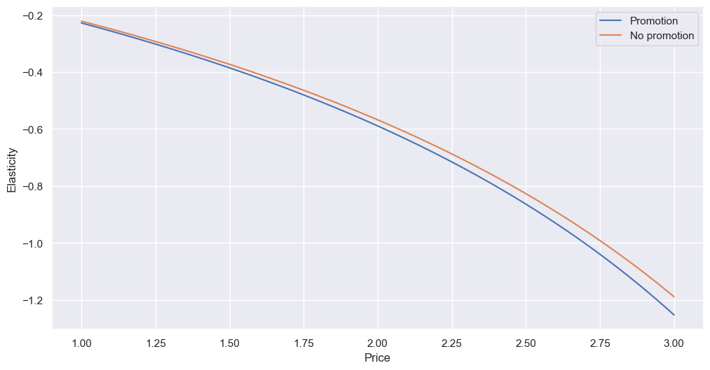
When there is a promotion, the quantity becomes slightly more elastic. Otherwise, the shape of the curve looks pretty similar to the others we found for price vs brand. However, unlike price vs brand, we can see customers are inelastic for prices up to almost 2.75, which covers all our brands (well, brand 5 is slightly outside this range at its top price); in other words, when customers buy an item of any brand, the price doesn’t really impact how many of it they buy.
I did this for each cluster:
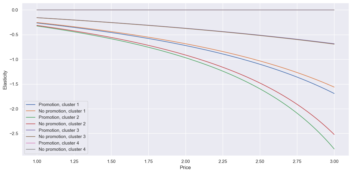
The line definitely splays out more. Cluster 2 (our below-average group) are most elastic overall, with the biggest difference between promotion and not - if there was a price reduction (resulting in more sales), especially on the more expensive brands, it’s wise to promote it to take advantage of the increased elasticity. It’s hard to tell, but cluster 4, our older well-off men, appear to have almost zero elasticity of quantity - however, this could be because they only make up ~5% of our data, so it would be good to re-test once we get more data.
Conclusion
What are the main insights from this analysis?
- Brand 2, followed by 5 then 4, are the top sellers, and brand 5, followed by 2 and 4, generate the most revenue. Brands 1 and 3 are laggards, as we’d previously found. I’d want to see the profit margins to get a clearer picture of overall performance.
- Brand 3 really is interesting. It appears to have positive elasticity, suggesting a higher price will cause more demand. This is definitely something worth testing, especially as it has the smallest range of prices so far. If this hypothesis doesn’t hold, however, I would still suggest looking into removing it altogether, given its low sales and revenue generating ability. Perhaps undertake user surveys to gauge interest, or trial removals (”sorry, out of stock”) and see if there is feedback.
- Brand 2 is the most price-sensitive and responds strongly to promotions, so a price reduction with a promotion could significantly boost sales.
- Clusters 1 and 2 are highly elastic, so are good candidates for targeted discounts. We know from part 3 they particularly like brand 2.
- Cross elasticity is confusing.
And combining this with what we’ve alreaady found:
- We have four clusters:
- Our largest, cluster 1, the averages, bring in the most revenue overall. They favour brands 2 and 5, and their demand is quite elastic. They typically buy the least number of items per visit.
- Cluster 2 are our below averages - the youngest, least educated, lowest employed, lowest income, in small cities. They’re the most likely to be married, and to be female. They behave more consistently than other groups, buy more items on average when they do buy, and strongly favour brand 2. They’re the most price sensitive (most elastic) and they’re most influenced by promotions. They are the second biggest group, and a similar size to cluster 3.
- Cluster 3 are the above averages - the inverse demographics of cluster 2. They favour brand 5, followed by brand 4. They visit the store more than any other cluster per person, and are less elastic than the average customer. However, their intra-group behaviour is the most diverse.
- Cluster 4, old successful men, make up only ~5% of our customers, but bring in the most revenue per person. They have a mid-range number of store visits per person, but they buy almost every visit, and buy a lot when they do. They strongly favour brand 4, and they’re the least elastic, almost unaffected by promotions.
- We have three top customers who need to be investigated.
- There are no clear seasonal trends.
Thanks for reading! Again, if you have any comments or questions, please do get in touch - contact details below.
