Customer Analysis Part III: Purchase Analytics
This is part three of a multi-part series. Part one, segmentation and clustering, can be found here. Part two, classification, is here.
This post contains incomplete code snippets. The full code for this section can be found in the repo: https://github.com/jamesdeluk/data-science/blob/main/Projects/customer-analysis/ca3-purchases.ipynb
UPDATE 2024-11-26: During part four I noticed I had made a mistake in the Product Analysis section - I’d accidentally used a subset of the dataset when doing an analysis. Given part four is exclusively about product and brand analysis, I have moved the now-corrected section to that post.
Intro
Welcome to part three! Now I’ll integrate some purchase data. I have a CSV where each record represents a time a customer visited a store. Each record has the unique visit ID, along with the customer ID, which aligns with the customer ID we’ve been playing around with in parts one and two.
Exploring the data
The first thing is to merge these two datasets (renaming the Customer ID column to match the style of the others, using underscores instead of spaces), so we can link the visit to the cluster:
df_raw = purchases.merge(customers, left_on='Customer ID', right_index=True).rename(columns={'Customer ID':'Customer_ID'})
What does this look like? I’ll ignore the columns we don’t care about, those we used for clustering, such as Age and Sex:
| ID | Day | Incidence | Brand | Quantity | Last_Inc_Brand | Last_Inc_Quantity | Price_1 | Price_2 | Price_3 |
|---|---|---|---|---|---|---|---|---|---|
| 200000001 | 1 | 0 | 0 | 0 | 0 | 0 | 1.59 | 1.87 | 2.01 |
| 200000002 | 11 | 0 | 0 | 0 | 0 | 0 | 1.51 | 1.89 | 1.99 |
| … | … | … | … | … | … | … | … | … | … |
| 200058692 | 722 | 1 | 2 | 3 | 0 | 0 | 1.51 | 1.82 | 2.09 |
| 200058693 | 726 | 0 | 0 | 0 | 2 | 1 | 1.51 | 1.82 | 2.09 |
| ID | Price_4 | Price_5 | Promotion_1 | Promotion_2 | Promotion_3 | Promotion_4 | Promotion_5 | Customer_ID | Cluster |
|---|---|---|---|---|---|---|---|---|---|
| 200000001 | 2.09 | 2.66 | 0 | 1 | 0 | 0 | 0 | 100000636 | 1 |
| 200000002 | 2.09 | 2.66 | 0 | 0 | 0 | 0 | 0 | 100000636 | 1 |
| … | … | … | … | … | … | … | … | … | … |
| 200058692 | 2.24 | 2.8 | 0 | 0 | 0 | 0 | 0 | 100001638 | 1 |
| 200058693 | 2.24 | 2.8 | 0 | 0 | 0 | 0 | 0 | 100001638 | 1 |
And a describe():
| ID | Day | Incidence | Brand | Quantity | Last_Inc_Brand | Last_Inc_Quantity | Price_1 | Price_2 | Price_3 | |
|---|---|---|---|---|---|---|---|---|---|---|
| count | 58693 | 58693 | 58693 | 58693 | 58693 | 58693 | 58693 | 58693 | 58693 | 58693 |
| mean | 200029300 | 349.4311 | 0.249399 | 0.844309 | 0.691973 | 0.840799 | 0.24807 | 1.392074 | 1.780999 | 2.006789 |
| min | 200000000 | 1 | 0 | 0 | 0 | 0 | 0 | 1.1 | 1.26 | 1.87 |
| max | 200058700 | 730 | 1 | 5 | 15 | 5 | 1 | 1.59 | 1.9 | 2.14 |
| ID | Price_4 | Price_5 | Promotion_1 | Promotion_2 | Promotion_3 | Promotion_4 | Promotion_5 | Customer_ID | Cluster | |
|---|---|---|---|---|---|---|---|---|---|---|
| count | 58693 | 58693 | 58693 | 58693 | 58693 | 58693 | 58693 | 58693 | 58693 | 58693 |
| mean | 200029300 | 2.159945 | 2.654798 | 0.34384 | 0.315608 | 0.042799 | 0.117851 | 0.035865 | 100001100 | 1.955395 |
| min | 200000000 | 1.76 | 2.11 | 0 | 0 | 0 | 0 | 0 | 100000000 | 1 |
| max | 200058700 | 2.26 | 2.8 | 1 | 1 | 1 | 1 | 1 | 100002000 | 4 |
There were 58693 different visits in total, across 730 days, so presumably two full years - although note the final record is 726, so the data is not entirely in date order. Incidence is a binary value, recording if a purchase was made on that visit. There are five brands, relating to prices and promotions _1 to _5; they look to be priced in order, from 1 the cheapest to 5 the most expensive. Brand 0 links with incidence 0, implying no purchase. This feels like a good opportunity to one-hot encode, using panda’s get_dummies:
df = df.join(pd.get_dummies(df['Brand'], prefix='Brand', prefix_sep='_').astype(int))
As we’re here, let’s calculate some stats. Revenue is price multiplied by quantity, so we can do that for each row by looping through each newly made brand column, creating a temp DataFrame with the revenue, then merging it into the existing DataFrame. We need to use fillna(0) to avoid NaNs:
for brand in [1, 2, 3, 4, 5]:
    temp = df[df['Brand'] == brand]
    temp = temp.assign(**{f'Revenue_Brand_{brand}': temp[f'Price_{brand}'] * temp['Quantity']})
    col = f'Revenue_Brand_{brand}'
    temp = temp[[col]]
    df = df.merge(temp, left_index=True, right_index=True, how='outer')
    df[col] = df[col].fillna(0)
And calculate total revenue by adding them up - yes, right now, each row only has one revenue figure, but later on, when we start grouping, this might be useful:
df['Total_Revenue'] = (df['Revenue_Brand_1']+df['Revenue_Brand_2']+df['Revenue_Brand_3']+df['Revenue_Brand_4']+df['Revenue_Brand_5'])
Lastly, Last_Inc_Brand and Last_Inc_Quantity I don’t care about, so I’ll remove them. I also reordered some of the other columns. As an example, the first row looks like:
| ID | Day | Customer_ID | Cluster | Incidence | Quantity | Brand | Brand_0 | Brand_1 | Brand_2 | Brand_3 | Brand_4 | Brand_5 |
|---|---|---|---|---|---|---|---|---|---|---|---|---|
| 200000007 | 28 | 100000636 | 1 | 1 | 2 | 2 | 0 | 0 | 1 | 0 | 0 | 0 |
| ID | Price_1 | Price_2 | Price_3 | Price_4 | Price_5 | Promotion_1 | Promotion_2 | Promotion_3 | Promotion_4 | Promotion_5 |
|---|---|---|---|---|---|---|---|---|---|---|
| 200000007 | 1.5 | 1.9 | 1.99 | 2.09 | 2.67 | 0 | 0 | 0 | 0 | 0 |
| ID | Revenue_Brand_1 | Revenue_Brand_2 | Revenue_Brand_3 | Revenue_Brand_4 | Revenue_Brand_5 | Total_Revenue |
|---|---|---|---|---|---|---|
| 200000007 | 0 | 3.8 | 0 | 0 | 0 | 3.8 |
Customer analysis
The first thing I want to analyse are the customers. Who are our top customers? What are their demographics? How often do they visit? How much do they buy? What do they buy?
I’ll show you my code, then talk you through my process:
df_customers = df[['Customer_ID','Cluster']].groupby('Customer_ID').mean().astype(int)
df_visits = df[['Customer_ID','Incidence']].groupby('Customer_ID').count().rename(columns={'Incidence':'Store_Visits'})
df_pinstances = df[['Customer_ID','Incidence']].groupby('Customer_ID').sum().rename(columns={'Incidence':'Purchase_Instances'})
df_pcount = df[['Customer_ID','Quantity']].groupby('Customer_ID').sum().rename(columns={'Quantity':'Purchases_Count'})
df_trevenue = df[['Customer_ID','Total_Revenue']].groupby('Customer_ID').sum()
df_customer_habits = df_customers.merge(df_visits, left_on='Customer_ID', right_on='Customer_ID')
df_customer_habits = df_customer_habits.merge(df_pinstances, left_on='Customer_ID', right_on='Customer_ID')
df_customer_habits = df_customer_habits.merge(df_pcount, left_on='Customer_ID', right_on='Customer_ID')
df_customer_habits = df_customer_habits.merge(df_trevenue, left_on='Customer_ID', right_on='Customer_ID')
df_customer_habits['Conversion_Rate'] = round(df_customer_habits['Purchase_Instances'] / df_customer_habits['Store_Visits'],2)
df_customer_habits['Visit_Yield'] = round(df_customer_habits['Purchases_Count'] / df_customer_habits['Store_Visits'],2)
df_customer_habits['Basket_Size'] = round(df_customer_habits['Purchases_Count'] / df_customer_habits['Purchase_Instances'],2)
df_customer_habits.sort_values('Total_Revenue', ascending=False)
We want details per customer, so all of these are grouped by Customer_ID. First, I created a DataFrame of the customer IDs and their clusters. Next, one of the count of Incidence - that is, the number of store visits for that customer (as each customer ID is linked to multiple visit IDs). Next, one for the sum of incidences - given 1 refers to a sale, this is a count of the actual times they purchased, which I named Purchase_Instances. Next, Quantity - how many items they purchased, which I called Purchases_Count. Finally, let’s also get the total revenue calculated earlier. I merged all these DataFrames into a single df_customer_habits.
From here, I added some new calculated columns: Conversion_Rate (times they purchased divided by the number of store visits), Visit_Yield (number of purchases divided by number of store visits), and Basket_Size (number of purchases divided by the number of times they purchased). Finally, sort by Total_Revenue. Also describe(). We get:
| Customer_ID | Cluster | Store_Visits | Purchase_Instances | Purchases_Count | Total_Revenue | Conversion_Rate | Visit_Yield | Basket_Size |
|---|---|---|---|---|---|---|---|---|
| 100001218 | 1 | 358 | 327 | 702 | 1859.2 | 0.91 | 1.96 | 2.15 |
| 100001255 | 3 | 347 | 320 | 676 | 1786.48 | 0.92 | 1.95 | 2.11 |
| 100000185 | 1 | 353 | 322 | 674 | 1781.05 | 0.91 | 1.91 | 2.09 |
| … | … | … | … | … | … | … | … | … |
| 100000036 | 1 | 102 | 7 | 13 | 22.55 | 0.07 | 0.13 | 1.86 |
| 100000865 | 2 | 103 | 9 | 11 | 18.03 | 0.09 | 0.11 | 1.22 |
| 100001937 | 1 | 102 | 9 | 11 | 17.75 | 0.09 | 0.11 | 1.22 |
| Cluster | Store_Visits | Purchase_Instances | Purchases_Count | Total_Revenue | Conversion_Rate | Visit_Yield | Basket_Size | |
|---|---|---|---|---|---|---|---|---|
| count | 500 | 500 | 500 | 500 | 500 | 500 | 500 | 500 |
| mean | 1.95 | 117.39 | 29.28 | 81.23 | 165.51 | 0.24 | 0.68 | 2.78 |
| std | 0.94 | 26.68 | 30.67 | 83.88 | 204.89 | 0.16 | 0.6 | 1.02 |
| min | 1 | 72 | 6 | 10 | 17.75 | 0.05 | 0.09 | 1.13 |
| 25% | 1 | 103 | 15 | 36 | 66.38 | 0.13 | 0.32 | 2.12 |
| 50% | 2 | 114 | 21 | 58 | 107.6 | 0.18 | 0.54 | 2.63 |
| 75% | 3 | 125 | 34 | 93 | 181.54 | 0.31 | 0.82 | 3.22 |
| max | 4 | 358 | 327 | 702 | 1859.2 | 0.92 | 5.36 | 8 |
There are 500 customers in this dataset, so although our customer dataset has records for 2000 customers, only a quarter of them were recorded as having made store visits. All clusters are represented. There’s a big range in customer behaviours, from 10 items purchased to over 700, a few dozen visits to a few hundred. It looks like it’s quite positively skewed too, based on the percentile figures.
Let’s do some plots. Given the Seaborn pairplot wasn’t possible in part two, I was determined to use it here. You might need to open it in a new tab or zoom in, but we can get the info we need:
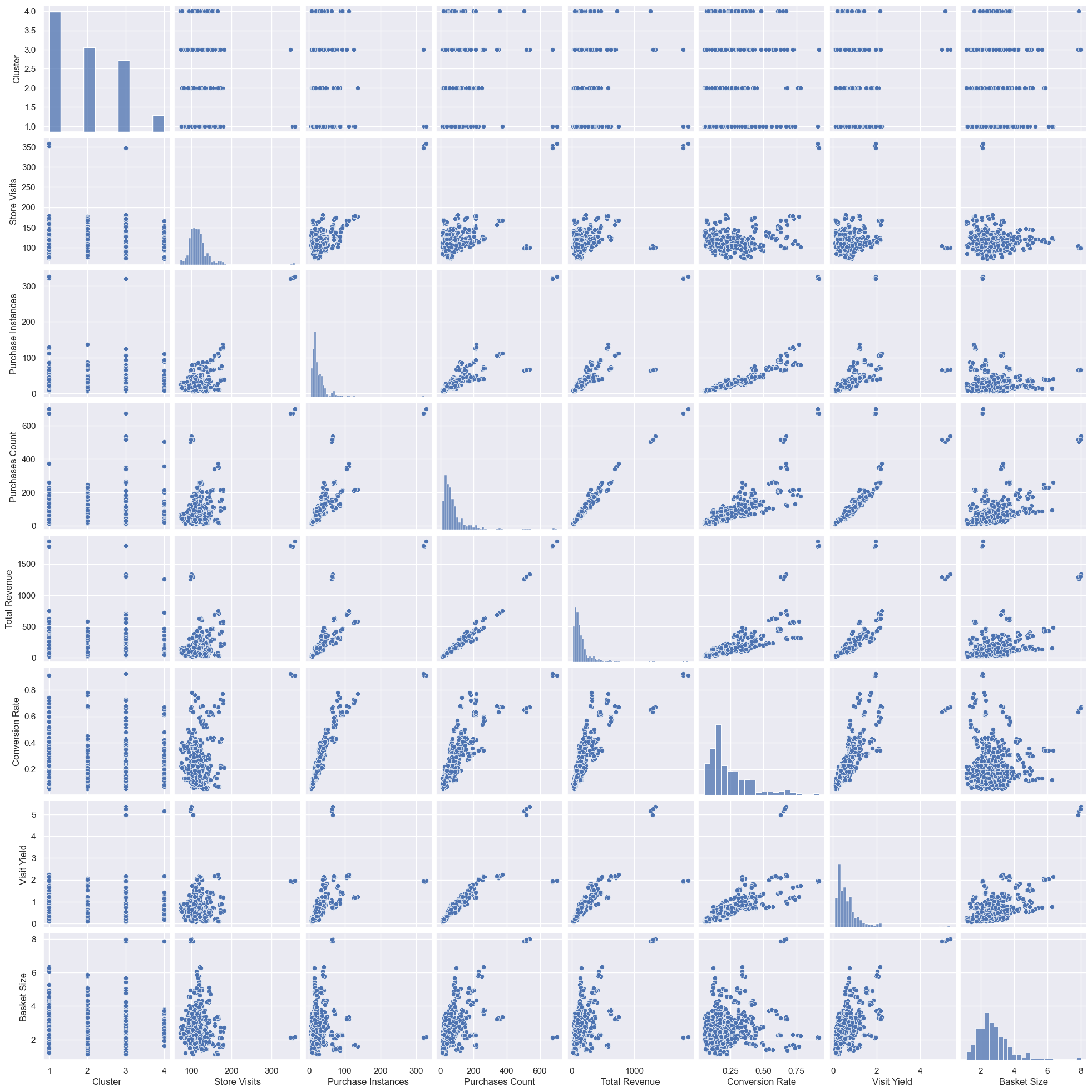
Lots here. Given the common axes, the charts to the upper right of the top-left to bottom-right diagonal are mirrored versions of those on the lower left. Looking at the diagonal, the distribution plots - as anticipated, most distributions are positively skewed. It seems that although we only have a quarter of the customers, the cluster ratio is similar to that of the overall clustering (see part one), which is good for when we come to cluster analysis later. There is typically a reasonable positive correlation between the different features, although conversion rate vs basket size seems to be less correlated. Let’s get some numbers for the correlations:
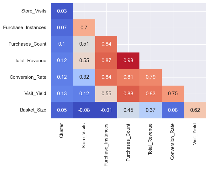
Unsurprisingly, most are positively correlated, the biggest between revenue and number of purchases (the more things you buy, the more you spend). This suggests most products are similarly priced though, as widely different price ranges could weaken the correlation (i.e. buying 1 item for £100 vs 100 items for £1). Interestingly, basket size actually has a negative correlation with store visits and purchase instances. However, it’s minor, so it might not be reliable. Cluster seems to have no real correlation - which is expected, given it’s a non-ordinal categorical number!
Going back to the pairs plot, there’s also something outs that jumps out- while most points are closely grouped, there are a few major outliers in most plots. Who are they? We can get them quite easily by viewing the dataset, sorted from high to low, e.g.:
df_customer_habits.sort_values('Store_Visits', ascending=False)
Sorted by visits, purchase instances, purchases, revenues, and conversion rate, it’s always the same three: 100000185, 100001255, and 100001218. These were actually displayed above when we first created this DataFrame, but as a reminder:
| Customer_ID | Cluster | Store_Visits | Purchase_Instances | Purchases_Count | Total_Revenue | Conversion_Rate | Visit_Yield | Basket_Size |
|---|---|---|---|---|---|---|---|---|
| 100001218 | 1 | 358 | 327 | 702 | 1859.2 | 0.91 | 1.96 | 2.15 |
| 100001255 | 3 | 347 | 320 | 676 | 1786.48 | 0.92 | 1.95 | 2.11 |
| 100000185 | 1 | 353 | 322 | 674 | 1781.05 | 0.91 | 1.91 | 2.09 |
They each have over 300 visits, over 300 purchase instances (giving a conversion rate of 91-92%), and ~700 purchases (giving an average visit yield of just under 2). We like these people! I’ll call them our top customers. Going back to our original demographics data, we can get a better understanding of who they are:
df_raw[df_raw['Customer_ID'].isin([100001218,100000185,100001255])].groupby('Customer_ID')[['Sex','Marital status','Age','Education','Income','Occupation','Settlement size']].mean().astype(int)
| Customer_ID | Sex | Marital status | Age | Education | Income | Occupation | Settlement size |
|---|---|---|---|---|---|---|---|
| 100001218 | 0 | 0 | 37 | 1 | 124597 | 1 | 2 |
| 100000185 | 0 | 0 | 36 | 1 | 106205 | 1 | 1 |
| 100001255 | 0 | 0 | 53 | 1 | 158193 | 1 | 1 |
All pretty average folk - mid-education, mid-occupation, mid or upper-mid incomes, mid or large cities. All single men. One bloke is older, and earning a little more, explaining his different cluster. Perhaps they live near the stores, which might explain their frequent visits. Something to investigate. And why do they spend so much - do they buy more expensive brands? We can check this, as we have their brand data:
df[df['Customer_ID'].isin([100001218,100000185,100001255])][['Customer_ID','Brand_1','Brand_2','Brand_3','Brand_4','Brand_5']].groupby('Customer_ID').mean().round(3)
| Customer_ID | Brand_1 | Brand_2 | Brand_3 | Brand_4 | Brand_5 |
|---|---|---|---|---|---|
| 100000185 | 0 | 0.003 | 0 | 0 | 0.909 |
| 100001218 | 0 | 0.003 | 0 | 0 | 0.911 |
| 100001255 | 0 | 0.003 | 0 | 0 | 0.919 |
As a reminder, the brands range from 1 to 5, with the higher number typically costing more. So yes, our top spending (and, also, top visiting) customers buy the more expensive brand the vast majority of the time. Note the rows in the table above don’t add up to 1 because I’ve removed “brand 0”, which is when no purchase was made - although we can see they buy something nearly every time they visit.
Interestingly, when it comes to visit yield and basket size, we get different customers, with a clear top four: 100000397, 100000914, 100000497, and 100000625. This is primarily because, while most of their stats are high (albeit not as high as our three top customers), they visited the store fewer times than average:
| Customer_ID | Cluster | Store_Visits | Purchase_Instances | Purchases_Count | Total_Revenue | Conversion_Rate | Visit_Yield | Basket_Size |
|---|---|---|---|---|---|---|---|---|
| 100000397 | 3 | 100 | 67 | 536 | 1336.85 | 0.67 | 5.36 | 8 |
| 100000914 | 3 | 99 | 65 | 519 | 1297.85 | 0.66 | 5.24 | 7.98 |
| 100000497 | 4 | 98 | 64 | 504 | 1253.77 | 0.65 | 5.14 | 7.88 |
| 100000625 | 3 | 104 | 66 | 518 | 1288.34 | 0.63 | 4.98 | 7.85 |
And their demographics?
| Customer_ID | Sex | Marital status | Age | Education | Income | Occupation | Settlement size |
|---|---|---|---|---|---|---|---|
| 100000397 | 1 | 1 | 55 | 2 | 165717 | 2 | 2 |
| 100000914 | 0 | 1 | 28 | 1 | 146463 | 1 | 2 |
| 100000497 | 0 | 0 | 29 | 0 | 222360 | 2 | 2 |
| 100000625 | 0 | 0 | 65 | 2 | 136812 | 1 | 1 |
And their brand preferences?
| Customer_ID | Brand_1 | Brand_2 | Brand_3 | Brand_4 | Brand_5 |
|---|---|---|---|---|---|
| 100000397 | 0 | 0 | 0.030 | 0.170 | 0.470 |
| 100000497 | 0 | 0 | 0.031 | 0.173 | 0.449 |
| 100000625 | 0 | 0 | 0.029 | 0.163 | 0.442 |
| 100000914 | 0 | 0 | 0.030 | 0.172 | 0.455 |
Some similarities, some big differences, within the group. We have men and women, married and unmarried, educated and not, very old and very young (at least relative to our dataset). However, they’re mostly high earners in big cities in managerial jobs. Perhaps they’re too busy to do frequent visits, so do less frequent but bigger shops? If that’s the case, should we incentivise them to come more often, or to purchase even more each visit? Would a home delivery service suit them? They typically buy premium brands, but at a lower rate than our top customers - interesting, given our top customers have lower incomes. That makes me wonder - is there a relationship between brand and income?
df_raw[df_raw['Incidence']==1][['Brand','Income']].groupby('Brand').mean().astype(int)
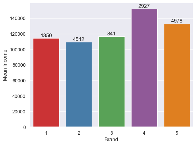
I added the count of customers to the top of each bar. There’s a bit of a link, with the three cheaper brands being favoured by those with lower incomes, and the more expensive two favoured by those with higher incomes. However, brand 4 attracts the top-earners more than brand 5, and brand 2 attracts the lowest-earnings (slightly) more than brands 1 and 2. What could be done to shift the high earners from 4 to 5, and, by extension, increase our bottom line? Looking at the total count on the top of each bar, most customers overall favour brand 5 (~1/3 of all purchases), closely followed by 2; brand 3 is not popular. Is it worth cutting brand 3 completely? Before going down this parth, we’d need to consider how customer behaviour would change - would they be more likely to buy brand 4 instead, resulting in more revenue, or brand 2, resulting in less? Profit margins also need to be factored in.
Cluster analysis
Let’s do everything we’ve done above, but group by clusters, to see how similar they each are. That was the entire point of parts one and two anyway - be able to target large swathes of our customers as well as individually. I took parts of the customer DataFrame, grouped by cluster, taking the sum(), and merged it with parts of another cluster-grouped customer DataFrame, taking the mean(). I renamed the clusters to the names from part one (although, to be precise, the below average careers were mostly married women, and the above average careers were mostly unmarried men):
| Average | Below average careers | Above average careers | Old successful men | |
|---|---|---|---|---|
| # Customers | 205 | 144 | 122 | 29 |
| % Customers | 0.41 | 0.29 | 0.24 | 0.06 |
| Store_Visits (total) | 24065 | 16592 | 14625 | 3411 |
| Store_Visits (mean) | 117.39 | 115.22 | 119.88 | 117.62 |
| Purchase_Instances (total) | 5995 | 3485 | 4072 | 1086 |
| Purchase_Instances (mean) | 29.24 | 24.2 | 33.38 | 37.45 |
| Purchases_Count (total) | 16059 | 9745 | 11521 | 3289 |
| Purchases_Count (mean) | 78.34 | 67.67 | 94.43 | 113.41 |
| Conversion_Rate (mean) | 0.23 | 0.21 | 0.26 | 0.31 |
| Visit_Yield (mean) | 0.63 | 0.6 | 0.77 | 0.96 |
| Basket_Size (mean) | 2.71 | 2.88 | 2.77 | 2.93 |
I then scaled and heatmapped them:
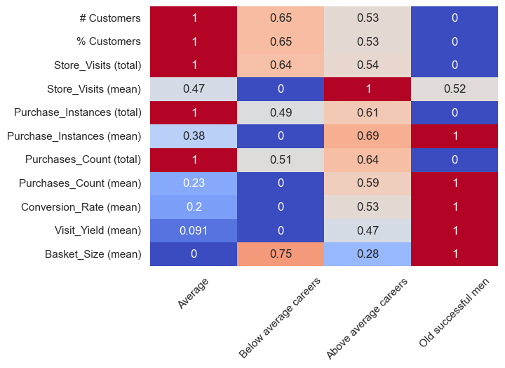
Most customers fall into the Average cluster, as we already knew. Unsurprisingly, then, they have the highest total number of store visits, highest purchase instances, and highest purchase counts. However, those with the above average careers have the highest mean number of store visits (i.e. average per person) - although the difference is actually only ~1%. The old successful men cluster make the most purchasing visits per person, the most purchases per person, and have the highest mean conversion rate, visit yield, and basket size. Our below average career-ers, per person, have the lowest stats - which isn’t particularly surprising, as people with less money typically spend less (although when they do visit, they do buy more than the average and above average groups, perhaps because they’re more time-poor so want to maximise their visits).
Let’s get some bar graphs going. I wanted to add lined representing the standard deviations, so, similar to above, I took a cluster-grouped customer DataFrame, but this time I used .std. We get:
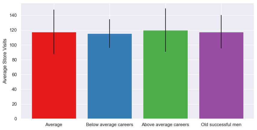
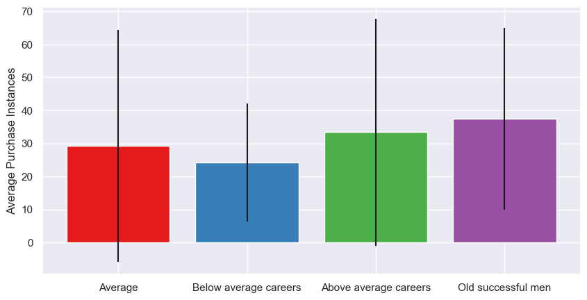
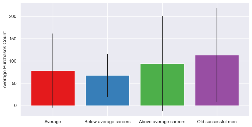
As we saw in the stats, the average number of store visits is pretty similar. However, the number of times a customer purchases from a store during a visit does vary; the more successful purchase more, whereas the less successful are more likely to visit and do some window shopping without actually buying anything. However, the standard deviations are large, especially for the average and above average groups, suggesting there’s a higher range of behaviours within the cluster group - that is, some customers tend to buy most times they visit, others tend to visit a lot without buying. This trend continues with the purchasing counts; so, while our below average purchase less frequently overall, the customers within the group behave more consistently than the other groups.
What about brand choice by cluster? Group and take the means:
df_cluster_brandpreference = df[df['Incidence']==1].groupby('Cluster')[['Brand_1','Brand_2','Brand_3','Brand_4','Brand_5']].mean().round(3)
df_cluster_brandpreference.index = cluster_names
sns.heatmap(df_cluster_brandpreference, annot=True, cmap='coolwarm', cbar=False)
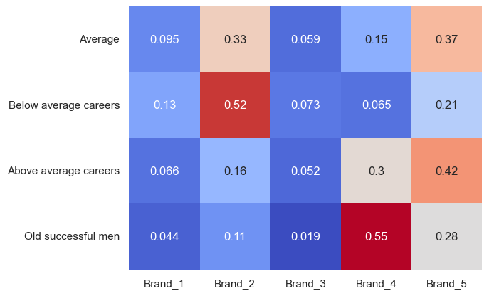
I didn’t scale the data used for this heatmap because I didn’t feel it necessary. There are some definite standouts - the below average career cluster loves brand 2, and older successful men love brand 4. This reminds me of our income to brand chart above - brands 2 and 4 were the most popular by number of customers, and this shows us that, within certain clusters, they get over half the love. The most premium product, brand 5, is mostly liked by average and above average customers - perhaps this is signalling, showing off that they can buy expensive products, whereas the older successful men simply want a high-quality product, and, understandably, the less well-off customers want a cheaper product? Brand 3 is the least loved overall, closely followed by brand 1; based on this, maybe the company should drop those lines? We’d already considered dropping brand 3. Again, it depends on profitability and how the customers would respond to the change, but it’s something to consider going forward. Unfortunately we don’t have profit data, but we have revenue - I reused the code above, but took the revenue columns instead of the brand ones, and instead of taking the mean value, I took the sum, to get:
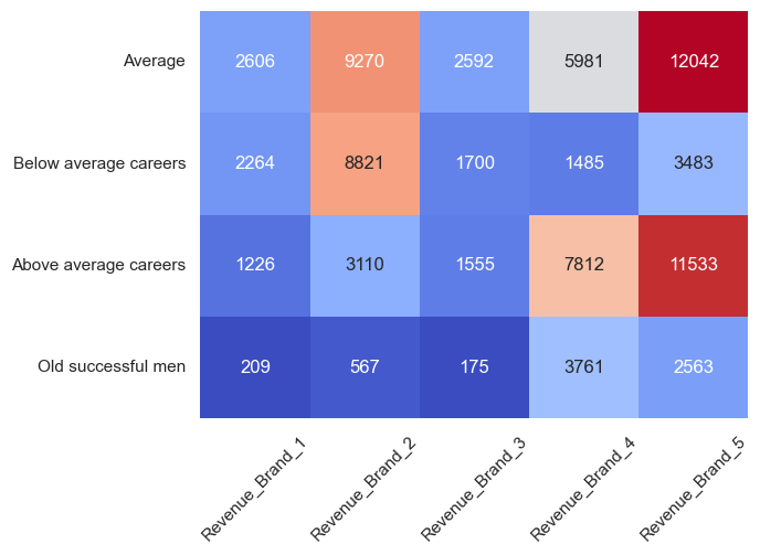
That is quite surprising, based on what we’ve see before Brand 5 brings in far more revenue than the others, mostly from the average and above average groups - then again, it does have the highest price, so doesn’t need such high sales volume. It looks like brand 2 brings in more revenue than brand 4. Again, though, 1 and 3 look less good. And what about total revenue per cluster?
df_revenue_by_cluster = df[df['Incidence']==1].groupby('Cluster')[['Total_Revenue']].sum().astype(int).rename(columns={'Total_Revenue':'Total Revenue'})
df_revenue_by_cluster.index = cluster_names
sns.barplot(x=df_revenue_by_cluster.index, y=df_revenue_by_cluster['Total Revenue'], errorbar=None, palette="Set1")
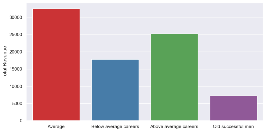
The old successful men bring in the least revenue overall, even though they visit the most and make a purchase almost every visit - although, given they’re only 6% of our customers, they make up a larger chunk than expected. Above average brought in more than below average, but average brought in most overall - then again, it is the biggest cluster, with 41% of the customers. The next thing to check, then, is the average revenue per customer:
df_revenue_by_cluster = df_revenue_by_cluster.merge(df_cluster_habits[['# Customers','% Customers']], left_index=True, right_index=True)
df_revenue_by_cluster['% Customers'] = df_revenue_by_cluster['% Customers']*100
df_revenue_by_cluster['Average Revenue per Customer'] = df_revenue_by_cluster['Total Revenue'] / (df_revenue_by_cluster['# Customers'])
| Cluster | Total Revenue | # Customers | % Customers | Average Revenue per Customer |
|---|---|---|---|---|
| Average | 32490 | 205 | 41 | 158 |
| Below average careers | 17753 | 144 | 29 | 123 |
| Above average careers | 25237 | 122 | 24 | 207 |
| Old successful men | 7275 | 29 | 6 | 251 |
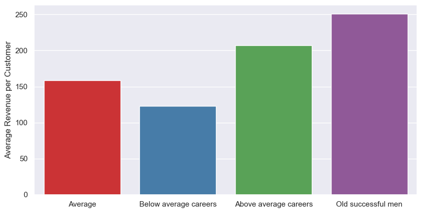
So although our old successful men bring in the least revenue overall, they bring in the most revenue per person. More of those please!
Temporal analysis
And now for something completely different. Way back in the beginning, I noticed there was a column that we haven’t looked at so far - Day. Let’s do a little digging. There are 730 days, or two lots of 365 days; let’s assume it’s two years in order. I started with grouping, dropping, and rounding (we’ll need both the sum and the mean):
df_byday_sum = df.groupby('Day').sum().drop(['ID','Customer_ID'], axis=1).round(2).copy()
df_byday_mean = df.groupby('Day').mean().drop(['ID','Customer_ID'], axis=1).round(2).copy()
I then did some plots - the number of visits that resulted in a sale, and the quantity of items sold - using the sum data:

I’ve roughly split each x-axis mark into three months. All we really see is huge variation, although it looks like it started quite quietly (based on the lower values at time 0 for all three plots) and grew for the first three months, after which the mean remained roughly constant. Maybe it was a newly-opened store? I could do some time series forecasting, like I did in my solar PV project here, but I won’t. Yet.
I also plotted Brand, Price and Promotion (sum, mean, mean, respectively):
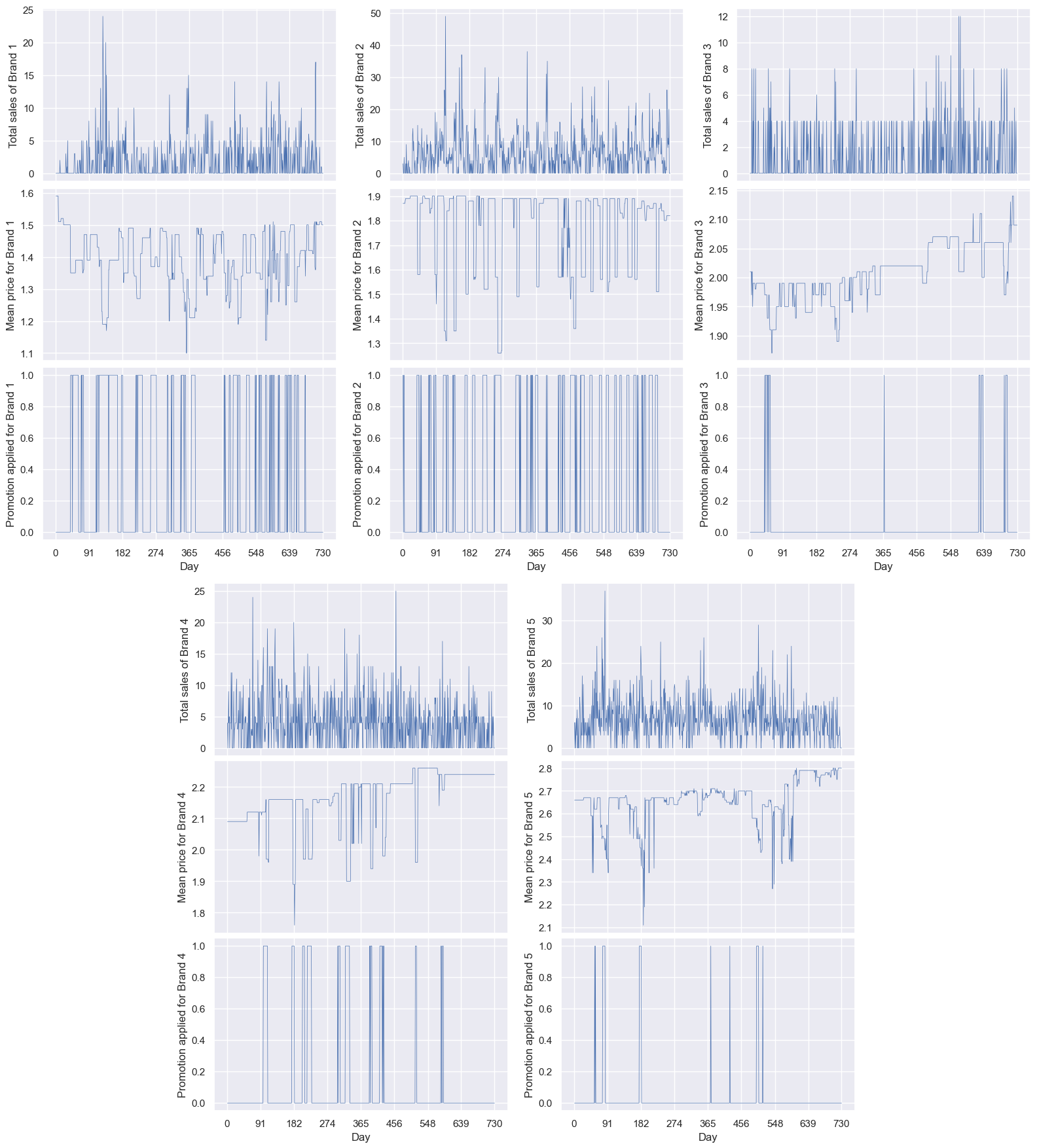
Note that, excluding the binary promotions charts, the scales are all different. I considered using common y-axis limits, but that would make some of them hard to see. I’ve vertically-aligned the sales/price/promotion for easier comparison. I also tried overlapping charts, but they’re a bit too busy so hard to interpret:
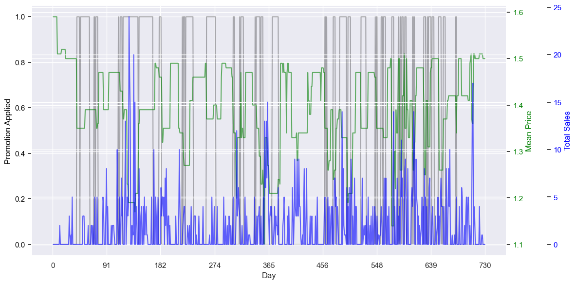
What can we see? Firstly, the bigger price drops look to aligns with the promotions, although even without the promotions, the prices fluctuate. In fact, the prices fluctuate a lot more than I expected. Brand 1 started with a high price (1.6), but after the first six weeks or so, never increased to that price again - and even dropped to 1.1. Brand 2’s price is mostly at about 1.85, sometimes for weeks in a row, before having dips. Both of these had regular promotions - they were on promotion almost as much as they were. Brand 3 started around 2.00, and grew over the two years, finally reaching almost 2.15. It seems to have the fewest number of promotions. The price of brand 4 also grew slightly over the period, from about 2.1 to 2.3, with a middling number of promotions. Brand 5’s price started much higher, 2.7, and grew to 2.8 - being almost double brand 1 goes some way to explain why it brought in so much revenue. Like brand 3, brand 5 had few promotions.
The number of sales per brand doesn’t look to have as high a correlation to price as I’d expect - for example, the big price dip for brand 5 around day 180 didn’t lead to an equally-large increase in sales, and the brand’s highest volume day, around day 85, came before the price drop around day 92. Sometimes they are linked though - the price drop for brand 1 around day 120 does look to cause an increase in sales. This suggests more than just price influences the sales for all the brands.
I’ll look into the relationship between sales, price, and promotion more later, but first, let’s do a bit more temporal analysis.
As mentioned before, I had two years’ worth of data. I compressed the two years into one, taking the average of the two relevant days (i.e. day 1 and day 366), to see if there were any more obvious seasonal trends than we saw from the two-year plot… But there wasn’t. It also removed the ability to see long-term price changes, such as for brand 3, so I opted to disregard that path of inquiry and not include it here.
What about an even smaller scale? We can convert the day number into the day of the week by dividing Day by 7 and taking the remainder. We don’t know if Day 1 is a Monday, Tuesday, Wednesday, etc, but at least we can get 7 days of the week, in order. Are there any weekly trends?
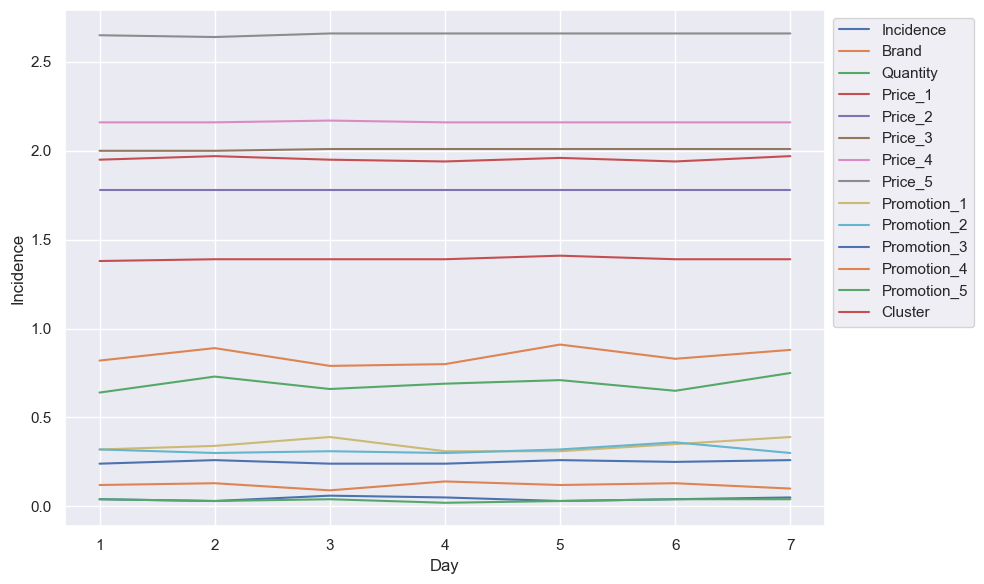
Not really. I was hoping we’d see a pattern which would give insight into which day is which, such as a dip on Sunday (due to, for example, reduced trading hours) after a jump on Saturday (days off work), but no such luck. The popularity of a specific brand, their prices, or the existence of promotions, doesn’t look to have any patterns, nor does which day each cluster shops. Sad.
Product analysis
Now moved to part four
Conclusion
I think that will do for now! Next time I’ll go deeper, introducing some regression models. What are our main actionable insights from this purchase analytics phase?
- Older men with successful careers bring in the most revenue per person, but they make up a small amount of our customers. How can we attract more of them? Or could we go to them, open stores in areas with people matching their demographics?
- We have three customers who visit, buy, and spend far more than all the others. Who are these people? We need to learn more about them, as we want more people like them - especially as they’re not in our older successful men group. Potentially invite them for interviews, or send them surveys?
- Below-average customers provide significantly less value to the store than other customer groups, yet are our second-largest cluster. They behave consistently, and favour brand 2, so targeted promotions could boost sales, especially given brand 2 is sensitive to promotions.
Until next time!
