Customer Analysis Part I: Segmentation and Clustering
This is part one of a multi-part series. Part two can be found here.
Intro
Customer analysis is one of the most important uses of data science. The better an organisation knows their customers, the better they can ensure their needs are met. This could be a supermarket providing special offers on a customer’s common purchases, a charity tweaking their messaging based on their’ donator’s personal interests, or a distributor using purchasing trends to determine where to open a new warehouse.
This post includes the first stage of customer analysis - segmentation. Segmenting is simply splitting into groups. Initially this seems easy - you could, for example, group all the men together and all the women together, or all the rich together and all the poor together. However, using machine learning techniques enable more intelligent groupings, resulting in more accurate predictions and hence more actionable insights. When unsupervised machine learning does the segmentation, it’s called clustering.
Full code on GitHub: https://github.com/jamesdeluk/data-projects/tree/main/customer-analysis
Exploring and pre-processing the data
I imported the data with pd.read_csv and stored it as df_customers. The dataset I have has seven categories, along with a unique customer ID. Based on the information that came with the dataset, plus a describe(), we have:
| Category | Type | Values | Labels |
|---|---|---|---|
| Sex | Categorical (Binary) | 0, 1 | Male, Female |
| Marital status | Categorical (Binary) | 0, 1 | Single, Married |
| Age | Numerical | 18 - 76 | n/a |
| Education | Categorical (Ordinal) | 0, 1, 2, 3 | Other/unknown, High school, Uni, Postgrad |
| Income | Numerical | 35,832 - 309,364 | n/a |
| Occupation | Categorical (Ordinal) | 0, 1, 2 | Unemployed/unskilled, Skilled, Management/self-employed |
| Settlement size | Categorical (Ordinal) | 0, 1, 2 | Small, Medium, Large |
There are 2000 customers, the mean being a slightly-more-male-than-female (0.46) half-married (0.50) 36 year old with high school education (1.04) earning 121k in a mostly skilled job (0.81) in a small-side-of-medium city (0.74).
Some clustering techniques only work with categorical data, and others only with numerical data. In preparation, I split the dataset into categorical-only and numerical-only data:
cols_categorical = ['Sex', 'Marital status', 'Education', 'Occupation', 'Settlement size']
cols_numerical = ['Age', 'Income']

df_customers_cats = df_customers[cols_categorical].apply(lambda col: col.astype('category').cat.codes)
df_customers_nums = df_customers[cols_numerical]
I’ll likely also need the numerical data scaled, and I may need the categorical data one-hot encoded, so I’ll do that now:
scaler_nums = StandardScaler()
customers_nums_scaled = scaler_nums.fit_transform(df_customers_nums)

encoder = OneHotEncoder(sparse_output=False)
customers_cats_encoded = encoder_kmeans.fit_transform(df_customers_cats)
The standard scaler scales the data so the mean is 0 and the standard deviation is 1; therefore, it keeps the same shape of the data, but normalises it.
One-hot encoding converts a category with multiple values into multiple binary columns. For example:
| ID | Occupation |
|---|---|
| 001 | 0 |
| 002 | 1 |
| 003 | 2 |
becomes
| ID | Occupation_0 | Occupation_1 | Occupation_2 |
|---|---|---|---|
| 001 | 1 | 0 | 0 |
| 002 | 0 | 1 | 0 |
| 003 | 0 | 0 | 1 |
Finally, I created a unified NumPy array for scaled and encoded data, plus another with all the data scaled, without one-hot encoding:
customers_scaled_and_encoded  = np.hstack((customers_nums_scaled, customers_cats_encoded))

scaler = StandardScaler()
customers_scaled = scaler.fit_transform(df_customers)
Plots
I like visuals, so let’s start with plots. I plotted everything against Income, because it’s good to have at least one continuous variable.
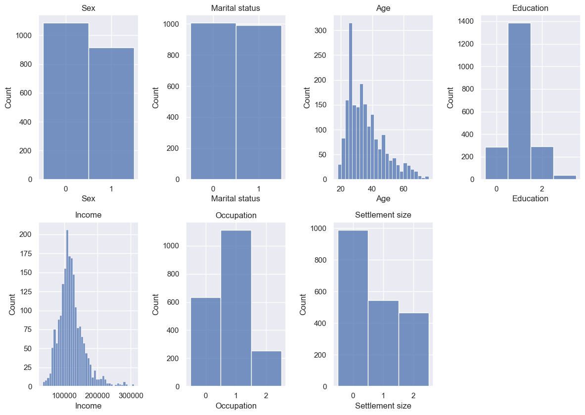
The histograms align with our mean person pretty well. Sex and Marital status are split almost 50:50, but High school Education, Skilled Occupation, and Small city Settlement size are clear winners in their individual groups. Age and Income are normal-ish, but with positive skews - I wonder if they’re correlated.
Now for scatter plots:
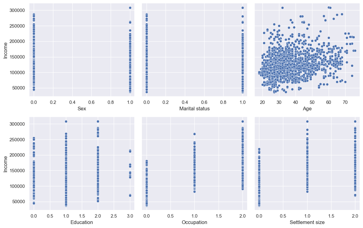
Little correlation between Age and Income, as it turns out. Occupation and Settlement size do look to be correlated; Sex and Marital status not really. Education is a strange one, with a positive correlation apart from post-grabs - but we can also see the count of post-grads is lower, which might be the reason (i.e. perhaps they’re all low-paid teachers)?
df_customers[df_customers['Education']==3].describe() states that most with post-grad education are 57 years old (way above average), nearly all married, mostly female, living in medium cities in skilled jobs - so perhaps they’re near retirement and taking it easy, and/or only working part-time (note we don’t have data on the hours worked, only the total income).
Correlations
And what about correlations? I like heatmaps.
I added a mask to hide unnecessary info (i.e. the correlation between Education and Income is the same as between Income and Education): mask = np.triu(np.ones_like(corr, dtype=bool))
I also sliced the data to remove duplicates (i.e. Sex and Sex has a correlation of 1): corr.iloc[1:,:-1], mask=mask[1:,:-1]
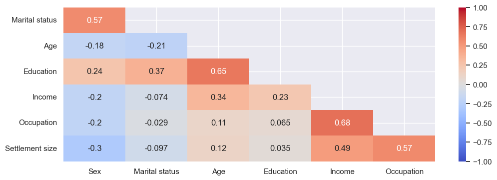
Based on this, the most highly positively correlated are, unsurprisingly, Occupation and Income. Education and Income are less positively correlated, likely due to the impact of post-grads as discussed above. Education and Age are quite highly positively correlated too, which makes sense - the older you are, the more chance you have to gain additional education. And Settlement size and Occupation can be explained by bigger cities typically having more white-collar jobs. Interestingly Marital status and Sex have moderate positive correlation, suggesting women are more likely than men to be married (although note there are more men in the dataset).
There are no strong negative correlations. Sex has the most negative correlations - in this dataset, women are more likely to earn less, in less skilled jobs, in smaller cities - but, also, be younger.
Now we have some basic insight into the dataset, let’s start splitting it up.
Clustering
I’ll use a range of techniques. As mentioned before, some techniques work best for numerical data, others for categorical data, and some work well for both. Fortunately the numerical-only techniques work reasonably well for binary or ordinal categorical data, as ours is. Alternatively, as explained above, it’s possible to one-hot encode the categorical data.
| Technique | Best for (data type) |
|---|---|
| Hierarchical clustering | Numerical |
| Gower distance | Mixed |
| K-means | Numerical |
| K-modes | Categorical |
| K-prototypes | Mixed |
There are far more than just these, including DBSCAN, Gaussian mixture models (GMM), and even BIRCH (Balanced Iterative Reducing and Clustering using Hierarchies), but I won’t consider them in for now.
Hierarchical
This is the one that makes cool images, so I like to start with this. I’ll rely on its ability to handle our categorical data and give it the entire dataset. SciPy can do the clustering using linkage and dendrogram. There are a bunch of methods for how to calculate the linkage - single, complete, average, weighted, centroid, median, ward - so I looped through to see which looked best. The key code is:
hier_methods = ['single', 'complete', 'average', 'weighted', 'centroid', 'median', 'ward']
for method in hier_methods:
    hier_clust = linkage(customers_scaled, method=method)
    # plotting code
If you don’t tell the dendrogram the truncate, you get very messy plots:
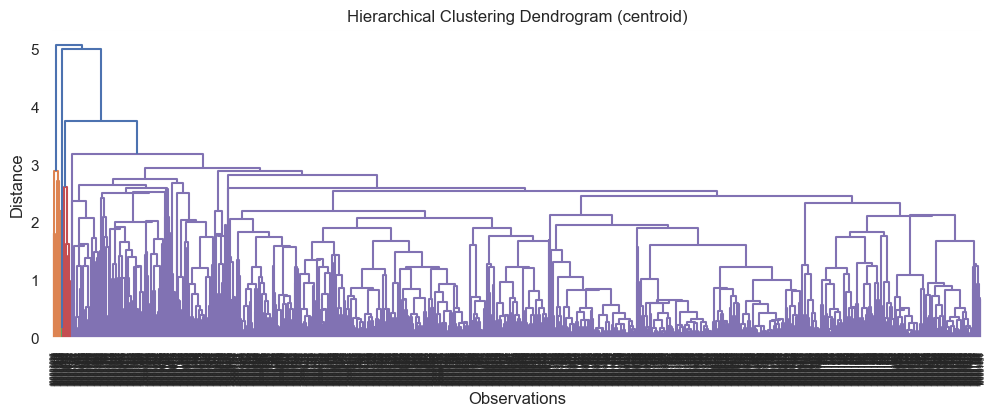
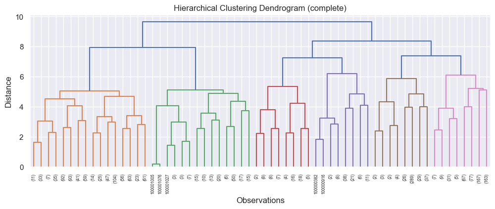
When I set it to truncate at level 5, I got more decipherable results. The top two, based on where the different leaves (vertical lines) looked quite balanced in quantity and distance, were:
and
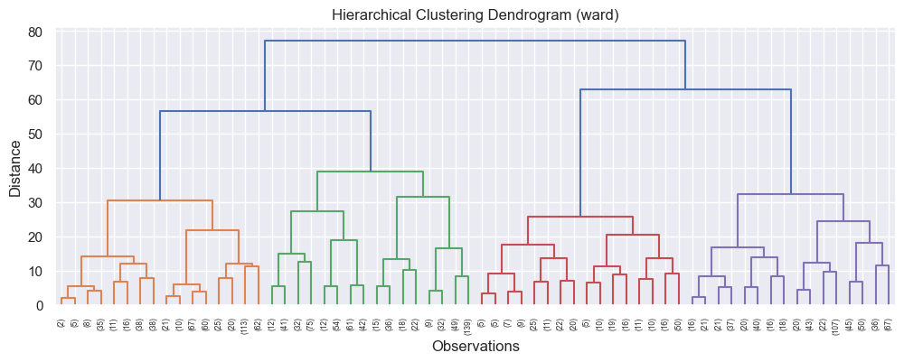
Based on this, I decided to cluster using the ward method, as it had the highest distance (y axis). The number of colours - in this case, 4 - is the number of clusters. I always make a copy of the dataset to work with, and I added the clustering results to this as a new column:
df_customers_hier_4 = df_customers.copy()
Z = linkage(df_customers_hier_4, method='ward')
clusters_hier = fcluster(Z, t=4, criterion='maxclust')
df_customers_hier_4['Cluster (hier)'] = clusters_hier
I next grouped each cluster to get some statistics - mean, median, and mode respectively:
display(df_customers_hier_4.groupby(['Cluster (hier)']).mean().round(2))
display(df_customers_hier_4.groupby(['Cluster (hier)']).median())
display(df_customers_hier_4.groupby(['Cluster (hier)']).agg(lambda x: x.mode()[0]))
| Cluster | Sex | Marital status | Age | Education | Income | Occupation | Settlement size |
|---|---|---|---|---|---|---|---|
| 1 | 0.50 | 0.51 | 34.62 | 1.00 | 115413.1 | 0.82 | 0.72 |
| 2 | 0.56 | 0.54 | 31.91 | 0.9 | 81766.74 | 0.24 | 0.21 |
| 3 | 0.31 | 0.45 | 40.7 | 1.19 | 152156.7 | 1.23 | 1.22 |
| 4 | 0.29 | 0.4 | 44.73 | 1.35 | 223444.6 | 1.75 | 1.45 |
| Cluster | Sex | Marital status | Age | Education | Income | Occupation | Settlement size |
|---|---|---|---|---|---|---|---|
| 1 | 0.0 | 1.0 | 32.0 | 1.0 | 114784 | 1.0 | 0.0 |
| 2 | 1.0 | 1.0 | 29.0 | 1.0 | 84596.5 | 0.0 | 0.0 |
| 3 | 0.0 | 0.0 | 37.0 | 1.0 | 149653 | 1.0 | 1.0 |
| 4 | 0.0 | 0.0 | 43.0 | 1.0 | 214364 | 2.0 | 2.0 |
| Cluster | Sex | Marital status | Age | Education | Income | Occupation | Settlement size |
|---|---|---|---|---|---|---|---|
| 1 | 0 | 1 | 26 | 1 | 102543 | 1 | 0 |
| 2 | 1 | 1 | 26 | 1 | 69487 | 0 | 0 |
| 3 | 0 | 0 | 30 | 1 | 133328 | 1 | 1 |
| 4 | 0 | 0 | 42 | 2 | 214364 | 2 | 2 |
I could also find out how many customers fell into each cluster, and what the percentages were:
df_customers_hier_analysis_4 = df_customers_hier_4.groupby(['Cluster (hier)']).mean()
df_customers_hier_analysis_4['#'] = df_customers_hier_4[['Cluster (hier)','Sex']].groupby(['Cluster (hier)']).count()
df_customers_hier_analysis_4['%'] = df_customers_hier_analysis_4['#'] / df_customers_hier_analysis_4['#'].sum()
If you’re wondering why ‘Sex’ is there - there needed to be a column to count. I chose Sex, but any would work.
| Cluster | # | % |
|---|---|---|
| 1 | 839 | 42% |
| 2 | 560 | 28% |
| 3 | 491 | 25% |
| 4 | 110 | 6% |
So almost half are in cluster 1, almost a quarter in clusters 2 and 3, and a small number in cluster 4.
I also wanted to do a heatmap; for this I first had to scale the data, this time with a MinMaxScaler, resulting in all the values being between 0 and 1, which makes the colouring works well. Note this means a 1 in the heatmap refers to the highest category of the categorical data - i.e. a 1 for Education on the heatmap is actually a 3 in the data. Also note the rows are 0-based not 1-based (i.e. cluster 1 is 0 on the heatmap):
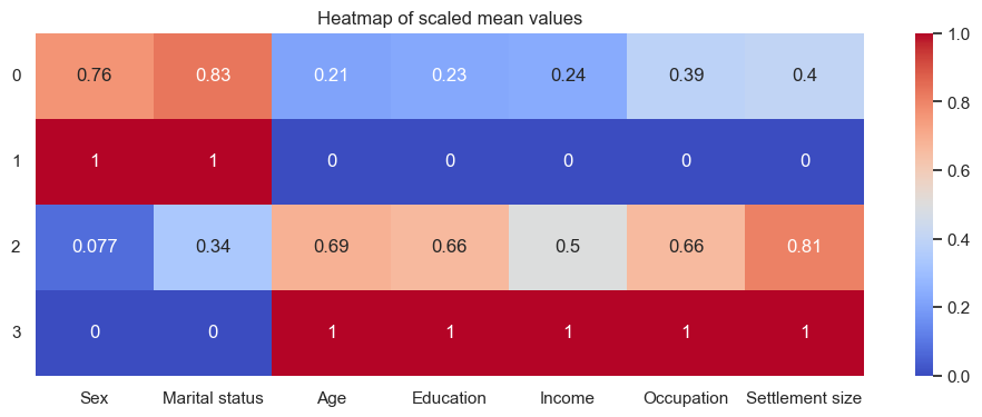
From all this I can attempt to give the categories names, to make them more human. Looking at the heatmap alone, cluster 2 looks to be mostly married women - although actually only 56% are women, and only 54% are married. However, it is the group with the greatest share of women, and the most married people. Cluster 4 has the most single men, with the highest everything else - although the median only has high school education (even though the mode is university). The other two clusters are somewhere in between.
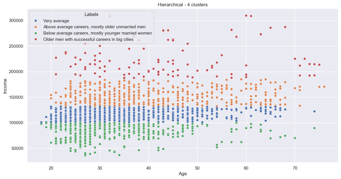
I wanted to have succinct names, focussing on the key differentiators. “Career” represents a combination of education, income, and occupation. I settled on:
1:'Very average',
2:'Below average careers, mostly younger married women',
3:'Above average careers, mostly older unmarried men',
4:'Older men with successful careers in big cities'
Now I can plot the continuous variables, Age and Income, and colour by cluster:
And categorical ones as subplots:

Looks to be some nice groupings. That’s our first clustering done!
Agglomerative (using Gower distances)
Agglomerative clustering is designed for mixed data, and works with Gower distance matrices. First I needed to convert the data to floats, and then create the Gower distance matrix:
df_customers_gower = df_customers.copy().astype('float')
gower_distance_matrix = gower_matrix(df_customers_gower)
Next is to determine the number of clusters. For this I can again use a dendrogram! The code is pretty similar - again I looped through different methods. The key code is:
condensed_distance = squareform(gower_distance_matrix, checks=False)
linkage_matrix = linkage(condensed_distance, method='ward')
dendrogram(linkage_matrix, truncate_mode='level', p=5, show_leaf_counts=True, labels=df_gower.index, leaf_rotation=90)
The best dendro was:
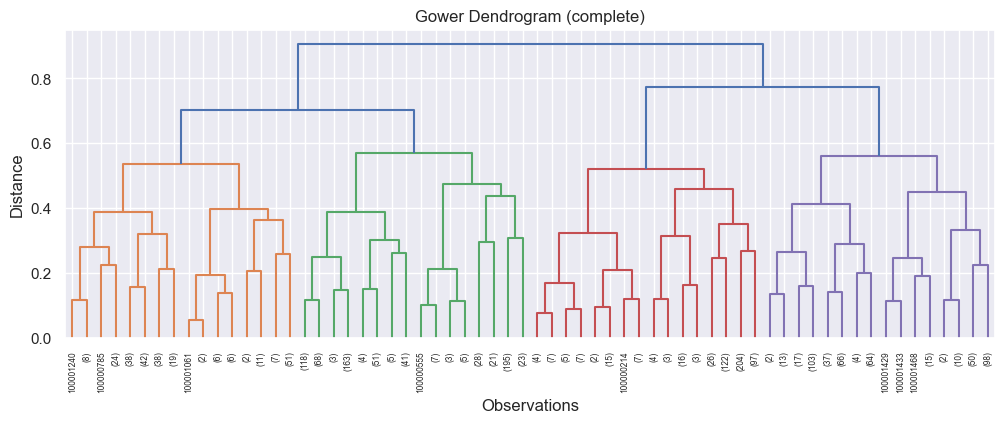
Again, 4 clusters, but with a different method (complete). The code to calculate the clusters:
clustering_gower = AgglomerativeClustering(n_clusters=4, linkage='complete', metric='precomputed')
df_customers_gower_4 = df_customers.copy()
df_customers_gower_4['Cluster (gower)'] = clustering_gower.fit_predict(gower_distance_matrix)
As I will for future methods also, I used the same code as the hierarchical clustering to add these clustering results to the DataFrames, view the stats, and name the clusters. I won’t show include all the tables here to save space, although the results were pretty different - the tables can be found in the repo, link at the top of this post. I will share the heatmaps, though:
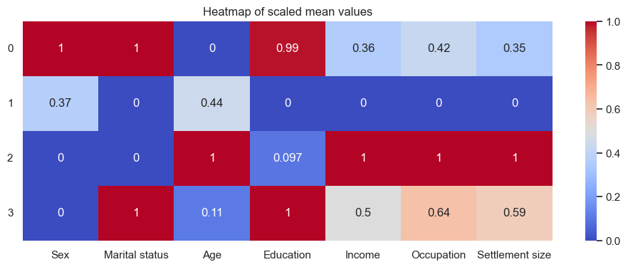
The names I settled on were:
0:'Younger married educated women with average careers',
1:'Unmarried men with unsuccessul careers in small cities',
2:'Unmarried uneducated older men with successful careers in big cities',
3:'Younger married educated men with average careers'
If it wasn’t for the location, it looks like the 0s could be married to the 3s. Single old men are economically best off, based on this.
The scatter is a bit more mixed:
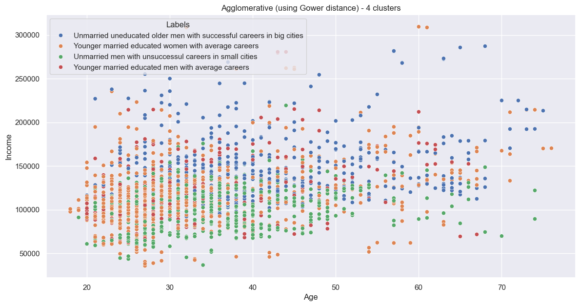
As are the categoricals:

K-means
Now for the popular one. K-means is designed for numerical data, but as the categorical data is binary or ordinal, as with hierarchical clustering, I can use it as-is (only scaled). However, instead of using a dendrogram to determine the number of clusters, I can use the elbow method. I calculated the within-cluster sum of squares (WCSS) for different numbers of clusters, then plotted them on a Scree plot, and looked for the biggest kink (the elbow) in the graph, which is the point of diminishing returns. Clustering into more groups than this leads of overfitting. This is the first bit of the code:
wcss = []
for i in range(1,11):
    kmeans = KMeans(n_clusters=i, init='k-means++', random_state=42)
    kmeans.fit(customers_kmeans)
    wcss.append(kmeans.inertia_)
And the plot:
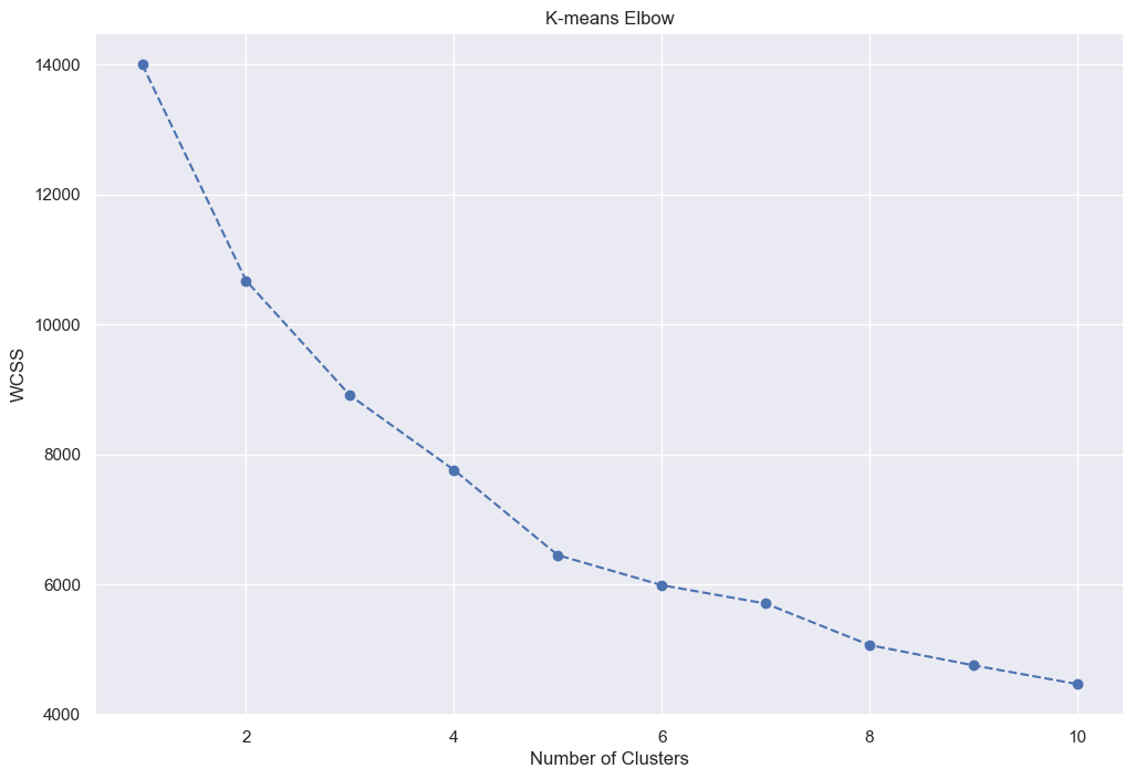
It looks to me that the biggest kink is at 5 clusters, so I did that:
kmeans_5 = KMeans(n_clusters=5, init='k-means++', random_state=42)
kmeans_5.fit(customers_scaled)
clusters_kmeans_5 = kmeans_5.labels_
The heatmap:
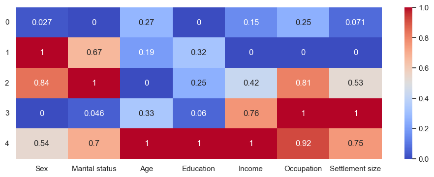
This time, while old men are still the most education with highest incomes, they don’t have the best occupations. There’s also a group of young men who are the worst-performing group so far. The labels:
0:'Unmarried uneducated men with unsuccessful careers in small cities',
1:'Married women with unsuccessful careers in small cities',
2:'Young married men with average careers',
3:'Unmarried uneducated men with successful careers in big cities',
4:'Older folk with successful careers in middle cities'
The plots:
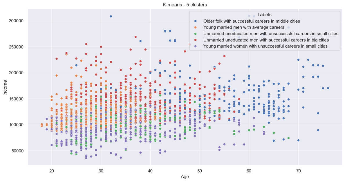

Again, quite jumbled.
K-modes
Where K-means is for numerical data, K-modes is for categorical data. I’ll have to simply ignore the numerical data - I’ll use the categorical-only dataset for clustering, and re-add the numerical data after. This might mean this isn’t the most reliable segmentation technique for this data.
Again I used the elbow method to determine the number of clusters; in this case, along with the number of clusters, there are two init methods, Cao and Huang. I did a nested loop to test all. Instead of WCSS it’s costs, but it’s the same concept. The code:
kmodes_costs = {'Cao': [], 'Huang': []}
kmodes_methods = ['Cao','Huang']
kmodes_cluster_range = range(1,11)

for init_method in kmodes_methods:
    for n_clusters in kmodes_cluster_range:
        print(f'Assessing {n_clusters} clusters for {init_method}')
        kmodes = KModes(n_clusters=n_clusters, init=init_method, n_init=10, verbose=0)
        kmodes_clusters = kmodes.fit_predict(df_customers_cats)
        kmodes_costs[init_method].append(kmodes.cost_)
The methods performed quite differently:
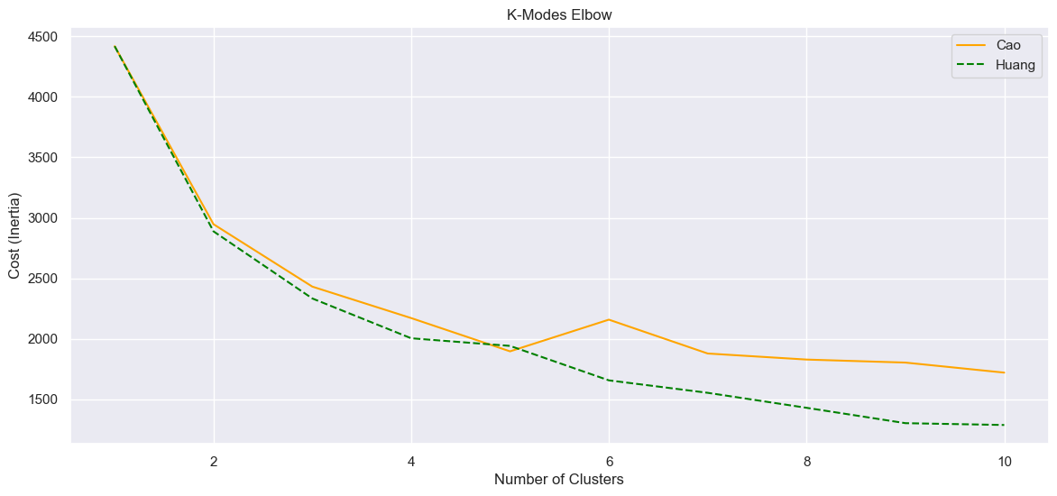
The line with the lower cost is best, and we look for the kink, so I’ll choose Huang at 3 (although 4 also looks good). Similar analysis code as before, except I needed to re-add the numerical columns - I did this by simply adding the cluster results to a new copy of the original dataset.
The heatmap:
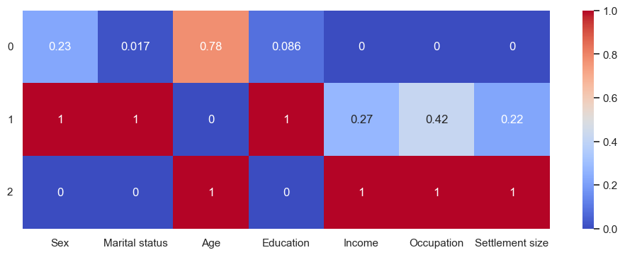
This is a but similar to the Gower distance heatmap. The age range is smaller though, 33 to 38. Labels:
0:'Unmarried men with unsuccessul careers in small cities',
1:'Married women with high education and average careers in smaller cities',
2:'Unmarried men with successful careers in big cities'
And so:
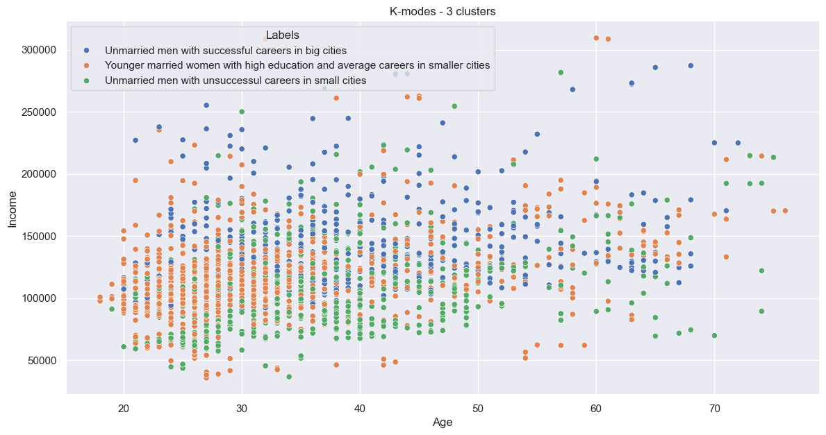

Again, quite jumbled.
K-prototypes
Finally, another technique designed for mixed data. The code is basically identical to K-prototypes, but we can use the entire dataset, not only the categorical data.
Of all techniques so far, this took by far the longest to compute - most techniques took only a few seconds, but this took an average of a minute per loop (loops with more clusters took more time).
Anyway, the elbow plot:
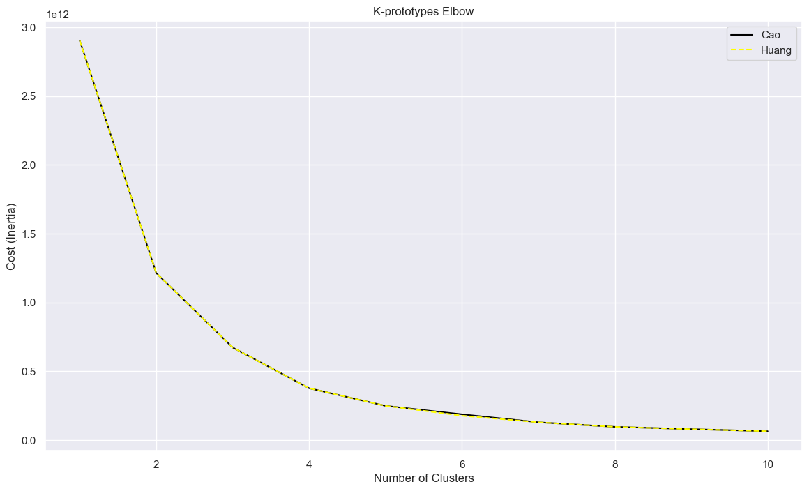
In this case, Cao and Huang methods are basically identical, but the kink remains at 3.
kproto = KPrototypes(n_clusters=3, init='Cao', n_init=10, verbose=0)
clusters_kproto = kproto.fit_predict(df_customers, categorical=[0,1,3,5,6])
The fitting also took longer than other techniques.
Add to the DataFrames and analyse as before. The heatmap:
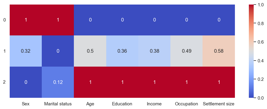
Kind of similar to hierarchical clustering, with high-earning old educated single men in cities and uneducated unemployed married women - although based on the numbers (not the heatmap), only 57% are female, and only 55% married. The fewer the clusters, the less unique they are. Therefore:
0:'Younger married women with below-average careers in small cities',
1:'Very average',
2:'Older men with successul careers in bigger cities'
This gives us:
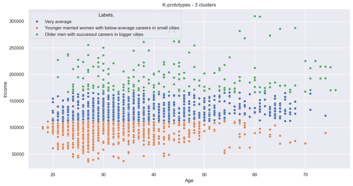

This looks similar to hierarchical, with clear horizontal groups - adding a fourth cluster might make it even more similar.
Dimensionality reduction
Now for something a little different. Dimensionality reduction is the process of analysing the individual features (columns) and reducing them to a smaller number, with the goal of increasing performance and reducing noise. This is especially good for large datasets with many columns - which is especially the case if data is one-hot encoded.
Factor Analysis of Mixed Data (FAMD)
Principal component analysis (PCA) is probably the most common technique, although it only really works for continuous numerical data. Multiple correspondence analysis (MCA) is similar, but for categorical data. Fortunately, FAMD is (effectively) a combination of the two. It’s available as part of the prince library in Python.
The first thing to do is to determine the number of components. The generally accepted rule of thumb is that components should cover 80-90% of the variance. This can be deciphered with a cumulative explained variance plot - or a Scree/elbow plot, as we used before.
For this tool, the datatypes need to be properly defined:
df_customers_famd = df_customers.copy()
for col in ['Sex', 'Marital status', 'Education', 'Occupation', 'Settlement size']:
    df_customers_famd[col] = df_customers_famd[col].astype('category')
for col in ['Age', 'Income']:
    df_customers_famd[col] = df_customers_famd[col].astype('float32')
Then make and fit:
famd = FAMD(n_components=len(df_customers_famd.columns), random_state=42)
famd.fit_transform(df_customers_famd)
Then plot, taking advantage of the built-in method famd.cumulative_percentage_of_variance_. Unfortunately, it doesn’t look like we can reduce the dimensions much:
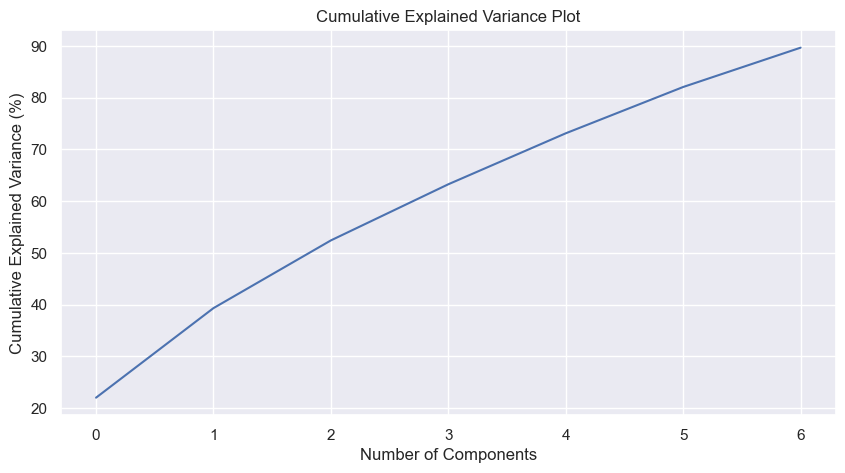
We’d need at least five components (down from our original seven), and we’d lose almost 20% of the data. Not really worth it.
As an aside, the module has a built-in method for creating the scree plot - famd.scree_plot():
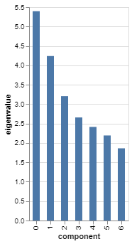
It’s even interactive, if you hover over, which gives stats including the cumulative percentage.
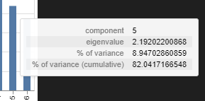
But yes, no FAMD-based dimensionality reduction needed.
Multidimensional scaling (MDS)
MDS is similar to PCA, but whereas PCA is linear for relationships in the Euclidean space, MDS is non-linear and is optimised for distance-based representations, like the Gower matrix. Given we already had a Gower matrix, I thought I’d give this a go.
Starting with how many components I can reduce to, I again used an elbow plot. Instead of WCSS or costs, it’s stress values. The key part of the code is:
mds = MDS(n_components=len(df_customers.columns), dissimilarity="precomputed", random_state=42)
mds.fit(gower_distance_matrix)
stress_values.append(mds.stress_)
Resulting in:
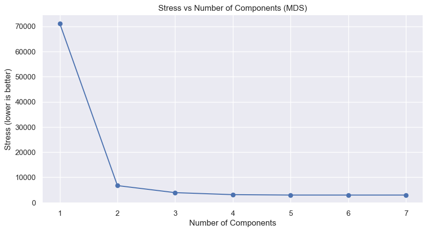
The kink is definitely at two, so we set it to two:
mds = MDS(n_components=2, dissimilarity="precomputed", random_state=42)
mds_fit = mds_final.fit_transform(gower_distance_matrix)
Next we need to cluster; K-means is typically good for MDS components. Again, an elbow plot:
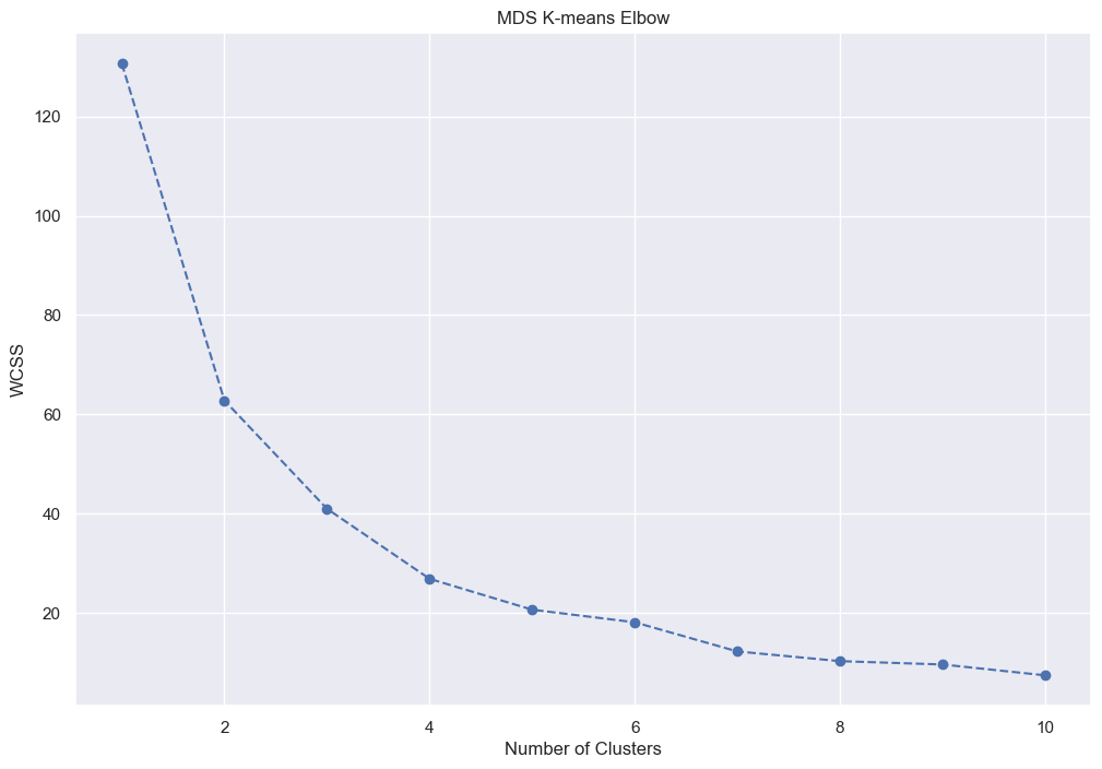
Let’s go for 4:
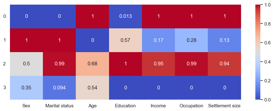
Which we’ll call:
0:'Unmarried uneducated older men with successful careers in big cities',
1:'Younger married women with average careers in small cities',
2:'Educated married folk with successful careers in big cities',
3:'Unmarried men with unsuccessful careers in small cities'
And gives us:
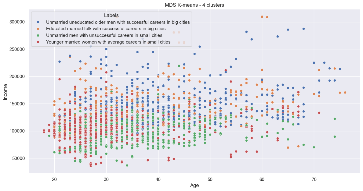

Again, quite jumbled.
Comparisons
I wanted to see how the different clustering techniques compared. As a first step I made a unified DataFrame with all cluster results. The +1s are the make sure the clusters all start with 1.
df_customers_clusters = df_customers.copy()

df_customers_clusters['Hier_4'] = clusters_hier
df_customers_clusters['Gower_4'] = clusters_gower +1
df_customers_clusters['Kmeans_5'] = kmeans_5.labels_ +1
df_customers_clusters['Kmodes_3'] = clusters_kmodes_3 +1
df_customers_clusters['Kprot_3'] = clusters_kprot_3 +1
Clustered clusters
I was curious to see how similar the clusters were, so I created a new column where I “merged” the clusters - for example, a merged results of 111111 would be hierarchical cluster 1, Gower cluster 1, K-means cluster 1, etc. I then counted to see how many customers were assigned to each combination:
df_customers_clusters['Clusters'] = df_customers_clusters[df_customers_clusters.columns[df_customers_clusters.columns.get_loc("Hier_4"):]].astype(str).agg(''.join, axis=1)

df_customers_clusters[['Clusters','Sex']].groupby(['Clusters']).count().sort_values('Sex', ascending=False).rename(columns={'Sex':'Count'})
This resulted in 126 combinations (out of a possible 720), with the most common group having 166 of the 2000 customers. It seems the methods differ fairly significantly.
| Clusters | Count |
|---|---|
| 212212 | 166 |
| 221114 | 144 |
| 334321 | 141 |
| 134321 | 129 |
| 113222 | 110 |
What if I recalculate three clusters for each technique? This reduces it to 61 groups, the top with ~14% of the customers:
| Clusters | Count |
|---|---|
| 112212 | 275 |
| 122111 | 158 |
| 231321 | 154 |
| 131321 | 144 |
| 113213 | 116 |
From this we can see that, while the clustering techniques can have overlaps, they do perform quite differently.
Proportions
Next, I wanted to see the proportional cluster split for each technique. I’d already calculated the %, so now it’s simply to chart it - and yes, I chose everyone’s least favourite type of chart, the pie:
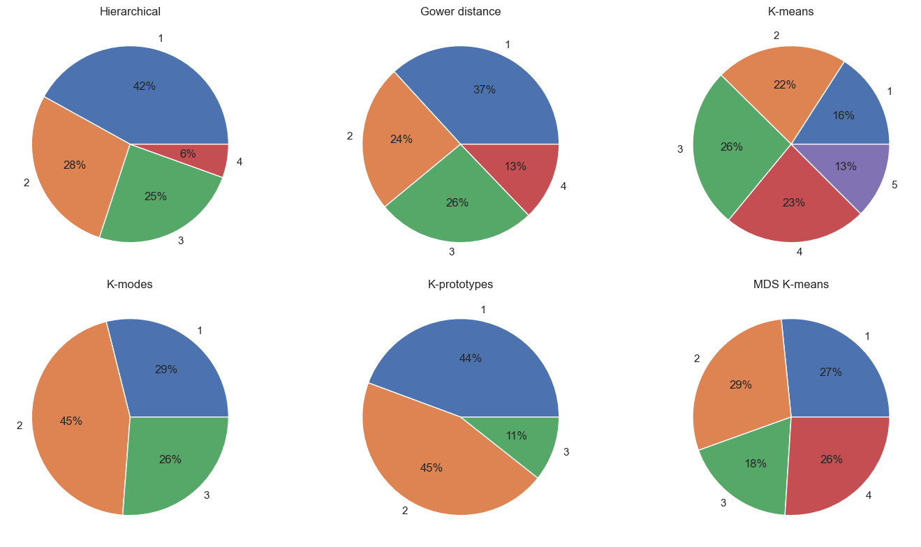
MDS K-means has the most equal split, K-prototypes the least.
It’s worth nothing that we’re not necessarily after an equal split, as that depends on the customers themselves - if we had a dataset with 9 men and 1 women, we’d expect a 90%:10% split. Without further information it’s impossible to determine which split is best.
Metrics
I also used statistical techniques to assess how good each clustering is. In particular, there is the Silhouette score, which measures how similar a point is to its own cluster compared to other clusters, and the David-Bouldin Index, which measures the average similarity ratio of each cluster with the cluster that is most similar to it. I used the single DataFrame with all the clustering results, and looped through it, the key code being:
labels = df_customers_clusters[method]
silhouette_score(df_customers_clusters.drop(columns=[method]), labels)
davies_bouldin_score(df_customers_clusters.drop(columns=[method]), labels)
A good clustering would have a Silhouette score close to 1 and a DB score close to 0. Surprisingly:
| Hierarchical | Gower | K-means | K-modes | K-prototypes | MDS K-means | |
|---|---|---|---|---|---|---|
| Silhouette Score | 0.81 | -0.1 | -0.11 | -0.02 | 0.14 | -0.09 |
| Davies-Bouldin Index | 0.32 | 7.48 | 7.54 | 5.55 | 2.29 | 14.39 |
Hierarchical is by far the best, with K-prototypes a distant second.
The winner!
Heirarchical is so far ahead with the metrics, I think it has to be the winner. Additionally, the groupings seem to make sense. As a reminder:


| Cluster | Label | # | % |
|---|---|---|---|
| 0 | Very average | 839 | 42% |
| 1 | Below average careers, mostly younger married women | 560 | 28% |
| 2 | Above average careers, mostly older unmarried men | 491 | 25% |
| 3 | Older men with successful careers in big cities | 110 | 6% |


Looking at the plots alone does suggest this clustering was decent… Probably could have saved myself a bunch of time! It was a fun experiment none-the-less, and the best clustering technique cannot always be determined visually alone.
Next steps
I’ll add the cluster group to the DataFrame, and export it to a CSV:
df_customers_final = df_customers.copy()
df_customers_final['Cluster'] = clusters_hier
df_customers_final.to_csv('customers-segmented.csv')
Which I’ll use for classification and purchase analysis! Coming soon…
