Predicting Belgium’s future solar PV generation: Part II
This is part two of a two-part series. Part one covered collecting and processing the data, then assessing the forecasts in the dataset. It also contains the link to the dataset and repo. This part covers my predictions, using machine learning.
Intro
OK, we’ve looked at the data, and we’ve seen how accurate their predictions are/were. Can I do any better?
I’m taking three approaches: SARIMA, TensorFlow, and Prophet.
A quick aside: Why do we want to predict the future energy generation? There are a number of reasons.
For one, electricity must typically be used as soon as it is generated - it cannot currently easily be stored, especially not vast amounts for extended durations. To avoid grid instability, supply must meet demand in real time to avoid having too much or too little power on the grid. Being able to forecast intermittent energy resources like solar enable an energy system operator to plan and ensure the grid remains balanced.
A second reason is for investment; being able to accurately predict generation potential enables more precise and more accurate return-on-investment calculations for those wanting to invest in renewable energy projects.
Anyway, on to the analyses!
SARIMA
SARIMA stands for Seasonal AutoRegressive Integrated Moving Average. Breaking it down:
- AutoRegressive is the core of the model, focussing on the relationships between the current value and previous values.
- Moving Average means it incorporates previous forecast errors, not only previous values.
- Integrated means it tries to make the series stationary (i.e. a stable mean and variable) by removing trends that could skew AR and MA.
- Seasonal means it attempts to incorporate regular cyclical patterns, such as daily, monthly, annually, etc.
In the ideal world I’d use SARIMAX, with the X standing for exogenous (i.e. external) data such as weather forecasts, although sadly I don’t have that.
Let’s get to it.
The process
I used pmdarima’s auto ARIMA module to find the optimum models for predicting. Auto ARIMA goes through a large number of ARIMA combinations to find the best one, determined by default as the one with the lowest AIC (Akaike information criterion). It follows a stepwise algorithm. The core of my code is:
model = auto_arima(df, seasonal=True, m=m, stepwise=True, error_action="ignore", trace=True)
m is the seasonal period. In my case, the data is every 15 minutes, so 96 values a day, so for a daily “season”, m is 96.
Once you have the model, you can predict the following values using:
predictions = model.predict(n_periods=p)
Where p is calculated the same as m - for example, seven days of predictions would be 96*7 = 672.
If I do the predictions for a period in the past, where actual data already exists, I can use my custom function to compare them, same as I did for Elia’s forecasts in part 1. This gives me an idea of how good the model is. In this case, the code is:
preds_vs_actual_stats_df(df_actual.measured, df_predictions[0])
The final thing is to plot them, using Matplotlib/Seaborn, to visually assess the predictions.
sns.lineplot(df.measured, color = 'black', label='Actual')
sns.lineplot(df.forecast_week, color='grey', alpha=0.5, label='Their week-ahead forecast')
sns.lineplot(df_predictions[0], color = 'red', label='My forecast')
I combined all of this into a custom function, so that, in one command, I could go from inputs to predictions, stats, and graphs.
The data
What data to use?
Shoving in the entire dataset didn’t work well. The dataset is huge, meaning large processing and memory requirements, and my laptop couldn’t handle it well. I cut it down slightly, and was able to get some results, but because the data is so volatile, the model failed to capture the variations well, so the predictions were useless.
As such, there are a few of paths forward:
- Use a subset of the data. Building a model using only 7 days is a lot easier than using 1400. Of course, this won’t capture longer-term patterns, but it might be better at predicting short-term trends. Additionally, it may be possible to capture longer-term patterns through multiple models.
- Sample the data. For example, instead of using 15-minutely data, use hourly data (
1h), taking the average of the four values. This is done simply withdf.resample('1h').mean(). Note this also changesm, as there are now 96/(60mins/15mins)=24 samples per day. - Smooth the data. This removes some of the volatility (such as due to a passing cloud), which makes it easier for the model to predict. This can be done with
df.rolling(window=w).mean(), wherewis the number of periods to smooth.
Typically it’s better to smooth before downsampling, if doing both.
The waiting
I incorporated these into my function. For the subset, I used a start date and “days back” as inputs, and the function calculated the data automatically. I also did “days forward” to tell the model how many days to predict. reduce determines whether you sample, smooth, or both, with sa and sm being how much to do so. This is the final form of my final function (full code in the repo, link in part 1):
def run_model(df_in, start, back, pred, reduce, sa, sm, m, info=True, trace=True, stats=True, plot=True, plot_title='', save=False, file_title=''):
Finally, set the variables, and call the function:
start = '2022-06-01'
back = 7
pred = (7,1)
sm = 4
sa = 1
m = int(96/4/sa)
arima_file_title = f'belgium_{start}_{back}d_{pred}d_arima_sm{sm}sa{sa}'
arima_plot_title = f'Belgium, {back}d history, {pred}d forward (sm{sm}sa{sa})'
run_model(df_in=df_be_arima, start=start, back=back, pred=pred, reduce='both', sm=sm, sa=sa, m=m, info=True, trace=True, stats=True, plot=True, plot_amount='all', plot_title=arima_plot_title, save=True, file_title=arima_file_title)
And this is where it gets difficult. What sample rate? What smoothing rate? How long of a window? How long to forecast forward? I tried a bunch. Often I found a sample and smoothing rate that worked for one period, but was terrible for another. So, mostly, it was trial and error.
I needed to automate it, so next I created a sliding window function. Instead of picking a single window, I set an overall start and end date, and modified my function so it would split the period into windows of length “back” and do the process on each. For a year period, this created 365 models - the largest of which was 150MB, so glad I had some storage space to spare. I also updated the function so it could predict multiple days forward, saving the stats and plots to files.
Trialling different window sizes, prediction sizes, and sampling and smoothing rates, literally took dozens of hours, but at least I could do something else while it was chugging away.
The results
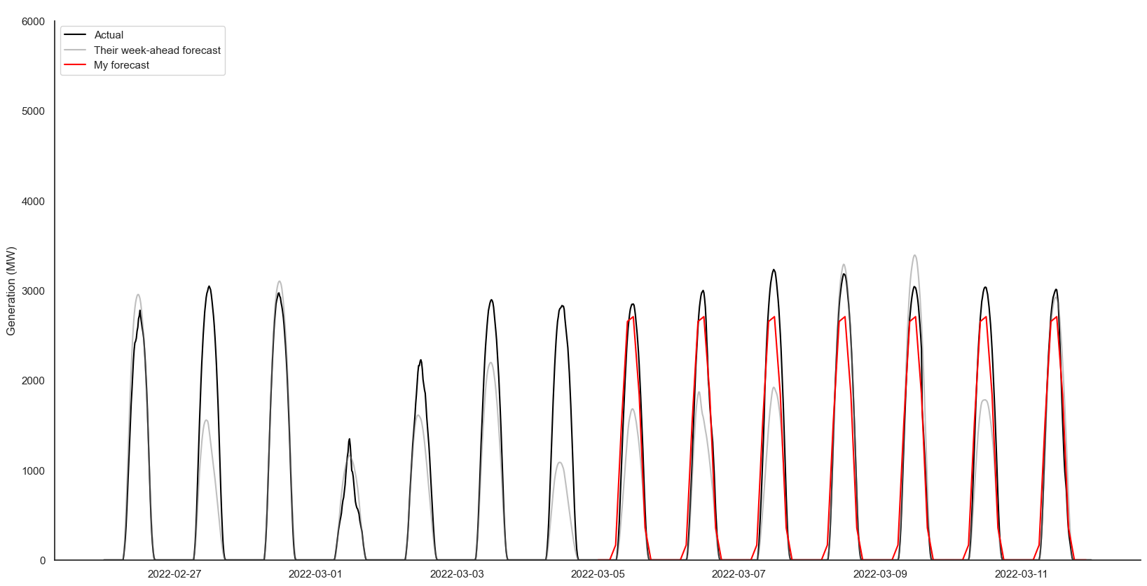
As I had exported the stats to CSV files, I also wrote some code to import and compare the stats for the different models/predictions. The best seven-day-history seven-day-forecast was centred around 5th March, with an R² and correlation coefficient of 0.99 and a MAPE of 10.75. It looks like this:
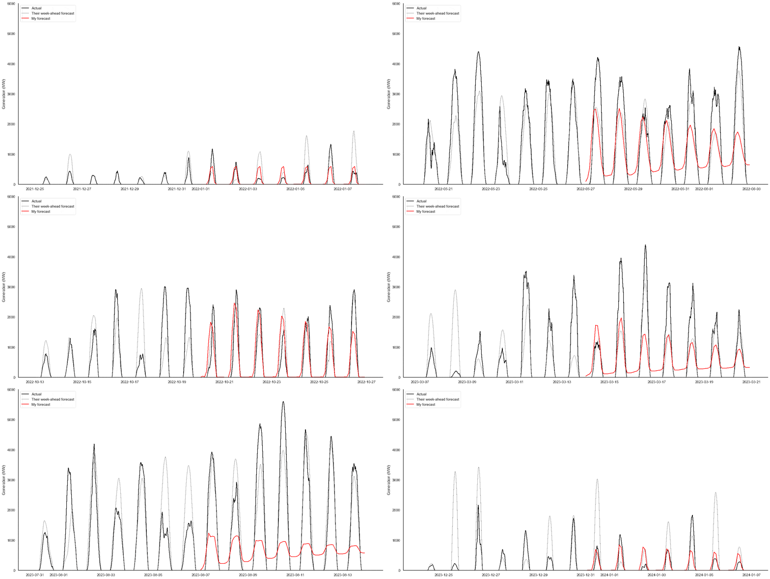
On an impulse I also created an animated GIF out of all the individual seven-day-back seven-day-forward plots. You can see some predictions are decent, some think the sun shines at night, and there are some flatliners:
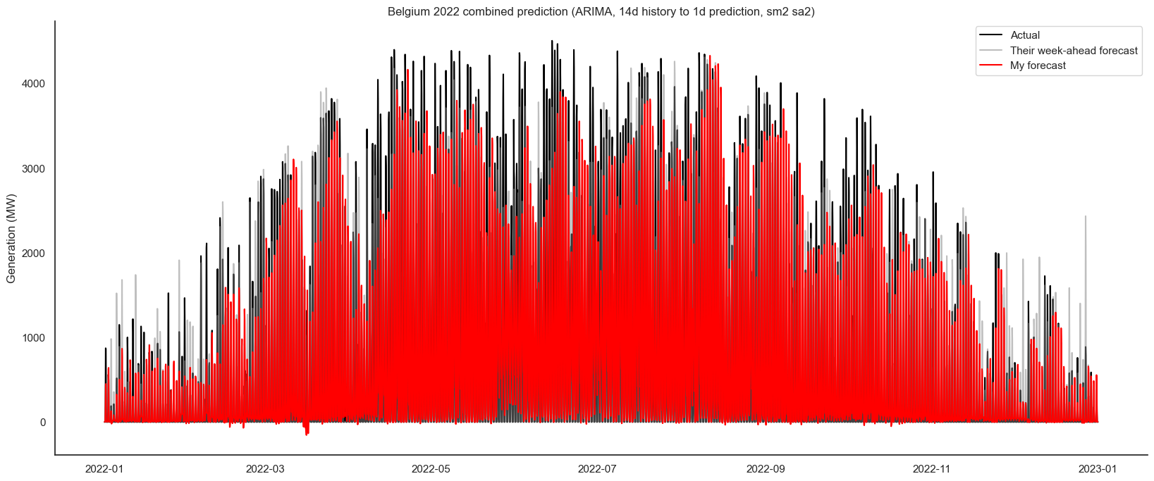
Finally, I wanted to use these to build a whole-year prediction. The individual predictions needed to be combined and averaged - as you can see in the GIF, each date had multiple models predicting the output (e.g. the dataset from 1st-7th predicted 8th-14th, and 2nd-8th predicted 9th-15th, etc), so I had to take the mean prediction for each timestamp.
Out of the combinations I tried, the best R², of 0.80, came from 30 days back to 1 day forecast. The best Mean Annual Percentage Error (MAPE) of 27.68 was from 14 days back, 1 day forward. These were both for a smoothing window of two with two-hourly sampling.

Some of the predictions caused negative forecasts, which worsened the statistics. For example, 7 day back to 1 day forward, to my eye, looks better, as it get the peaks more successfully, but has the negative predictions, which harm the stats:
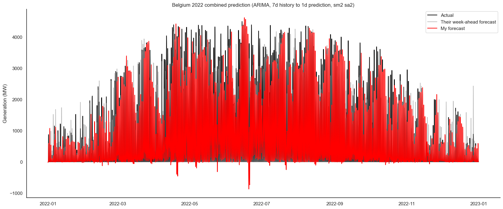
I could improve these by adding logic so that the predictions are never below zero, and so that they always go to zero overnight. However, while this would improve the stats, it wouldn’t improve the overall pattern and peaks, so I opted not to do several more hours of computations.
All the seven-day forecasts performed worse, even with the averaging mentioned above.
Some things to note. To save time, I only looked at 2022, as it was the least volatile year. Doing more years would mean more days (literally) of my computer chugging away doing calculations. I also didn’t do every combination of days back / days forward / smoothing / sampling for the same reason. I did try combining the different forecasts (e.g. combining the 30 day back and 14d back forecasts), but they performed no better.
TensorFlow / Keras
Let’s try something different. Instead of ARIMA-based models, let’s use neural networks; to be precise, long short-term memory (LSTM) with TensorFlow and Keras. Modelling this way can handle larger datasets more easily, so I was able to use larger chunks of the dataset to forecast longer predictions, without sampling or smoothing (likely in part because my laptop has a GPU).
The process
Initially I only used a single feature for the dataset - the measured generation. This is scaled using MinMaxScaler, then X and y are created based on the sequence length, the number of measurements per step. As above, I chose 96 - the daily number of samples.
df_tf_train = df_be[['measured']][date_back:date_train_end].copy()
scaler = MinMaxScaler(feature_range=(0, 1))
df_tf_train_scaled = scaler.fit_transform(df_tf_train)
Then onto the model. A basic one looks like:
model = Sequential([
    LSTM(50, return_sequences=True),
    LSTM(50),
    Dense(1)
])
This is two layers of LSTM of size 50 (return-sequnces because it’s a time series), and Dense (a.k.a the fully-connected layer) which basically ties everything together.
Next, compile and fit i.e. train the model. To avoid data leakage given the linear nature of a time series, I manually split X and y into training and validating data. The fitting iterates to reduce the loss; I set early stopping so it stops when it notices the model is not improving, rather than doing a pre-set number of attempts (epochs).
early_stopping = EarlyStopping(monitor='val_loss', patience=5, min_delta=0.001, mode='min', restore_best_weights=True)
model.compile(optimizer=Adam(learning_rate=0.0001), loss='mse')
history = model.fit(X_train, y_train, epochs=100, batch_size=32, validation_data=(X_val, y_val), callbacks=[early_stopping], verbose=0)
Then to check the model against the actual data. The model predicts the values of y based on X , i.e. it uses the same data as was used to train the model, so should be pretty good. After predicting, the scaling needs inverting:
predictions = model.predict(X)
predictions = scaler.inverse_transform(predictions)
Now, forecasting the future. Starting with the last value of the known data (X), a prediction is made, then this new prediction is used to predict future values. This sequence of predictions is stored, and this cycle repeats until we have the desired number of predictions. Based of this forward propagation, I decided to ensure the prediction was not negative. As with the predictions, the scaling needs inverting:
last_sequence = X[-1].flatten()
for _ in tqdm(range(forecast_period)):
    current_sequence = last_sequence.reshape(1, seq_length, 1)
    next_prediction = np.float32(np.maximum(model.predict(current_sequence, verbose=0)[0][0],0))
    forecast.append(next_prediction)
    last_sequence = np.append(last_sequence[1:], next_prediction)
forecast = scaler.inverse_transform(np.array(forecast).reshape(-1, 1))
Finally, plot and stats!
The results
First, how does this compare with the best seven-day-history seven-day-forecast SARIMA found:
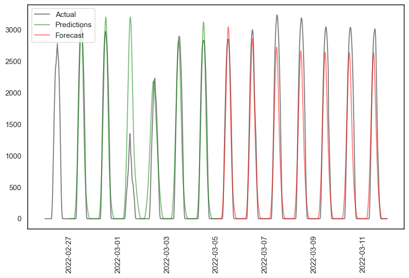
The predictions based on existing data weren’t great, R² of 0.8 (see the mismatch in the fourth day). The forecast didn’t perform quite as well as ARIMA, with an R² of 0.89, but it’s not bad. When I used the same (re-trained) model with five years of data to forecast six months, it didn’t do well:
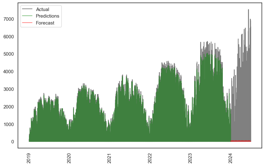
Yes, that red bit is the forecast. Not particularly good. On the other hand, the green prediction is excellent, although misses the long-term peak growth trends.
It should be noted this isn’t comparable to the full-year prediction I did with SARIMA. This is using all the data to do the entire forecast. The processing requirements for ARIMA to do a similar operation was too much, so that is the average of 365 individual one-day predictions - so it’s natural that it’s better.
The improvement attempt
Let’s see if we can improve our results. As mentioned earlier, we can add more features. More features means more correlations the neural network can investigate to integrate into the model. That said, it also increases complexity and processing time, and may lead to overfitting. I opted to add:
df_tf['day_of_year_sin'] = np.sin(2 * np.pi * df_tf.index.dayofyear / 365)
df_tf['day_of_year_cos'] = np.cos(2 * np.pi * df_tf.index.dayofyear / 365)
df_tf['hour_sin'] = np.sin(2 * np.pi * df_tf.index.hour / 24)
df_tf['hour_cos'] = np.cos(2 * np.pi * df_tf.index.hour / 24)
Sine and cosine are used because it makes the flow of values smoother - for example, the hours cycle smoothly from 0-1-0, not 0-24 then jump back to 0.
Additionally, the model itself can be changed. You can change the size of the LSTM, add more LSTM layers, add dropouts (to avoid overfitting), add a 1D convolutional layer (tries to capture patterns or features) and a 1D max pooling layer (simplifies the Conv1D to improve efficiency and reduce overfitting), and lots more. I made a bunch of models then looped through fitting them to find the one with the lowest loss, validation loss, and lowest delta between the two. I even went as far as actually doing the full process, including fitting, prediction, forecasting, and plotting, on a range of models - this took hours. The “winning” model was:
model = Sequential([
    Conv1D(128, 3, activation='relu', input_shape=(seq_length, num_features)),
    LSTM(50, activation='tanh', return_sequences=True),
    LSTM(50, activation='tanh', return_sequences=True),
    LSTM(50, activation='tanh', return_sequences=True),
    LSTM(50, activation='tanh', return_sequences=True),
    LSTM(50, activation='tanh'),
    Dense(1)
])
How does our week-back-week-forward look now?
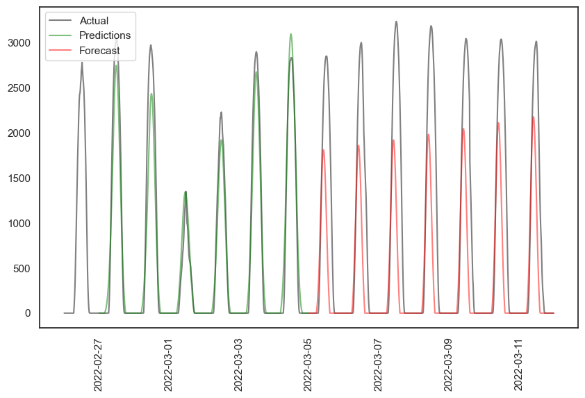
The prediction is better, R² of 0.95 (the fourth day in particular is far better), but the forecast R² drops to 0.4! It’s definitely underpredicting. And what about the full dataset?
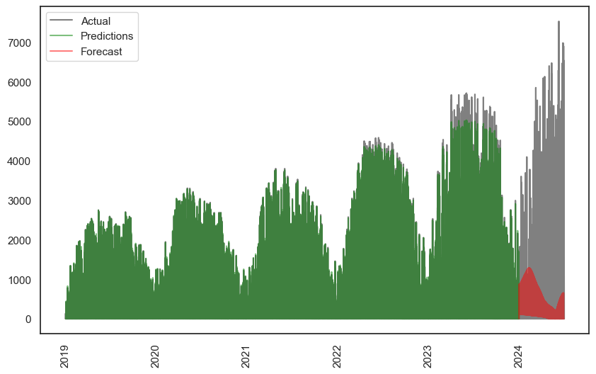
The green prediction is still excellent, although it continues to miss the long-term peak growth trends. The red forecast is better than the single-feature simple-model version, but still terrible.
At this stage I decided to park TensorFlow. I’m sure I could get better results by varying the model, add more features such as lags or moving averages, do another custom sliding window similar to ARIMA, or combine different models for different timeframes (e.g. a day model, and month model, a year model). However, at this stage I’d hit my head against a wall enough times for this fun personal project that. Another few weeks of processing time for a small improvement was not worth it at this stage, given the clear limitations of the data. Plus, I have more projects to work on!
Prophet
I also gave Prophet a go. I had issues running it on my computer (RuntimeError: Error during optimization!), and looking at the Prophet GitHub, I wasn’t the only one. However, I found it worked on Google Colab.
I decided to not go as in-depth as either TensorFlow or SARIMA; I was just curious to give it a go.
After pre-processing the data, the basic code for Prophet is super simple. This is it in its entirety:
m = Prophet(daily_seasonality=True, yearly_seasonality=True)
m.fit(df)
future = m.make_future_dataframe(periods=samples_per_day*days_to_predict, freq="15min")
forecast = m.predict(future)
m.plot(forecast)
m.plot_components(forecast)
Yes, that’s it. Build the model, fit it, predict the future. Prophet combines the predictions for the existing data and the forecasting into the future within the predict method. Nice and easy eh?
Let’s see how our favourite March date looks, using Prophet’s build-in plot method:
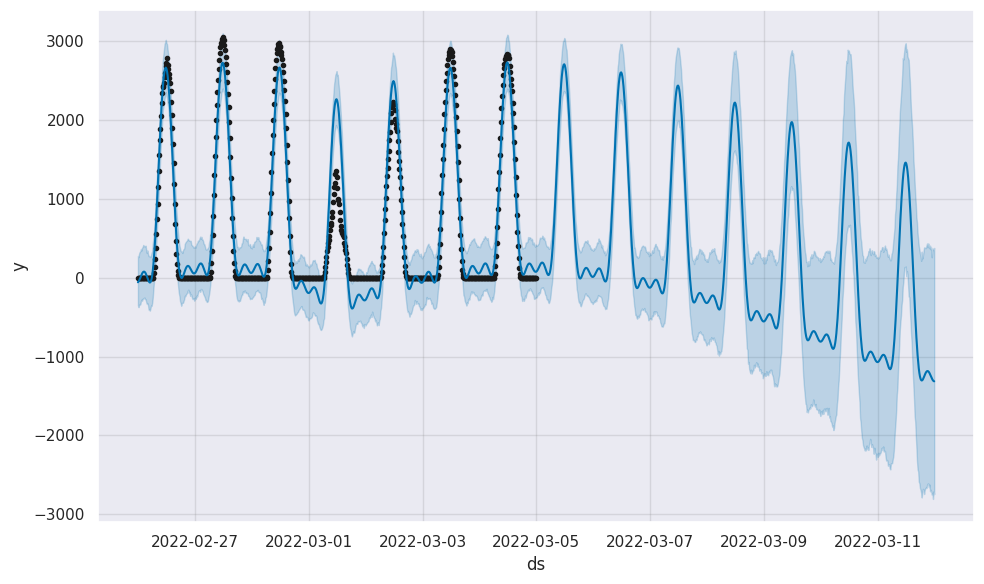
It’s nice that Prophet also adds confidence levels automatically. It’s less nice that it predicts Belgium solar generation will crash, and soon be more negative than positive.
And what about using all the data? Luckily Prophet can predict this in only a few minutes, whereas TensorFlow took an hour or two, and in SARIMA it was effectively impossible. We get:
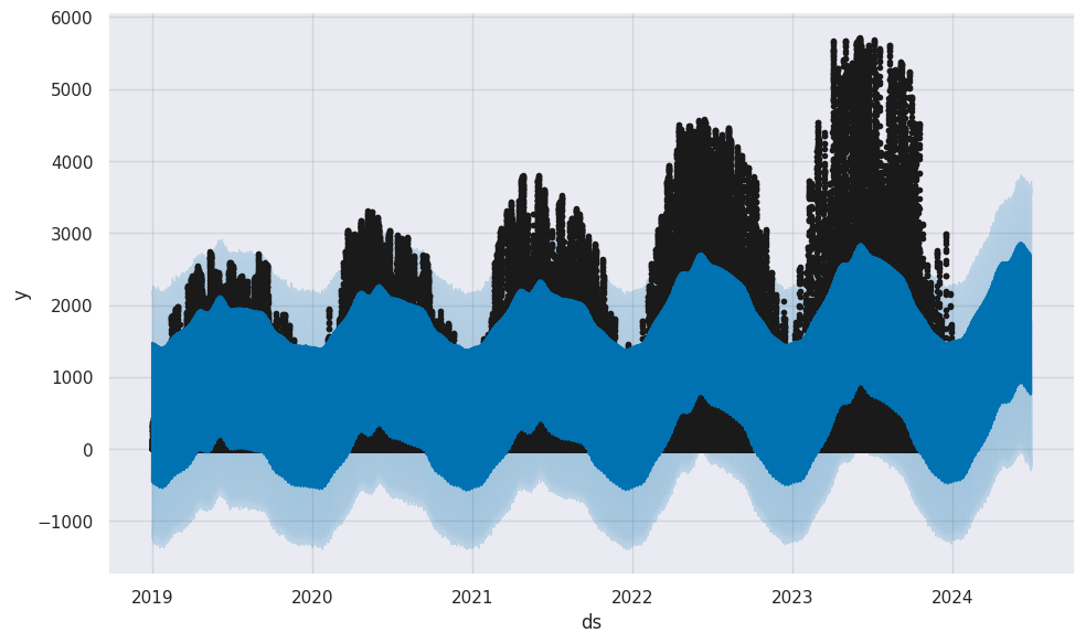
For some reason, the floor feature didn’t work, so we get negative predictions. However, it definitely gets the patterns, better than the other methods, although it misses the magnitudes.
Prophet also shows the individual components in a single command:
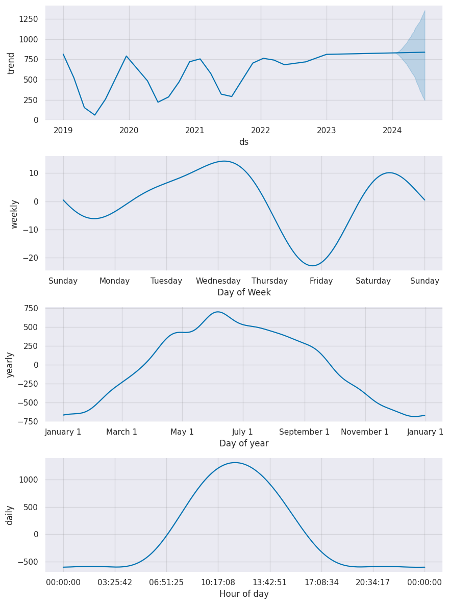
We can see from the first plot it doesn’t capture the upwards trend, and weirdly flattened out from 2022. Days is interesting; my part 1 analysis had Wednesday as the best day, Thursday as the worst, whereas while this model agrees with Wednesday, it thinks Friday is worse. Hours and months are similar.
Conclusion
Unsurprisingly, Elia’s predictions are better than mine.
Forecasting future solar PV generation using only historical data is hard. When I worked in the solar industry and had to generate forecasts, we used the system capacity (i.e. how much it would generate on a perfect day), geographical data (to understand the path of the sun), and, for shorter-term forecasts, weather data (to see how much of the sun would be obscured). This clearly is a more sensible way if you want accurate predictions.
That said, given I was only using historical data, I’m actually pretty satisfied with my results. The SARIMA short-term predictions were typically quite good, and the long-term averaged one captured the annual trend and a decent amount of the daily variety, and mostly avoided negative predictions without needing to be told. I didn’t get such great results from TensorFlow and Prophet, but that’s likely due to not spending enough time tweaking. I also didn’t try the averaged-prediction method I did for SARIMA, as the short-term predictions seemed worse, but it’s possible the combinations may have been better than the default all-history approaches.
It’s also notable that ARIMA created “spikier” predictions with sharper shifts, whereas both TensorFlow and Prophet’s predictions were more smooth and sinusoidal in nature. I’d imagine the best results would come from a combined approach, using multiple models based on multiple libraries, taking in different amounts of historical data and predicting different periods into the future. However, I set myself a deadline for this project, and that is now reached. Even so, I do look forward to doing some more time series modelling in the future - although perhaps next time I’ll pick something a little less volatile and relying less on exogenous data!
