Predicting Belgium’s future solar PV generation: Part I
This is part one of a two-part series. This part covers collecting and processing the data, then assessing the forecasts in the dataset. Part two covers my predictions.
Intro
I have a friend who owns a solar management platform, and he asked me to investigate some solar PV generation data provided by Elia, one of Belgium’s transmission system operators. The data includes measured solar PV generation by region, along with their various forecasts.
The data is available here: https://opendata.elia.be/explore/dataset/ods032
The full code of my analysis is available here: https://github.com/jamesdeluk/data-projects/tree/main/solar-pv-time-series-forecasting
For those who don’t know, Belgium is split into Brussels, Flanders in the north (consisting of West Flanders, East Flanders, Antwerp, Flemish-Brabant, and Limburg), and Wallonia in the south (consisting of Hainaut, Walloon-Brabant, Namur, Liège, and Luxembourg - not to be confused with the country of Luxembourg, which it borders). The dataset contains individual and combined data.
Collect and process the data
Elia provides two ways to collect the data, via file download or via API. File download is of course easiest, and they provide it in multiple forms - CSV, JSON, Excel, and Parquet. Initially I used the CSV, to do some quick initial analysis, but later on I built some code to use the API. Why?
- Rather than downloading the entire dataset each time I wanted to get an update, instead I could simply get the new days - much faster, and lower bandwidth usage.
- The entire dataset includes data I didn’t need, such as P10 and P90 values - using the API I could only download the data I wanted, which saves storage space.
The API only returns a maximum of 100 results per call, and each day for each region (of which there are 14) has 96 values, so I created loops to get one day for one region per call. I didn’t get up to today, as I didn’t want partial day data - in fact, often the latest data was more than 24 hours old, so either check the data on the webpage itself, of give yourself a couple of days slack.
df = pd.DataFrame()
start_date = datetime(2018, 10, 1) # first day of data
end_date = datetime(2024, 10, 27) # the end date used in this analysis
date_list = [start_date + timedelta(days=x) for x in range((end_date - start_date).days + 1)]
regions = ['Wallonia', 'West-Flanders', 'Flanders', 'Antwerp', 'Belgium', 'Walloon-Brabant', 'Brussels', 'Limburg', 'Liège', 'Luxembourg', 'Namur', 'East-Flanders', 'Flemish-Brabant', 'Hainaut']
max_iterations = len(date_list) * len(regions)

with tqdm(total=max_iterations, desc='Fetching data') as pbar:
    for region in regions:
        for date in date_list:
            url = f"https://opendata.elia.be/api/explore/v2.1/catalog/datasets/ods032/records?select=datetime%2C%20region%2C%20measured%2C%20mostrecentforecast%2C%20dayaheadforecast%2C%20weekaheadforecast&limit=100&refine=region%3A%22{region}%22&refine=datetime%3A%22{date.year}%2F{date.month:02d}%2F{date.day:02d}%22"
            r = requests.get(url)
            if r.status_code == 200:
                temp_df = pd.DataFrame(r.json()['results'])
                df = pd.concat([df, temp_df], ignore_index=True)
            pbar.update(1)

df.datetime = pd.to_datetime(df.datetime, utc=True)
df.datetime = df.datetime.dt.tz_localize(None)
df.set_index("datetime").sort_index().reset_index().to_csv('ods032-api.csv', index=False)
Once I had this original dataset, I created a modified code cell to only get the new data, being sure to sort and reset the index. The key code:
api_data = pd.read_csv('ods032-api.csv')
new_start_date = datetime.strptime(api_data.iloc[-1].datetime,'%Y-%m-%d %H:%M:%S') + timedelta(days=1)
new_start_year = new_start_date.year
new_start_month = new_start_date.month
new_start_day = new_start_date.day
start_date = datetime(new_start_year, new_start_month, new_start_day)
To be safe, it’s good to check for (and potentially drop) duplicates.
df.duplicated().sum()
# df.drop_duplicates()
Finally, time to clean and process the data. An iterative process, but not much needed doing apart from fixing the index (as it’s a datetime) and filling missing values. I also found the downloaded CSV and the API provided different column names, so I ensured they were the same, regardless of data source. I also made some filtered datasets, as for this analysis I’m focussing on Belgium as a whole (which is a combination of the rest of the data), and I created a fullyears DataFrame, as some analyses won’t work as well with partial years (for now I’ve put the dates manually).
df = df.rename(columns={'Datetime':'datetime',
                        'Region':'region',
                        'Measured & Upscaled':'measured',
                        'Most recent forecast':'forecast_recent',
                        'Week-ahead forecast':'forecast_week',
                        'Day-ahead 6PM forecast':'forecast_day',
                        'mostrecentforecast':'forecast_recent',
                        'dayaheadforecast':'forecast_day',
                        'weekaheadforecast':'forecast_week'})
df.datetime = pd.to_datetime(df.datetime, utc=True)
df.set_index("datetime", inplace=True)
df = df.sort_index()
df = df.ffill().bfill()

df_be = df[df.region == 'Belgium'].drop(['region'], axis=1).copy()
df_be_fullyears = df_be['2020-01-01':'2023-12-31'].copy()
Exploring the data
Describe
describe() is always a good start. I had to set pd.options.display.float_format = '{:,.2f}'.format to avoid horrible numbers.
| measured | forecast_recent | forecast_day | forecast_week | |
|---|---|---|---|---|
| count | 2,982,336.00 | 2,982,336.00 | 2,982,336.00 | 2,982,336.00 |
| mean | 137.48 | 136.36 | 136.88 | 129.52 |
| std | 430.63 | 421.82 | 424.47 | 393.9 |
| min | 0 | 0 | 0 | 0 |
| 25% | 0 | 0 | 0 | 0 |
| 50% | 0.14 | 0.5 | 0.51 | 0.42 |
| 75% | 75.69 | 77.13 | 77.8 | 78.17 |
| max | 7,526.47 | 7,055.24 | 7,280.85 | 6,512.31 |
Almost 3,000,000 datapoints. Unexpected, the lowest was 0 (no generation at night), which also brought the mean very low. However, at the peak, Belgium generated up to 7.5MW from PV - not bad. The forecast figures look pretty similar too, suggesting they may be quite accurate.
Plots
Visualising time series data is always one of the best ways to start.
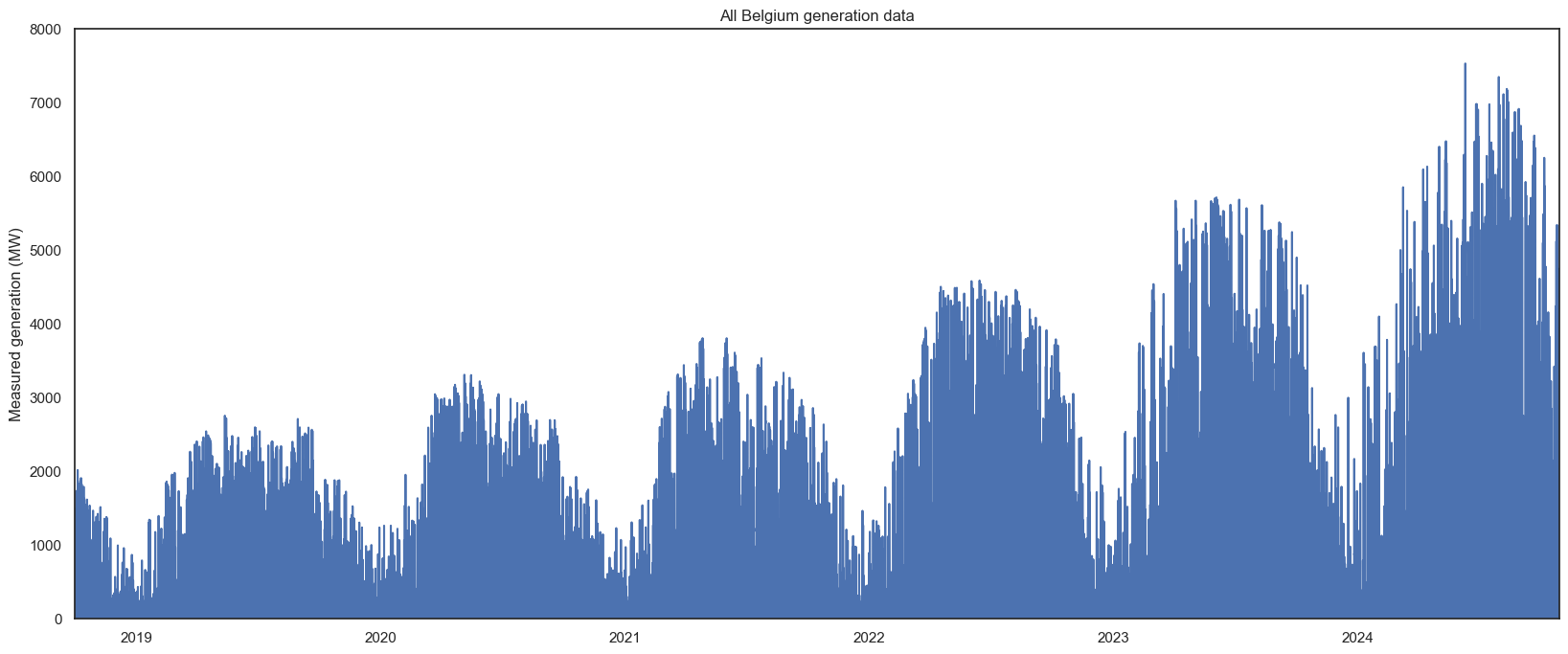
All the data:
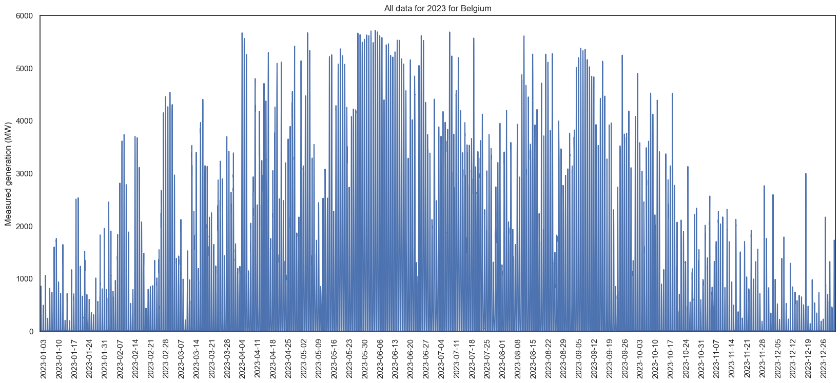
A single year (2023, the most recent complete year), in more detail:
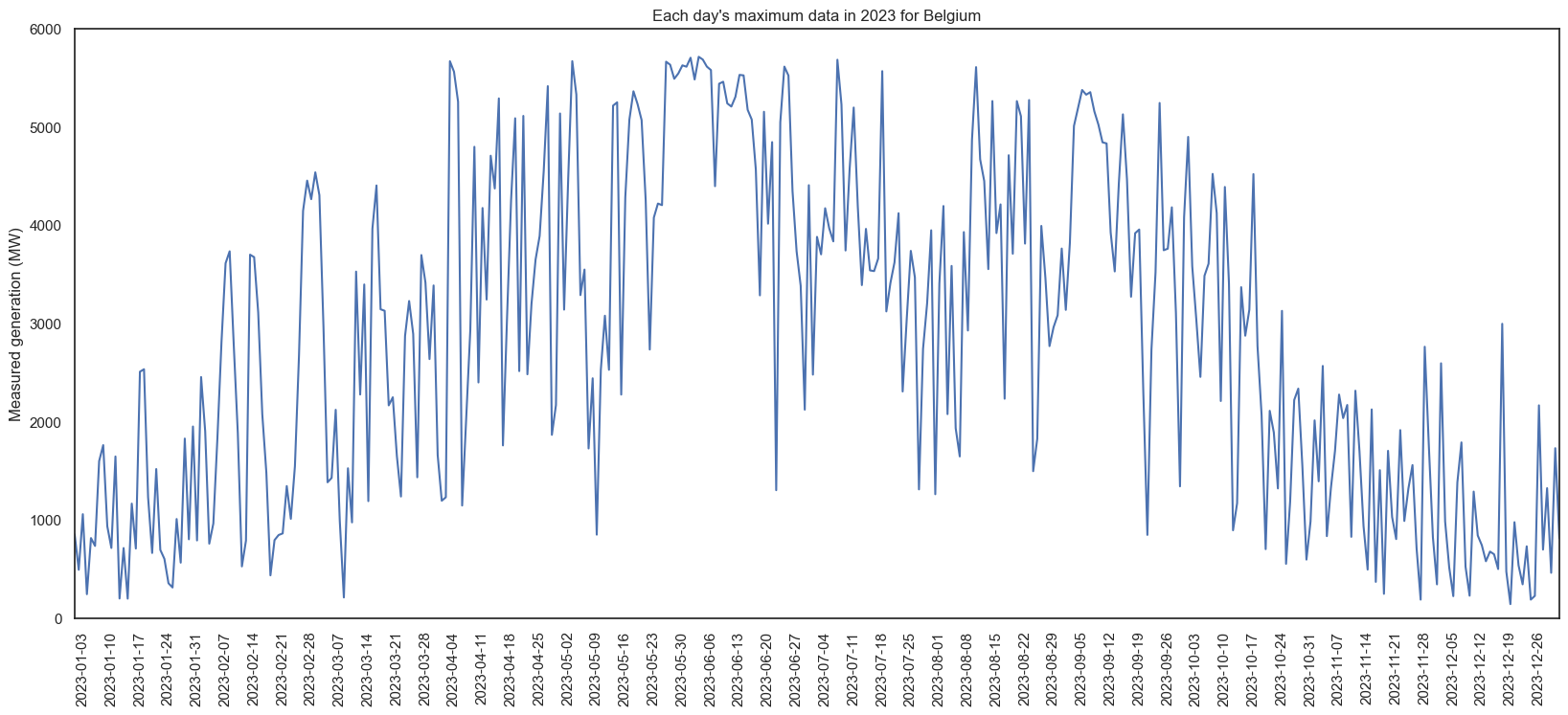
Only the maximum values for each day:
And monthly smoothed data:
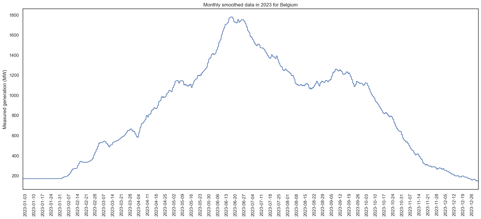
I love graphs. As expected, more generation in summer than winter. In 2023, September was higher than August - and looking at the graph with all years, most years seem to have an unexpectedly low periods among higher ones. Based on the maximums, we can also see the daily max varies dramatically - in 2023, June had a day of ~1000 and ~6000 within a few days. I predict all this is going to make forecasting without exogenous data (e.g. weather) very difficult.
Also, let’s see a random day:
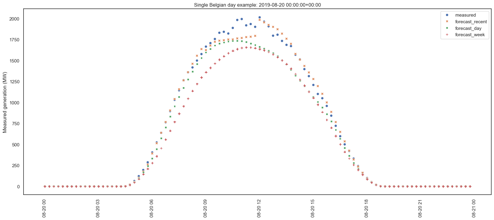
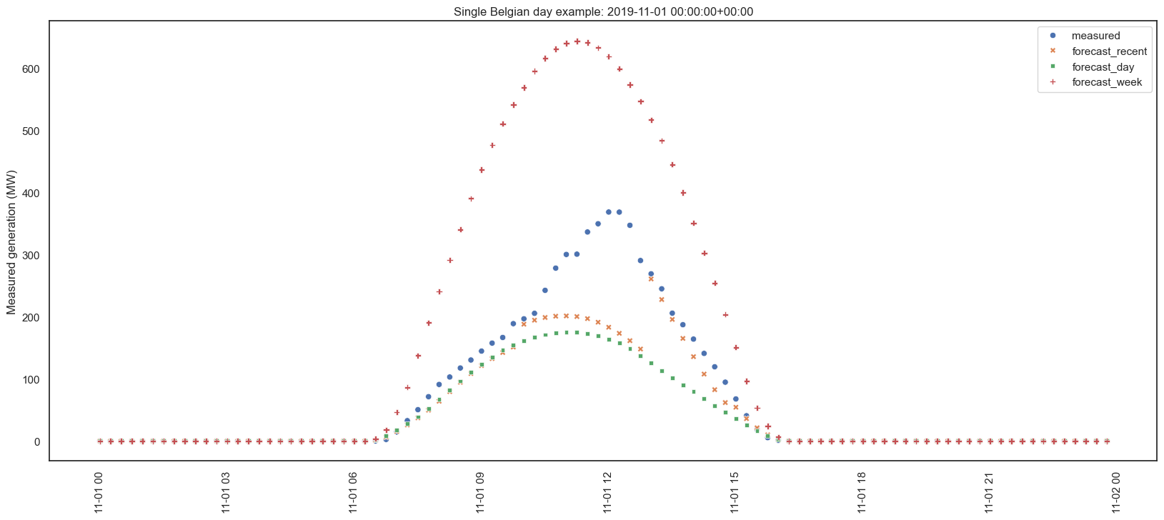
Sometimes the forecasts are pretty good. But sometimes they aren’t:
Grouped by timeframe
What’s the average hour, the average day, the average month, and the average year? This averages the data from the timeframe across the entire dataset, i.e. every Monday, regardless of month or year.
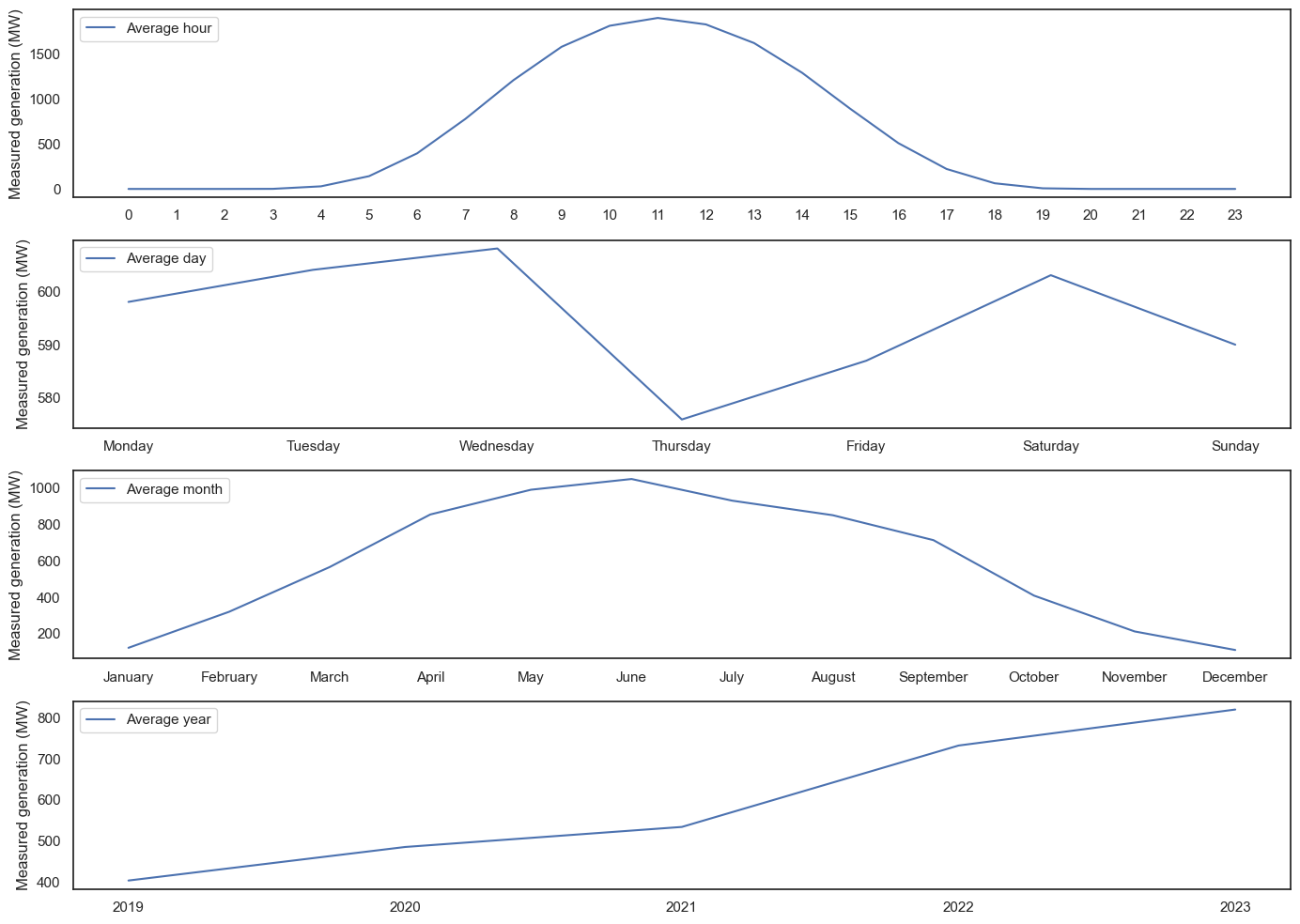
The day looks as expected - a clearly example of reversion to the mean! Interestingly, Thursday was a low-PV day, based on the average of over 25,000 values - however, looking at the actual numbers, it’s only 5% lower than the highest day (Wednesday), so not as dramatic as the graph makes it look. Months are similar to days, and it’s likely that with more data, over more years, this would smooth out. And the year is a fairly linear increase - presumably due to increased installed capacity and not that, over 4 years, Belgium has become twice as sunny!
Variability
Next, let’s get some basic stats. This is for the fullyears data:
| Metric | Value |
|---|---|
| Coefficient of Variation | 1.672 (167.2%) |
| Average Hourly Variation | 57.516 |
| Average Daily Variation | 737.438 |
| Average Monthly Variation | 814.156 |
| Interquartile Range (IQR) | 851.291 |
In short, the data is very variable. The daily variation is almost as high as the monthly variation - weather is almost as important as season.
STL decomposition
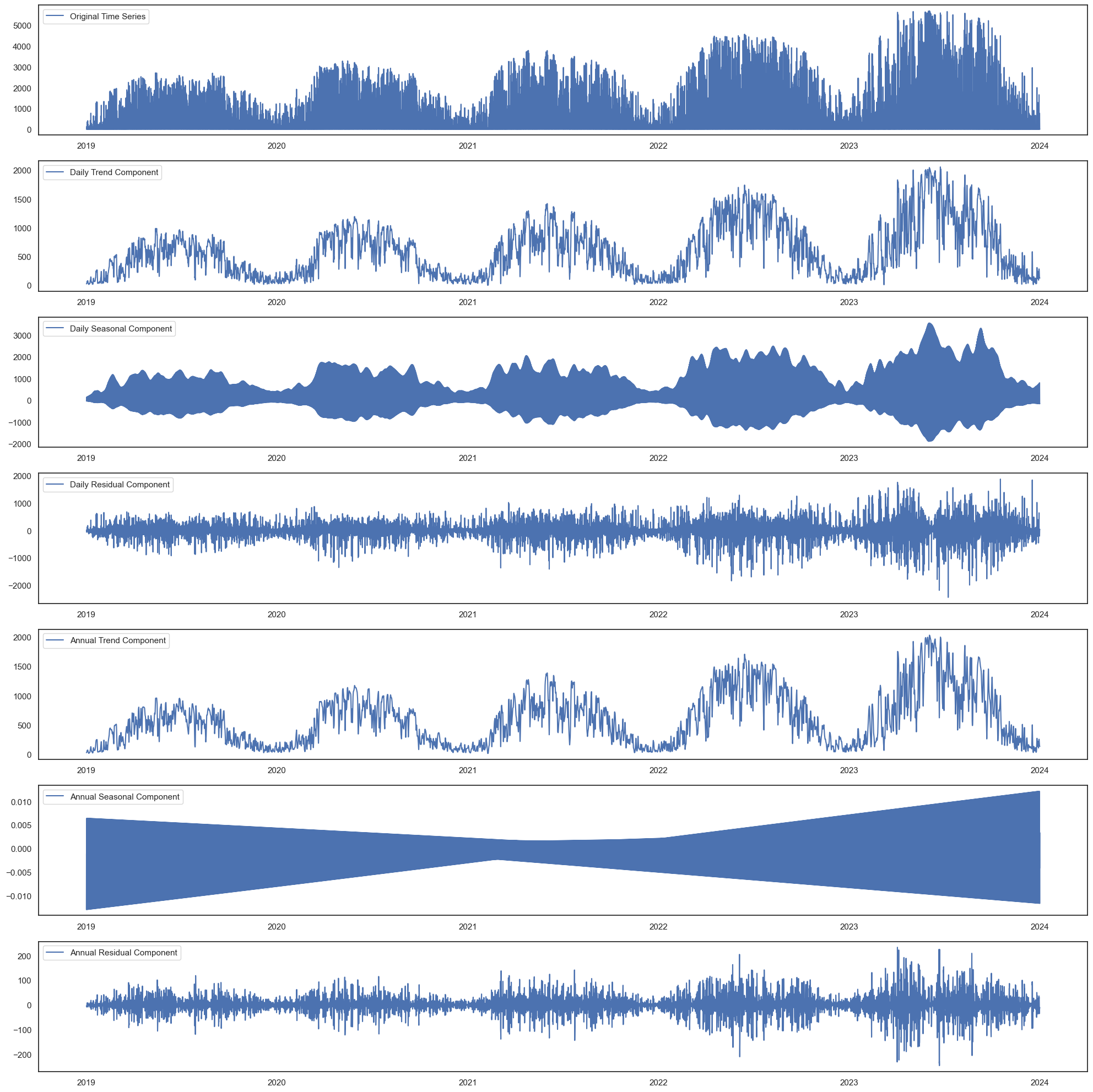
Seasonal and Trends decomposition attempts to extract seasons/trends from the data. This data is quite complicated, with daily cycles, annual cycles, and annual trends. Luckily, the statsmodels package has a module for STL analysis. After resampling the data from 15-minutely to hourly, I first did a daily analysis, with a period of 23 (the ideal period is 24, for 24 hours, but it needed an odd number; I found 23 performed better than 25), then an annual analysis, with 8759 hours (one year is 8760). The STL module has two options, robust and not robust. Robust reduces the influence of outliers.
This is not robust:
This is robust:
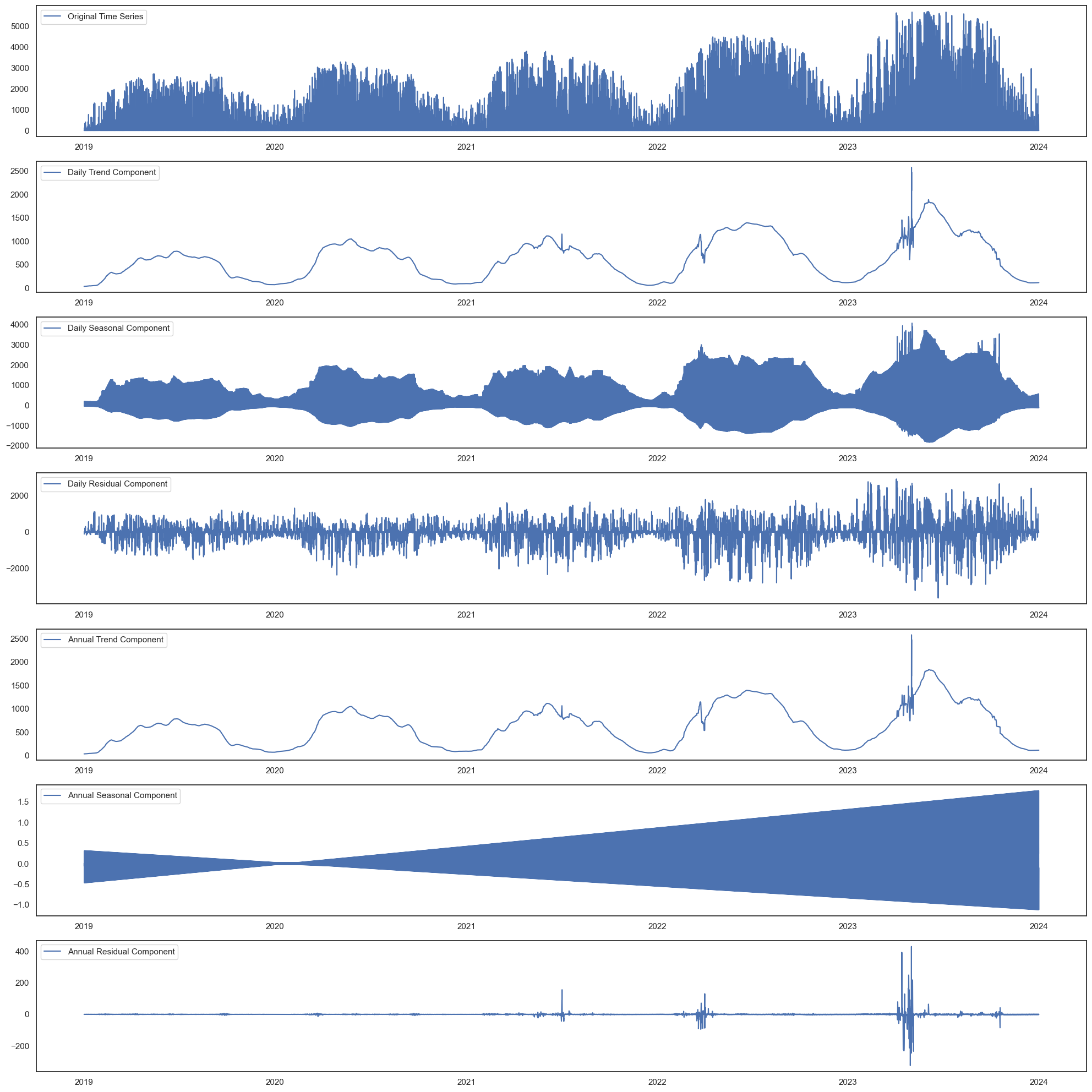
The robust analysis looks better, with smoother lines and lower residuals, especially on the annual level. However, the daily residuals are huge (some over 3000!), suggesting a lot of volatility, especially in summer - which makes sense, as winter it doesn’t matter if it’s cloudy or not as the solar irradiation is weak.
Visualised distributions
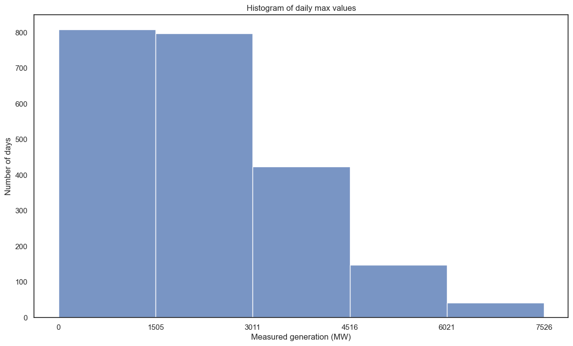
I was also curious to see how many values fall into each 20% bracket. First I tried a histogram:
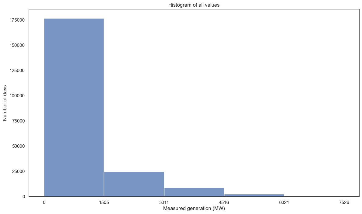
Ah, yeah. Lots of 0s. Let’s try something different - take the daily maximum value:
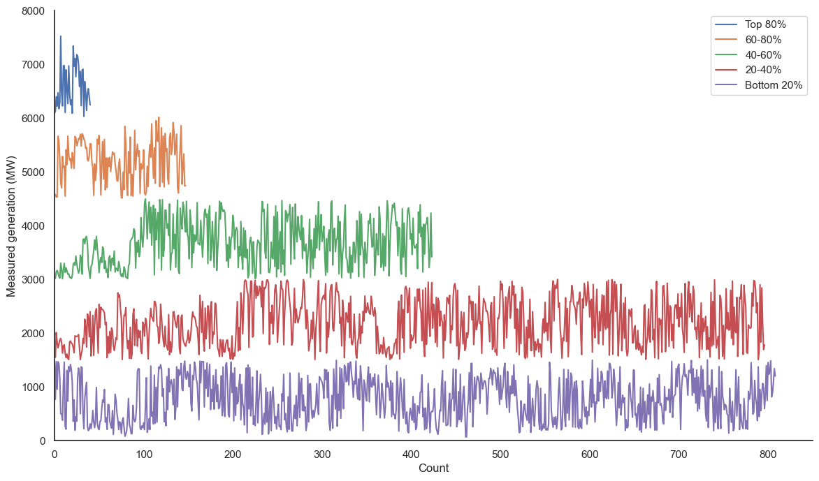
I was also curious to show this data in a line graph form, similar to the generation-over-time plots above. Below is effectively a histogram on its side, but instead of simple buckets, it has the actual data points, with relative time for each line (i.e. the left of each line is 2018 and the right of each line is 2024, and the points are in temporal order). The actual x axis is the count of points, same as the histogram y.
Stationarity
Stationarity is when the statistical properties - namely mean and variable - of a time series do not change. Again, statsmodels made this easy, with their Augmented Dickey-Fuller (ADF) function (adfuller(df_be.measured, autolag='AIC')). The null hypothesis is non-stationarity. The results:
(-11.94507306500257,
4.449909467141862e-22,
82,
212941,
{‘1%’: -3.4303807098155406,
‘5%’: -2.8615535733366726,
‘10%’: -2.5667772245983227},
2141580.3188957865)
-11.95 is less than all the % values, suggesting stationarity. Also, the p-value is tiny (0.000000000000000000000044), far less than 0.05, also suggesting stationarity.
I don’t know how to properly interpret this yet.
Analysing their forecasts
Plotting forecasts vs measured generation
As mentioned, the dataset includes their forecasts. These include week ahead, day ahead (11AM and 6PM), and a most recent forecast (when this is is not stated). I thought I’d focus on the first and last of these.
So far I’ve only been focussing on the data for all of Belgium, but for this I’ll include all regions.
I made sure the plots are square, with equal axes, so a datapoint on the 45° is a perfect prediction.
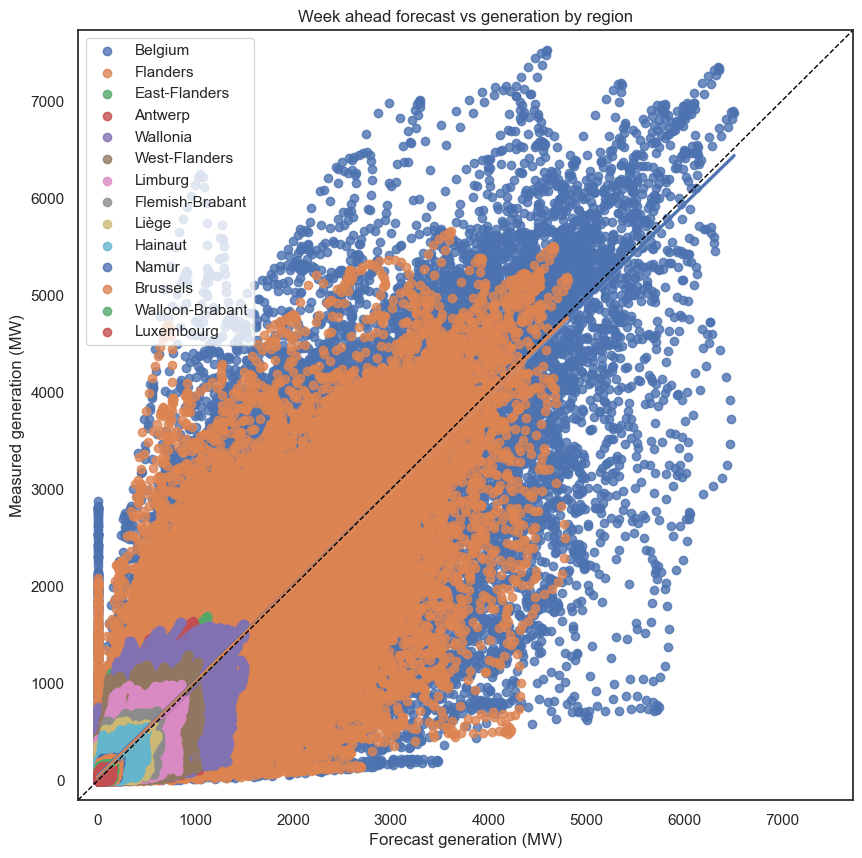
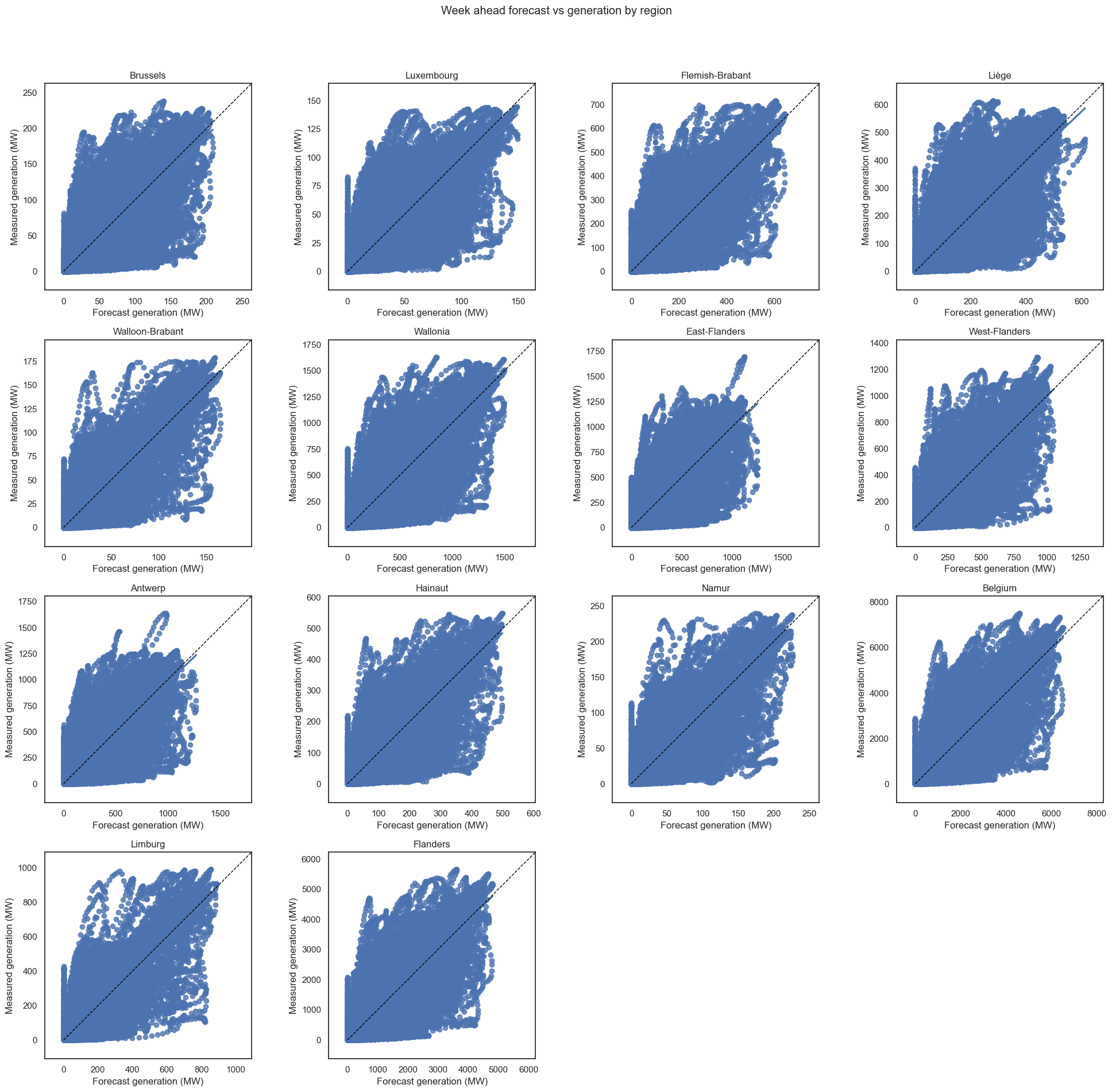
At the week ahead level, while there is a correlation between forecast and measured generation, it’s not great - for example, there can be forecasts of ~6000, but the reality was <1000. And for those wondering about the vertical line, the top value is for 2021-09-23 11:30:00, where 0 was predicted, but in reality 2622MW was generated.
The predictions do get better for most recent though. I call these my comets:
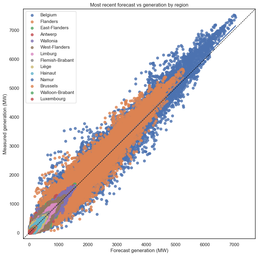
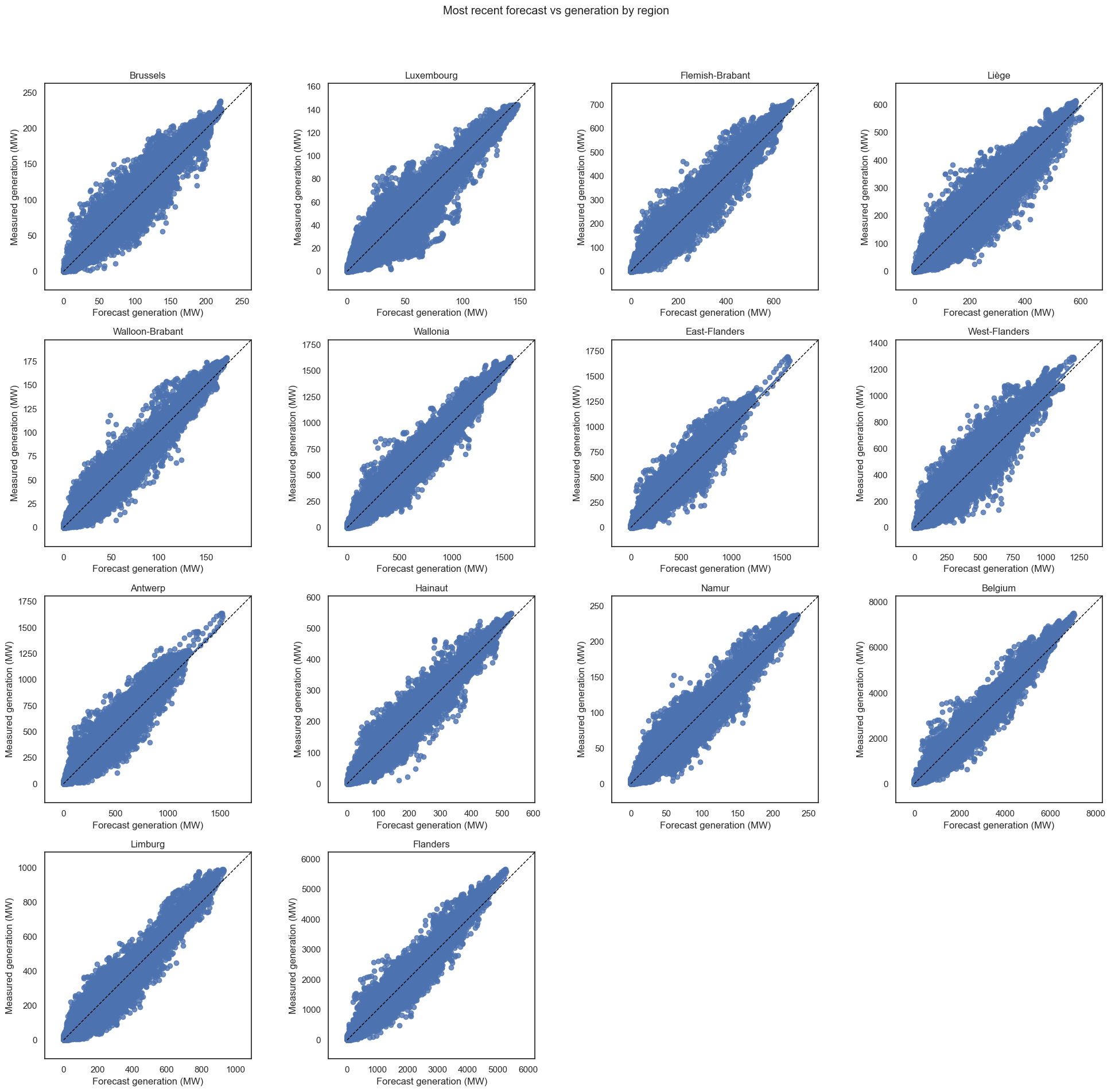
There are still a few outliers, like a prediction of ~2000 with a reality of ~4000. But they’re definitely better. No vertical lines. It still seems that the predictions, on average, slightly underestimate the generation.
The next step is to investigate the errors directly.
Plotting errors over time
The error is defined as the forecast subtract the generation, so an underprediction is a negative error. Let’s plot them:
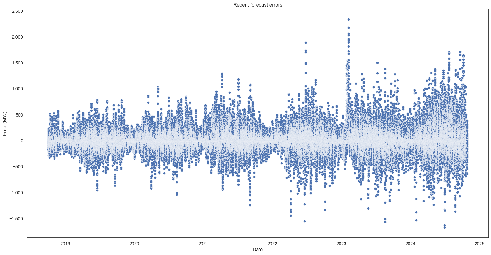
The errors get bigger over time because generation capacity is increasing, and you can also see to summer/winter link (a steady percentage error would still give the same summer/winter pattern as actual generation).
Error statistics
Now for some numbers. The final version of the script involved creating a function that generates a bunch of statistics, then another function that takes that and puts it in a visually-appealing DataFrame.
This is only for the “Belgium” region, as it’s the sum of all the others - doing the overall stats would skew downwards:
| Metric | Week Ahead Forecast | Most Recent Forecast |
|---|---|---|
| Mean (Actual) | 646.47 | 646.47 |
| Mean (Predicted) | 609.1 | 641.21 |
| Median (Actual) | 2.29 | 2.29 |
| Median (Predicted) | 5.91 | 7.09 |
| Mode (Actual) | 0 | 0 |
| Mode (Predicted) | 0 | 0 |
| Std Dev (Actual) | 1108.59 | 1108.59 |
| Std Dev (Predicted) | 1010.08 | 1085.04 |
| Positive Errors | 52941 | 59863 |
| Negative Errors | 59831 | 52923 |
| Mean Error | -37.37 | -5.27 |
| MAE | 224.32 | 63 |
| MSE | 249249.7 | 19529.07 |
| RMSE | 499.25 | 139.75 |
| Median Error | 0 | 0 |
| MedAE | 2.59 | 1.64 |
| Mode Error | 0 | 0 |
| Std Dev Error | 497.85 | 139.65 |
| Min Error | -5193.69 | -2337.12 |
| Max Error | 4998.91 | 1672.95 |
| Mean Error (%) | 119.59 | 63.4 |
| MAPE | 137.42 | 71.79 |
| SMAPE | 52.2 | 27.4 |
| Min Error (%) | -100 | -100 |
| Max Error (%) | 1703500 | 1188925 |
| Mean Bias Deviation (%) | -5.78 | -0.81 |
| R² Score | 0.8 | 0.98 |
| Correlation Coefficient | 0.89 | 0.99 |
| Theil’s U | 5.55 | 1.55 |
OK, that’s a lot of stats. I think I went a bit crazy. First, some acronyms: (S)MA(P)E is Symmetric Mean Absolute (Percentage) Error, (R)MSE is (Root) Mean Squared Error, and MedAE is Median Absolute Error.
Now, let’s look into some of them:
- The means of the predictions are slightly lower than the actual measurements, and they have a smaller standard deviation. For an energy system, this is probably good - it’s better to believe you’ll have too little energy than too much, as it’s easier to tell another energy source not to turn on than get one to turn on at short notice.
- The medians and modes of zero or near-zero make sense given overnight there is zero solar generation.
- The prediction errors range from -5194 to +4999, which is a high percentage of the max we found earlier (7526). At 2024-09-06 11:45:00, the week ahead prediction was 5723, but reality was a measly 725. Even the most recent forecast was 1003, still a long way off. At 2024-10-05 11:00:00, the week ahead prediction was 1053, but reality was a huge 6246. This time the most recent forecast was better, 6104.
- While mean error values for both forecasts are negative (under prediction), the most recent forecast has more positive errors than negative ones. This suggests that, although they are more numerous, they are of smaller magnitude than the negative errors.
- The mean error and mean error (%) columns are calculated by averaging all individual errors, which means positives and negatives may cancel out. Therefore, while it gives an indication of the direction of the error (i.e. if it’s an under or over prediction), the magnitude may be misleading. MAE and MAPE use absolute errors, so they give the magnitude, but without the direction.
- The mean errors being negative while the mean error percentages being positive suggests that while the that the predictions are on average slightly lower than the actual values, some are dramatically higher, which brings the mean from negative to positive.
- The min error of -100% states that at least once the prediction was 0 when there was measured generation. In fact, there were >2500 of these, with the largest actual measurement being 2880! Quite an underprediction (although, for this time at least, the most recent forecast was 2622, which is much closer).
- The max error percentage is, in a word, high. Several others are of this magnitude. Digging a little deeper shows that these are when the actual is near zero - for example, the error of 1,703,500% was when -17.036 was predicted, but the actual was 0.001 (see the maths?) If we only consider times when the measured generation is significant, say over 1% of the maximum (i.e. greater than 7.526), the max error drops to 2590%.
- The mean bias deviations both being negative also suggest slight underpredictions overall.
Even with all this, the R² values (close to 1) and Thiel’s U (close to 0) suggest both models have robust predictive power.
Error stats by region
Now, let’s split by region. I’ve ordered them approximately north to south, west to east, removing the regional groups (that is, Flanders, Wallonia, and Belgium). The week ahead forecast errors:

And the most recent forecast errors:

What can we gather from this mass of information?
- The key observation is that the predictions for the Flanders regions, in the north of Belgium, are worse than those for the Wallonia region, in the south. However, the SMAPEs are relatively consistent across regions, as are the R²s and correlation coefficients, which suggests that all forecasts are decent.
- When it comes to percentage errors, Walloon-Brabant is best. Luxembourg also performs well, but has a high mean bias deviation, linked to a high number of positive errors, suggesting it has a lot of overprediction. Luxembourg also has the highest Thiel’s U number, making the model’s reliability more questionable.
- Antwerp and West-and East-Flanders had the worst predictions, with high values across the board, including percentage errors, absolute errors, and squared errors. That said, they’re also the areas with highest overall generation, which explains the latter two errors.
- The R² and correlation coefficients are high for both most recent and week ahead forecasts, for all regions, suggesting the models are pretty good.
I was curious if the size of the errors relate to the size of the region, so I went back and added the data in by creating a new DataFrame and pd.mergeing it, the normalising it by dividing the values by the area (so we get MW/km²).
These are the areas, from smallest to largest:
| Region | Area |
|---|---|
| Brussels | 162 |
| Walloon-Brabant | 1097 |
| Flemish-Brabant | 2118 |
| Limburg | 2427 |
| Antwerp | 2876 |
| East-Flanders | 3007 |
| West-Flanders | 3197 |
| Namur | 3675 |
| Hainaut | 3813 |
| Liège | 3857 |
| Luxembourg | 4459 |
I won’t include the full tables, because there was only one key finding:
- Brussels, being far smaller than the others, had the highest generation per unit area - possibly due to high density rooftop PV. However, this caused the error figures to go from being some of the lowest (i.e. best) to the highest (i.e. worst), as is to be expected.
Error stats by year
I also grouped by year, instead of region, to see if predictions were getting more accurate. I only did complete years. Week ahead then most recent forecasts:
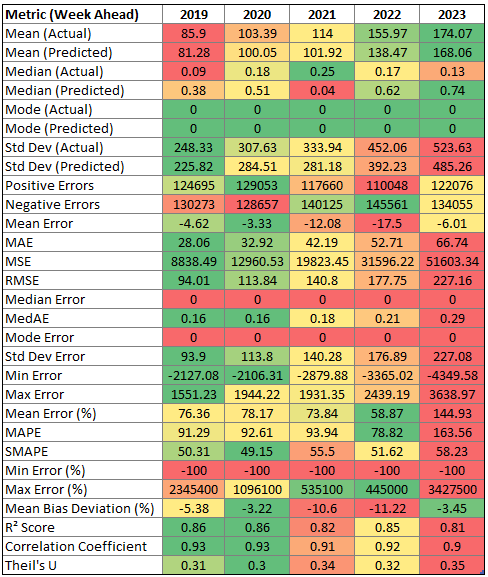
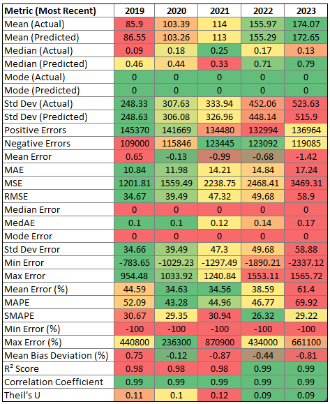
Unsurprisingly, the measured and forecasts values were both increasing (due to increased installed solar capacity), as were the absolute errors (more generation means more room for errors given an equal error percentage). The error percentages were (slightly) decreasing over time… Until 2023, when they roughly double (week ahead) or increase by 50% (most recent). So we can’t really say the predictions are getting better - or, perhaps, 2023 was an outlier. In a few months I can get the stats for 2024 and see how they look.
Conclusion
So, what have we learnt?
- Both forecasts tend to slightly underpredict generation, which is generally preferable for energy system management.
- The most recent forecasts are significantly more accurate than week-ahead forecasts, as expected.
- Predictions for the Flanders regions in the north of Belgium are less accurate than those for the Wallonia region in the south.
- Brussels, despite having the smallest area, has the highest generation per unit area, likely due to high-density rooftop solar installations.
- While forecast accuracy seemed to improve over the years, 2023 saw an unexpected increase in error rates.
Overall, while the forecasts show robust predictive power with high R² values and correlation coefficients, there’s still room for improvement, particularly in certain regions. It will be interesting to see how the 2024 data looks, to see if the 2023 predictions were anomalies, or if it’s a sign that solar PV is becoming harder to predict, such as due to more uncertain weather patterns.
Next
My predictions! Can I beat the might of Elia, using only historical data and machine learning magic?
